This portfolio is password protected. Enter the password to continue.
Incorrect password. Please try again.
A multimodal catalog where customers discover and re-engage with Alexa Apps.
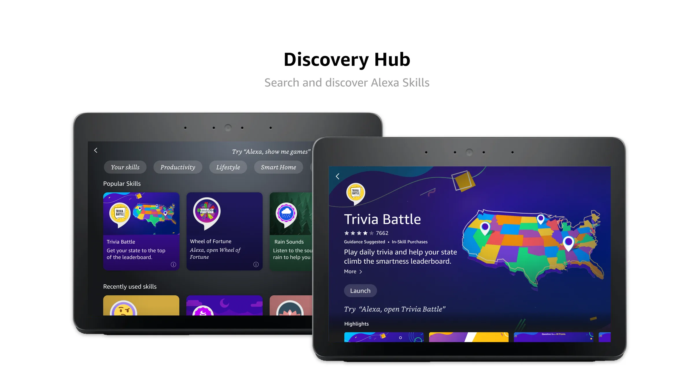
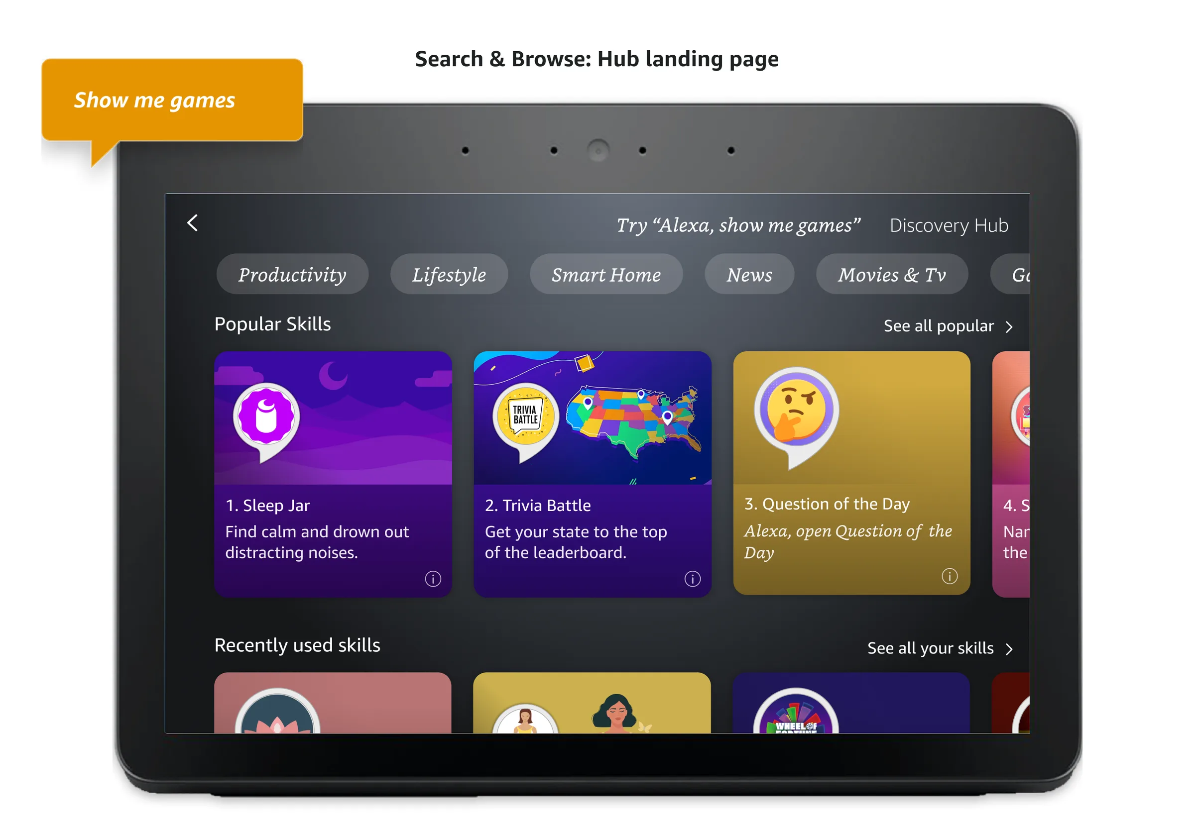
Discovery Hub is a multimodal home for Alexa skills on Echo Show. Users can browse, search and filter the catalog, find new skills and get back to the ones they already like, all on one screen.
Discover new skills and find your favorites on Discovery Hub
In the span of 3 months, Discovery Hub generated over 23,000 skill launches, with a conversion rate of 60% compared to the previous 23% for skills, more than doubling the launch rate.
I ran 30-minute moderated sessions with 6 Echo Show owners on a Figma prototype (June–July 2022), in parallel with a voice-only study of the same feature.
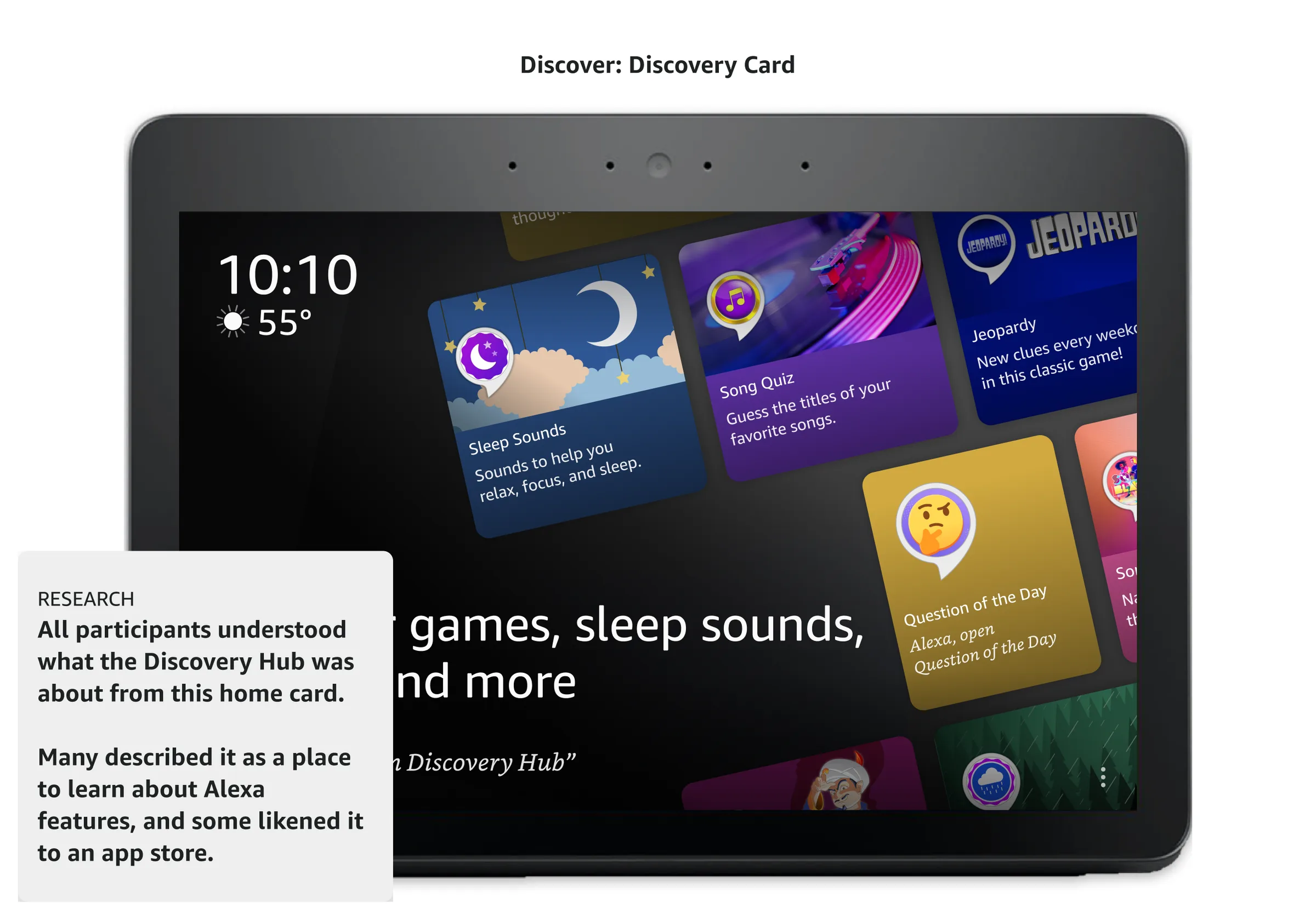
Everyone understood the home screen card right away. Several called it "an app store for Alexa".
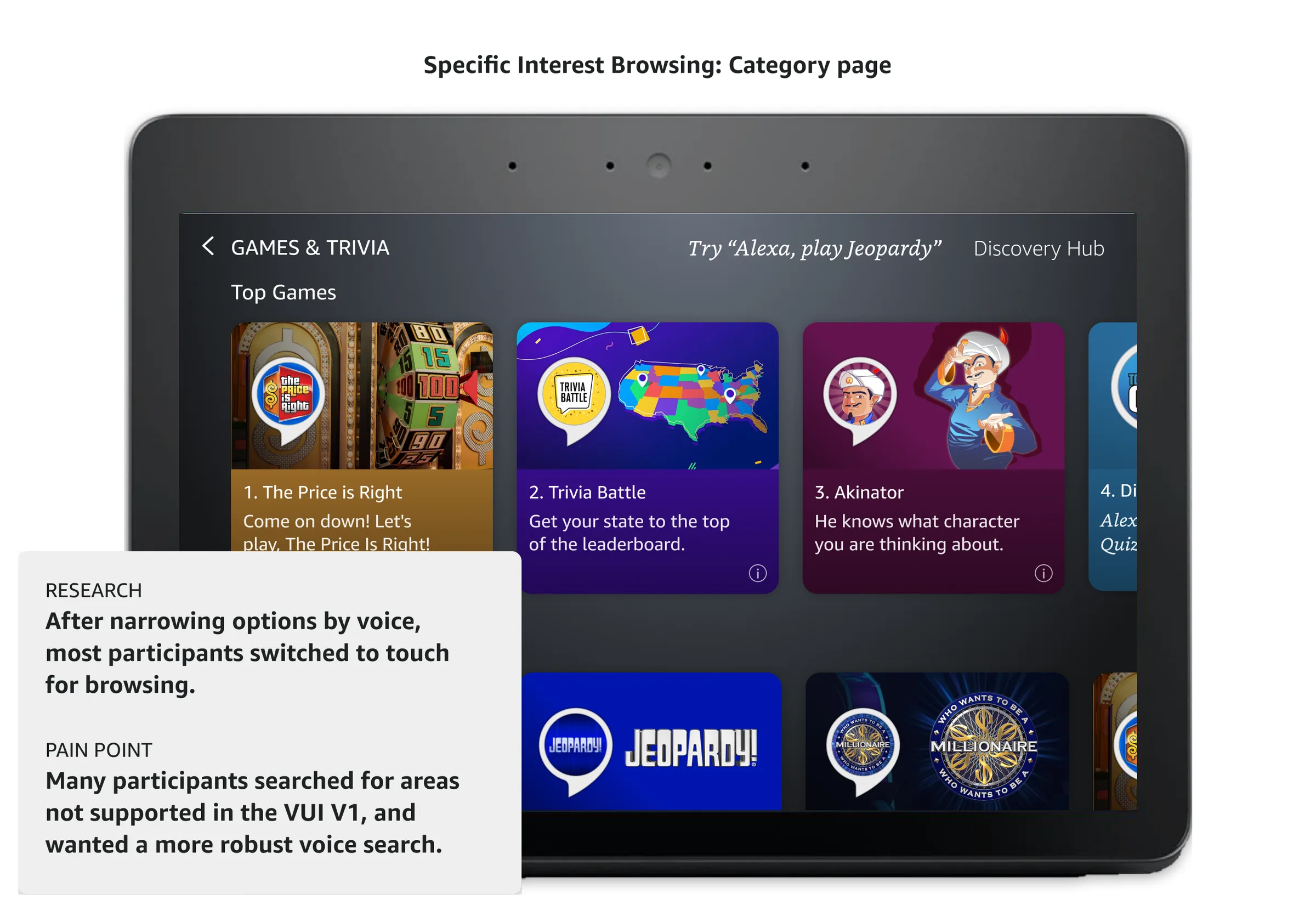
Half opened the hub by voice and half by touch. Proximity decided it, not preference.
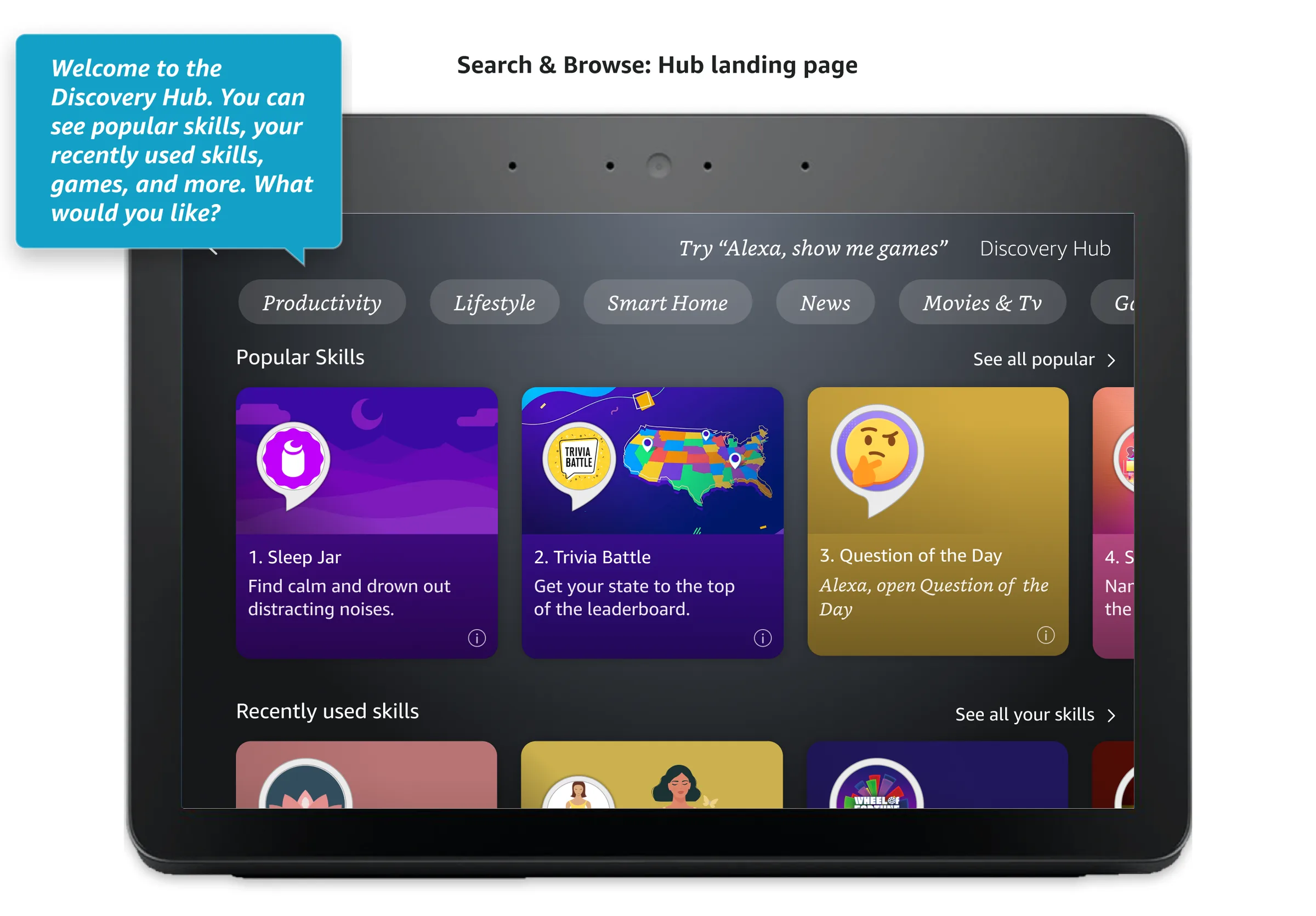
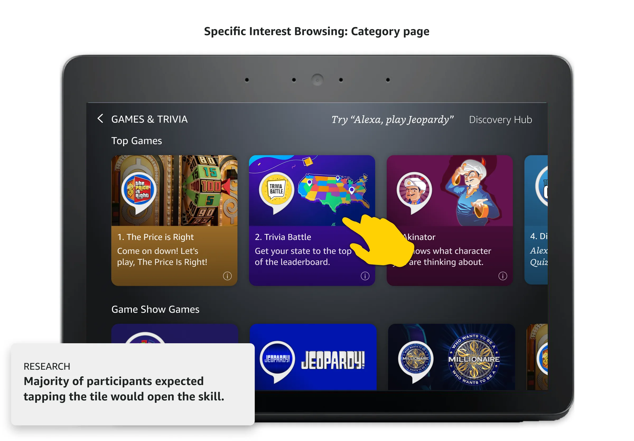
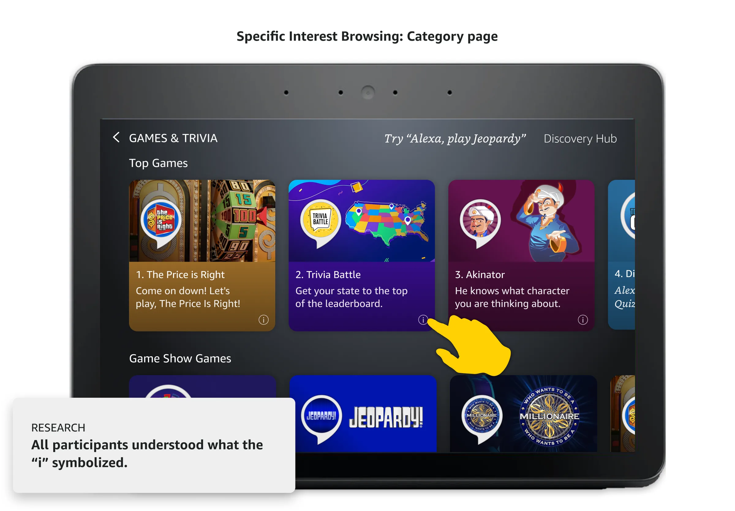
People browsed with category pills and horizontal rows, and used the info icon, but expected tapping a tile to launch the skill.
Leaving a skill and landing on the home screen felt like a dead end. People expected to return to the hub.
Alexa has 130,000+ skills, but most users only ever came back to the handful they already knew. On Echo Show, finding new ones meant listening to a long narrated list, with no way to browse visually. I led the concept design, working closely with product, and partnered with a principal designer on implementation.
I worked with UX designers on interaction and visual patterns, UX research on testing, engineers on feasibility within existing multimodal APIs, and our PM on requirements and priorities.
With our PM, I turned the requirements into a concept prototype for VP-level stakeholders. Having something tangible to walk through got us the green light.
Initial concept prototype
The multimodal catalog experience can be broken out into 4 use cases.
Browse & Discover
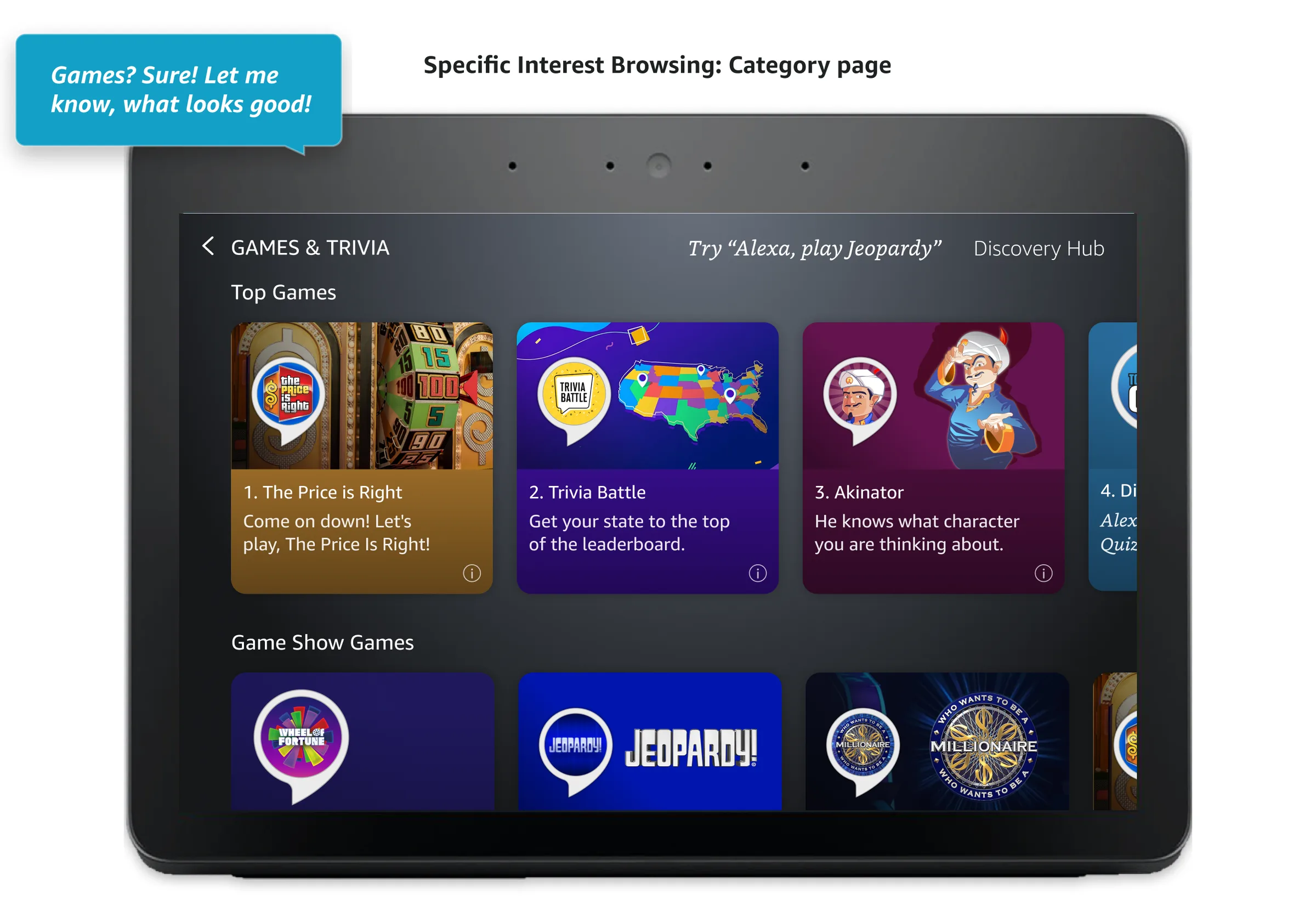
Browse the catalog, and search via voice to narrow down results and discover skills.
Evaluate & Engage
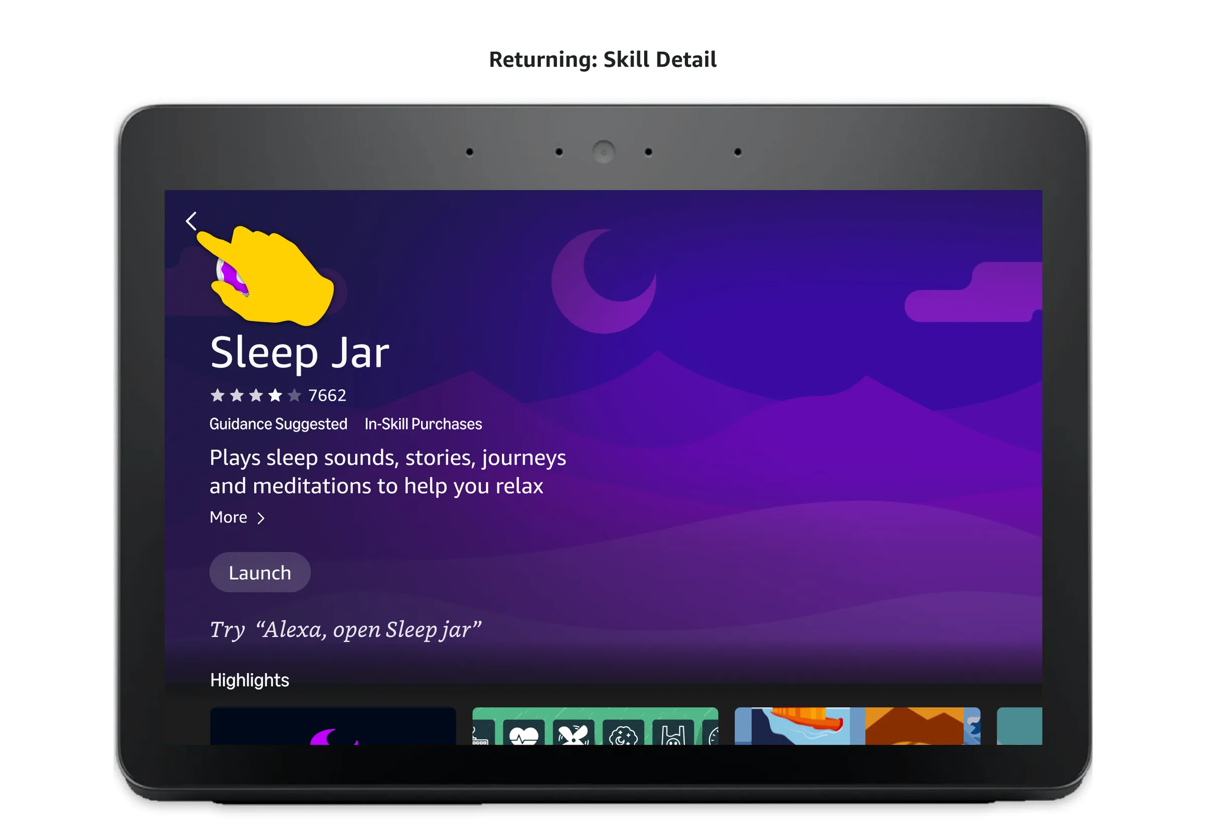
Quickly open skills from tiles or review details.
Return & Re-engage
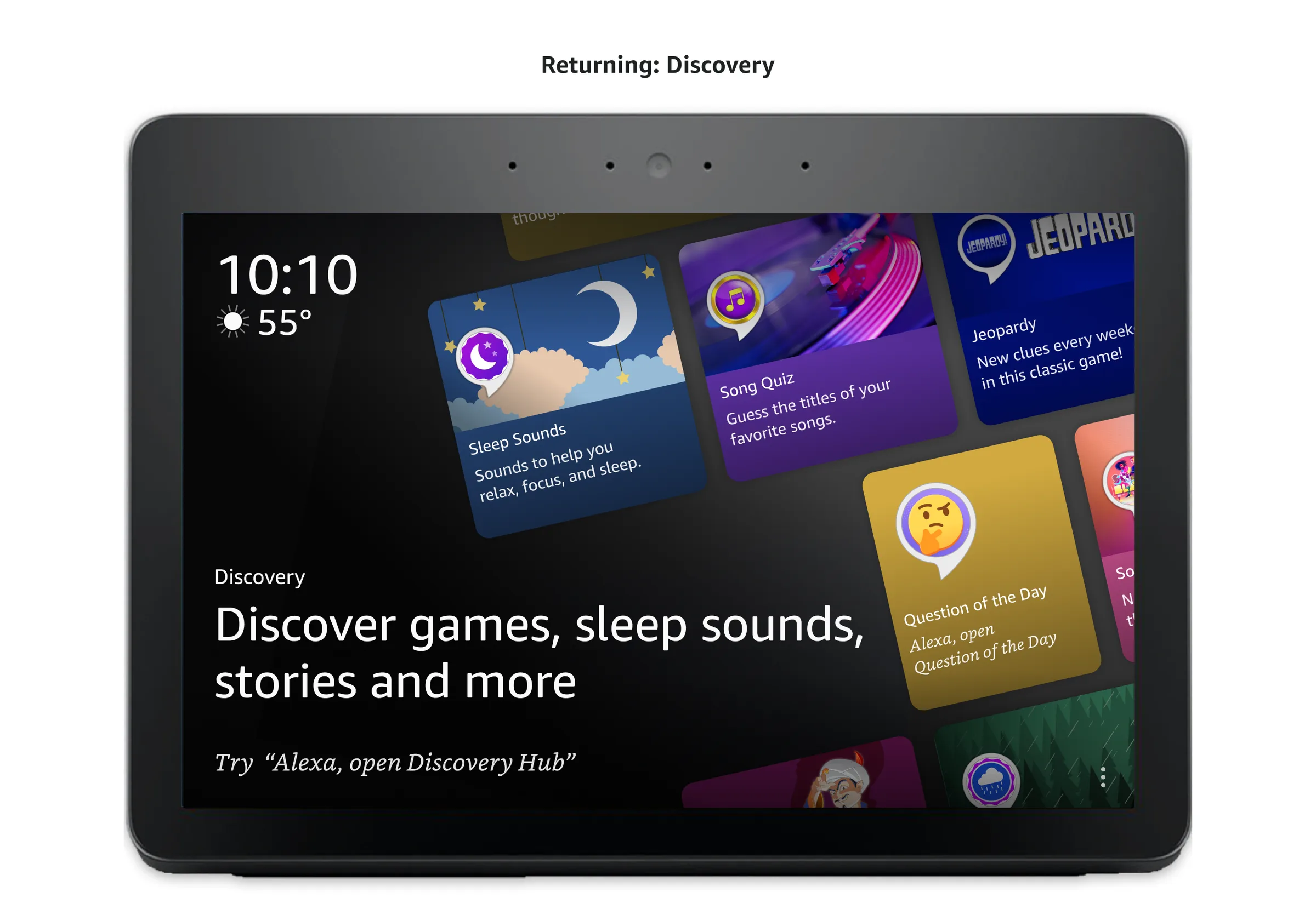
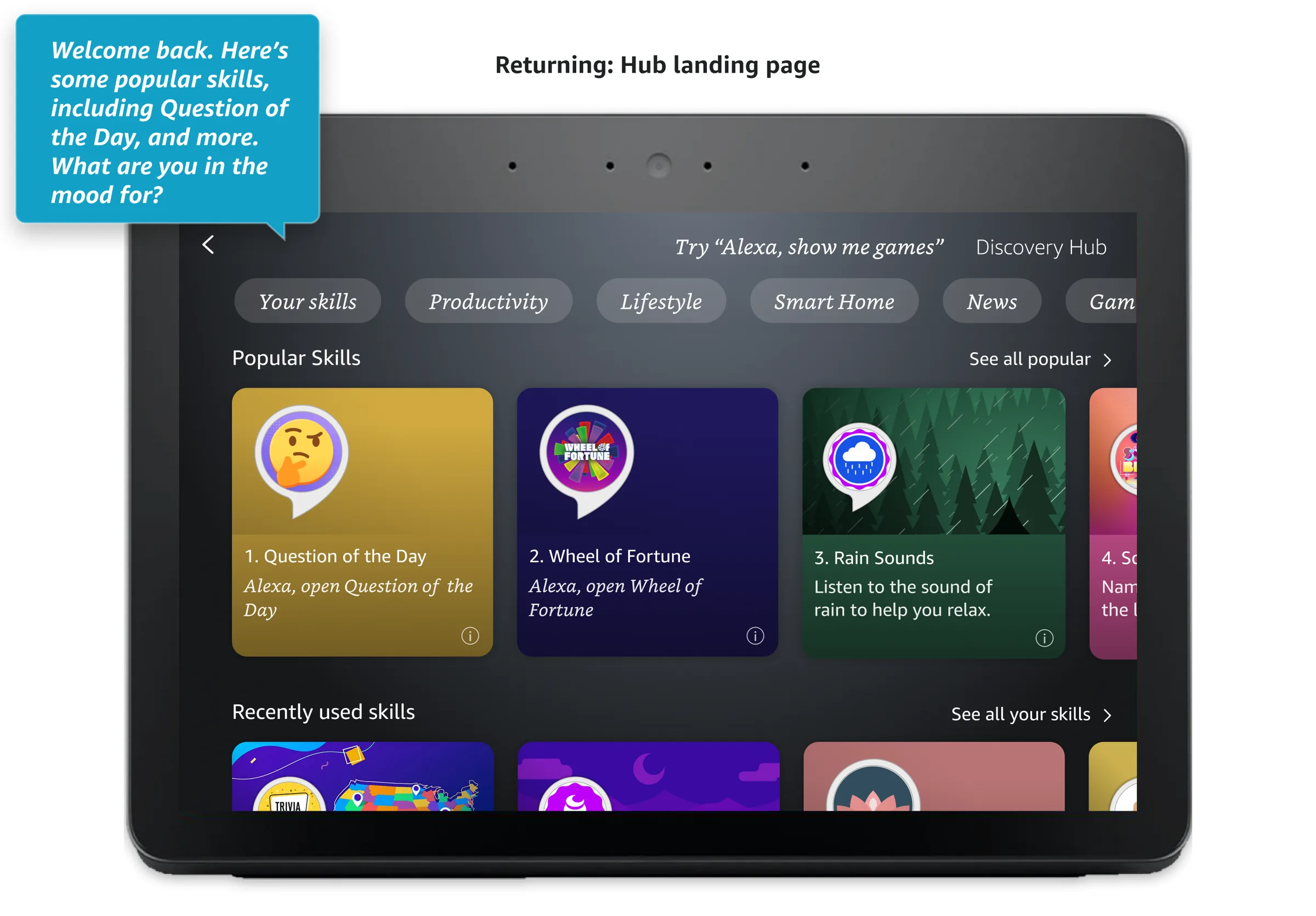
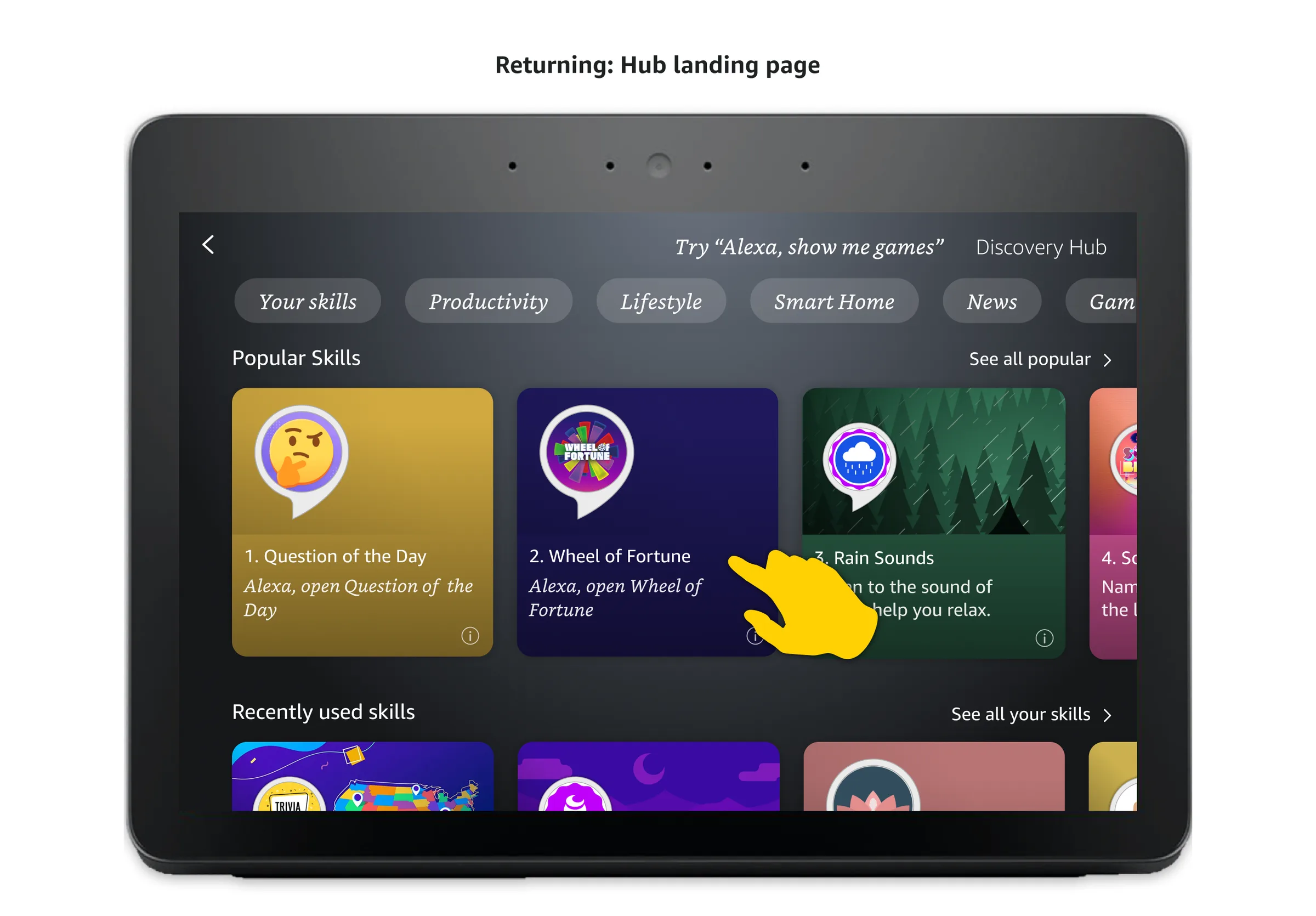
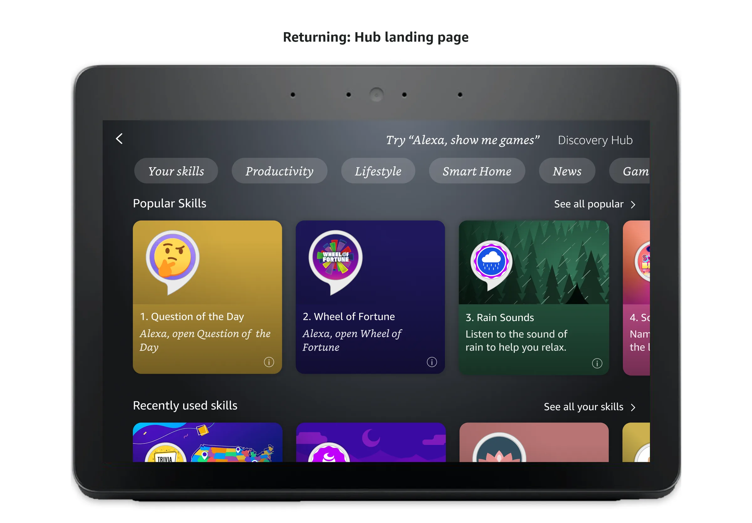
Be reminded of skills I've used and ingress into the hub to see all recent skills.
Manage & Resolve
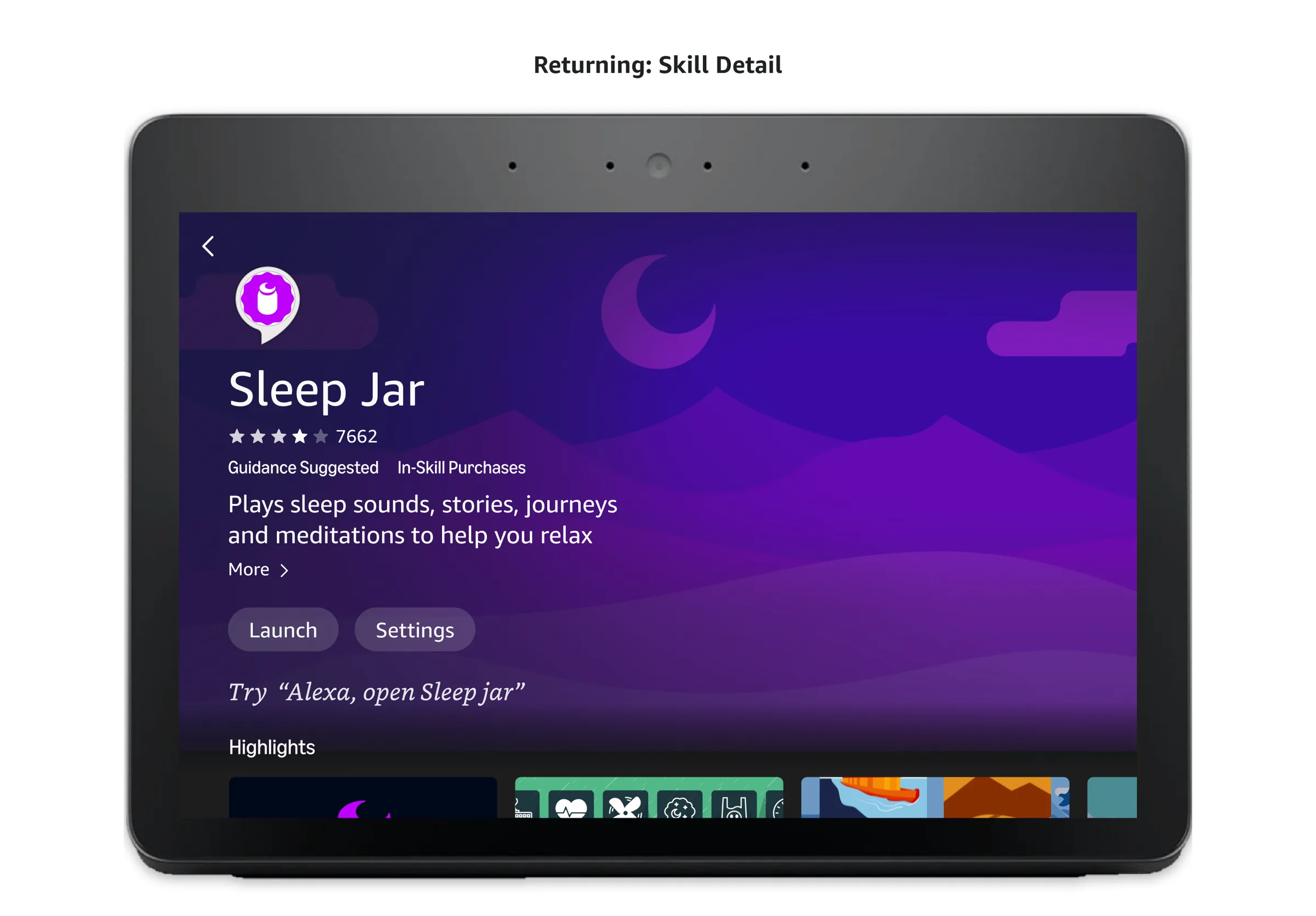
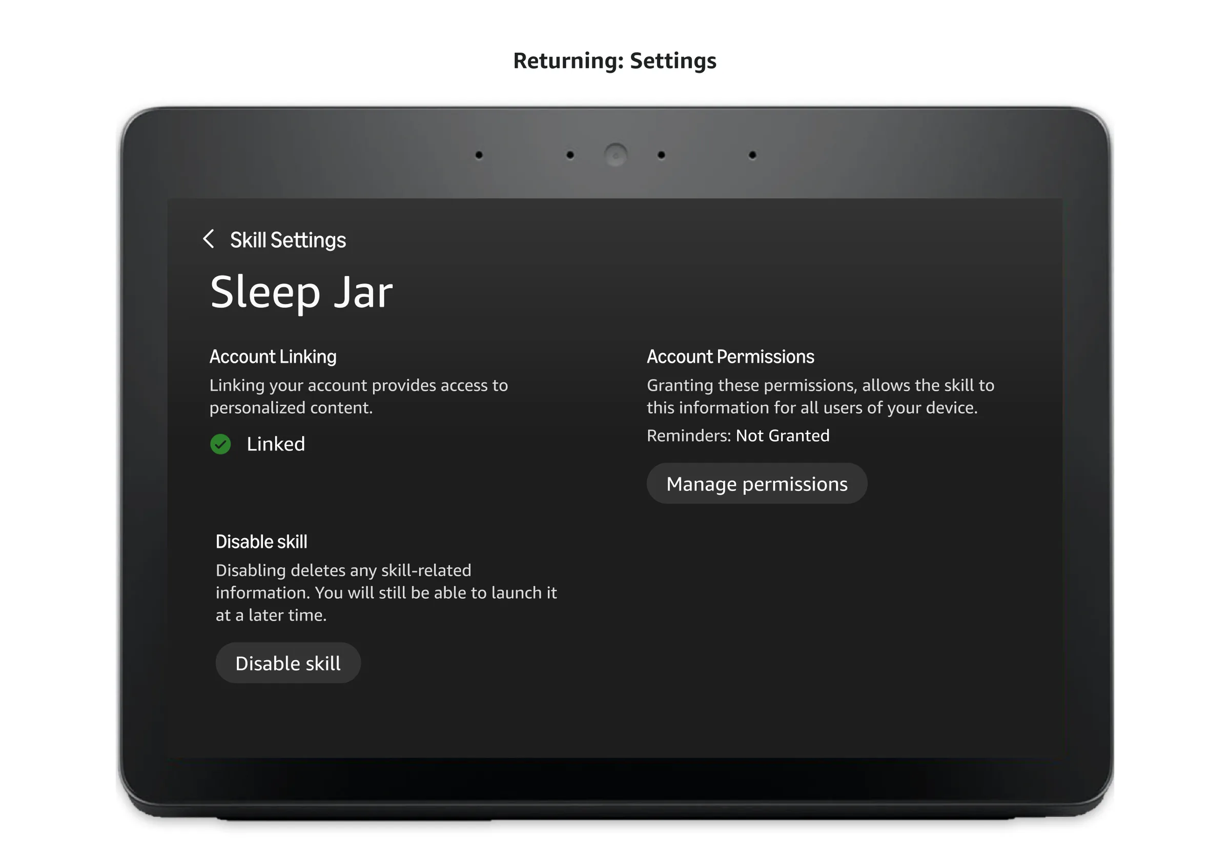
Manage core functionality for my skills in detail page settings.
Hand-picked, high-quality skills get a background image with a tint sampled from the image itself, then softened with scrims so every tile stays legible and balanced.
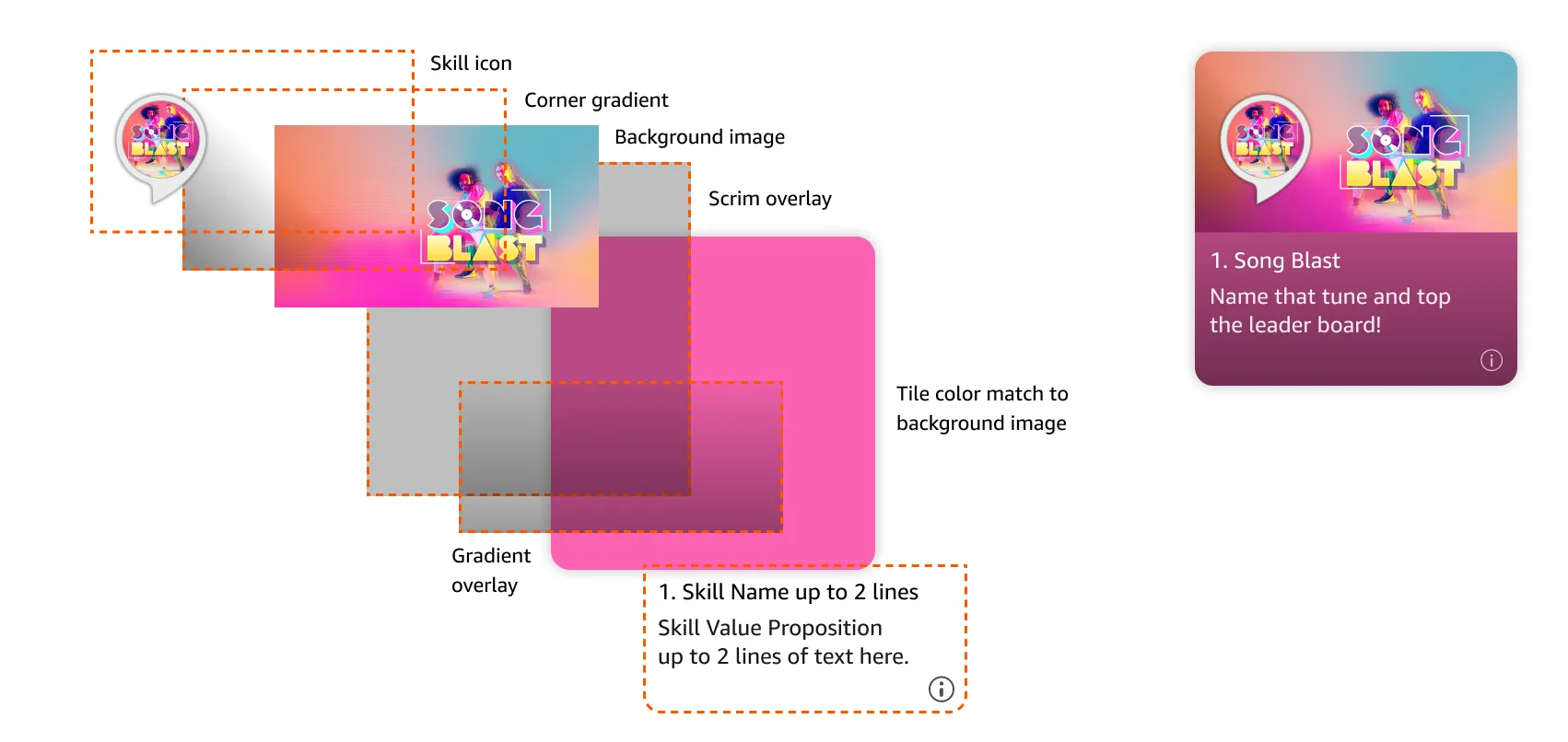
Default tiles cover the less popular, lower quality skills that don't have as much developer investment or maintenance. Rather than a custom background image, the tile color matches the skill's icon, keeping the same layered scrim and gradient treatment as featured tiles so the whole grid still feels visually consistent.
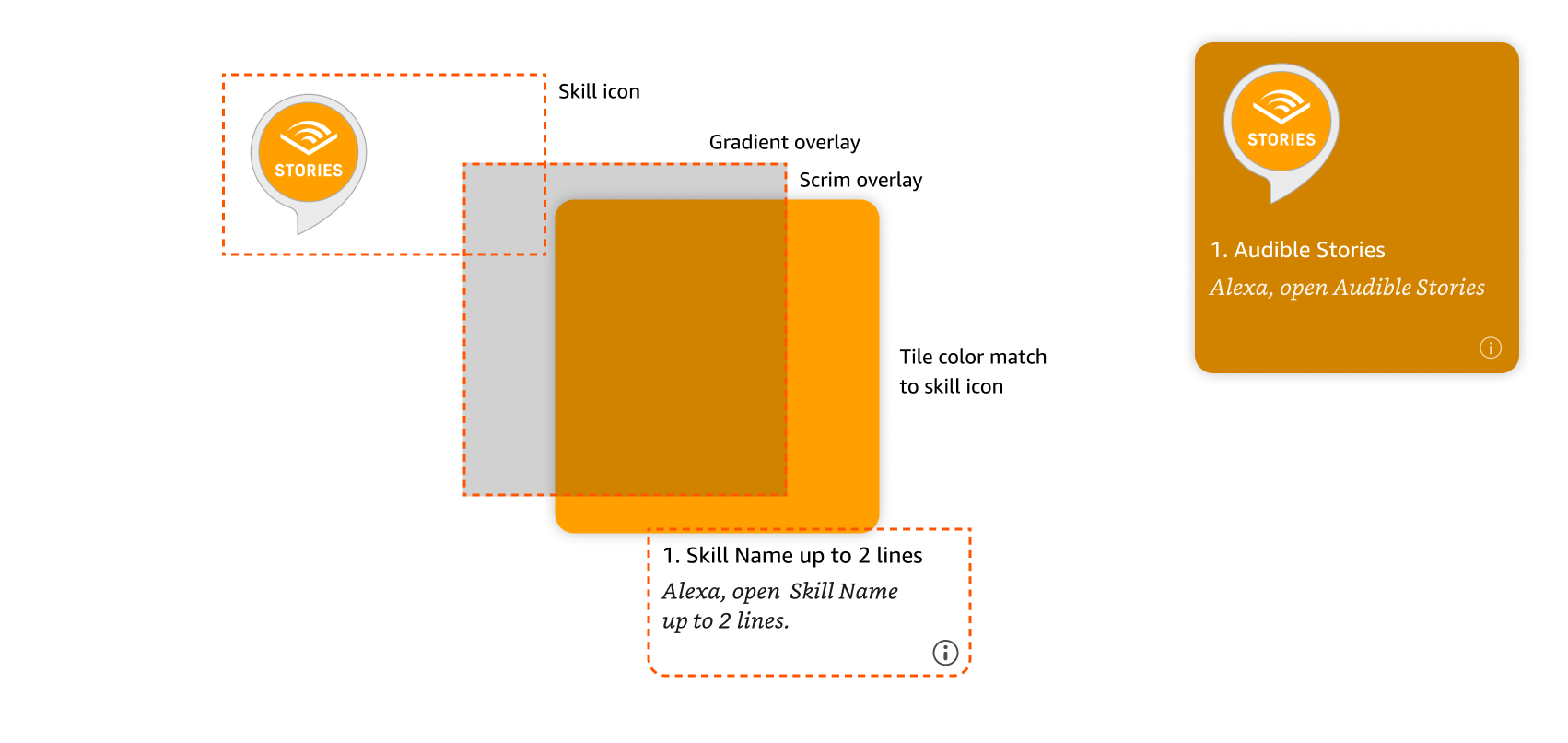
Less-maintained skills use their icon color instead of a custom image, with the same scrim treatment so the grid stays consistent.
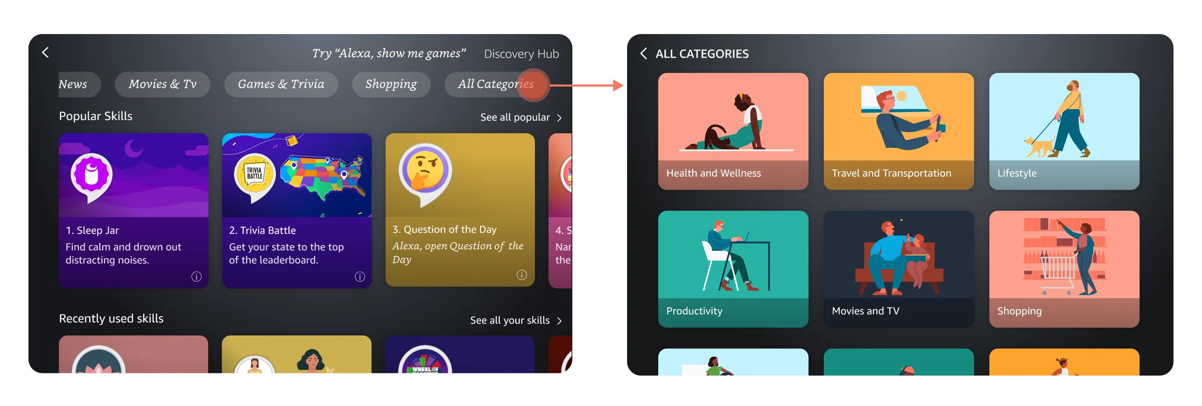
Only a few category pills fit in a row, so I used usage data to surface the most popular categories and moved the rest behind an "All Categories" page with an illustration for each.
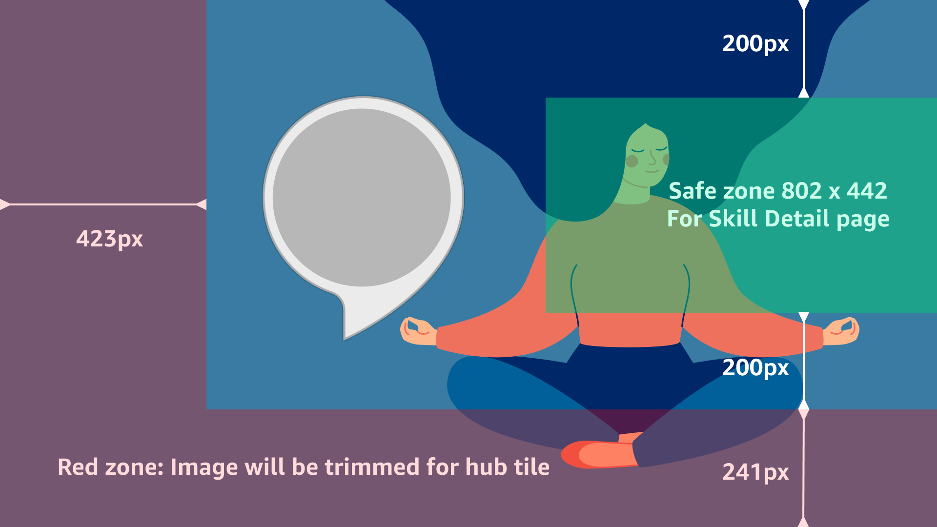
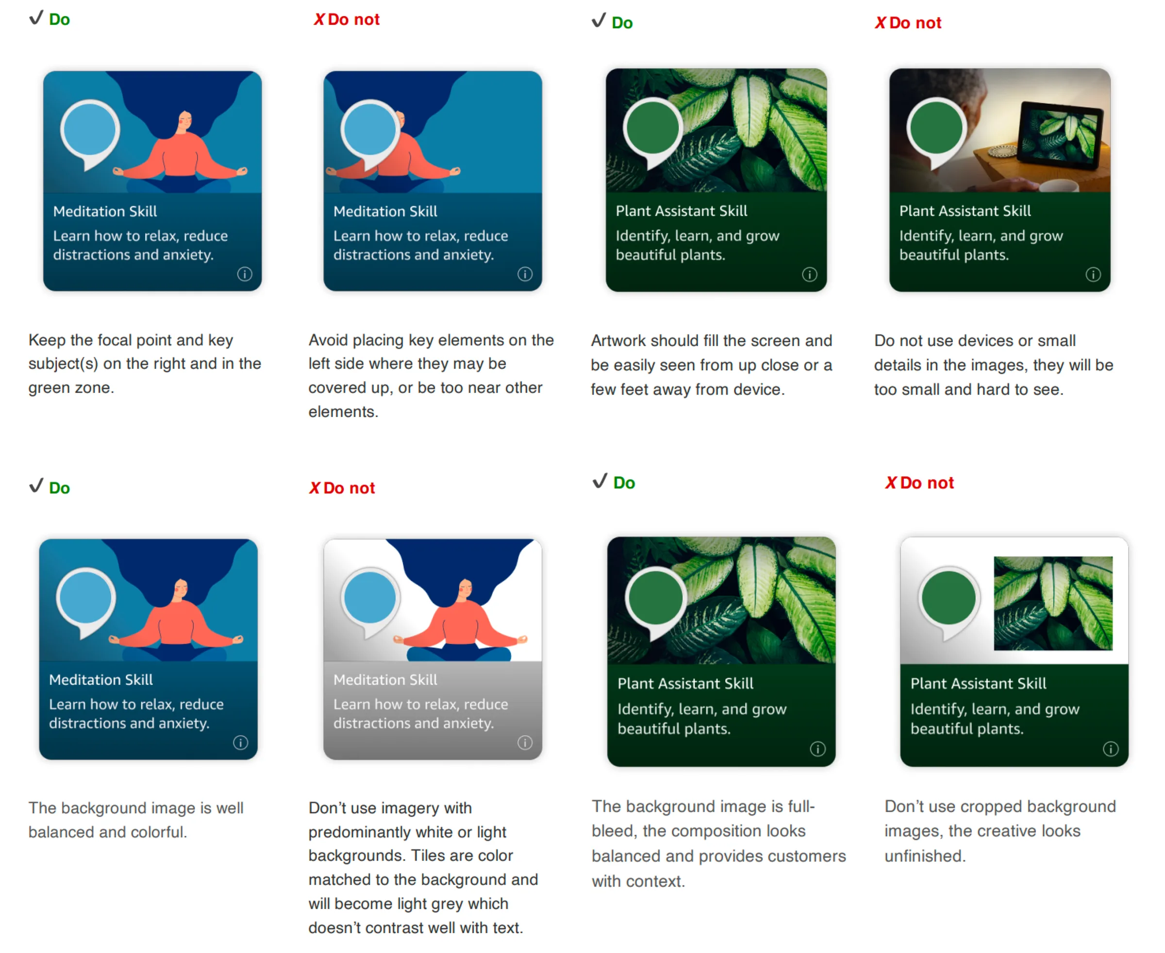
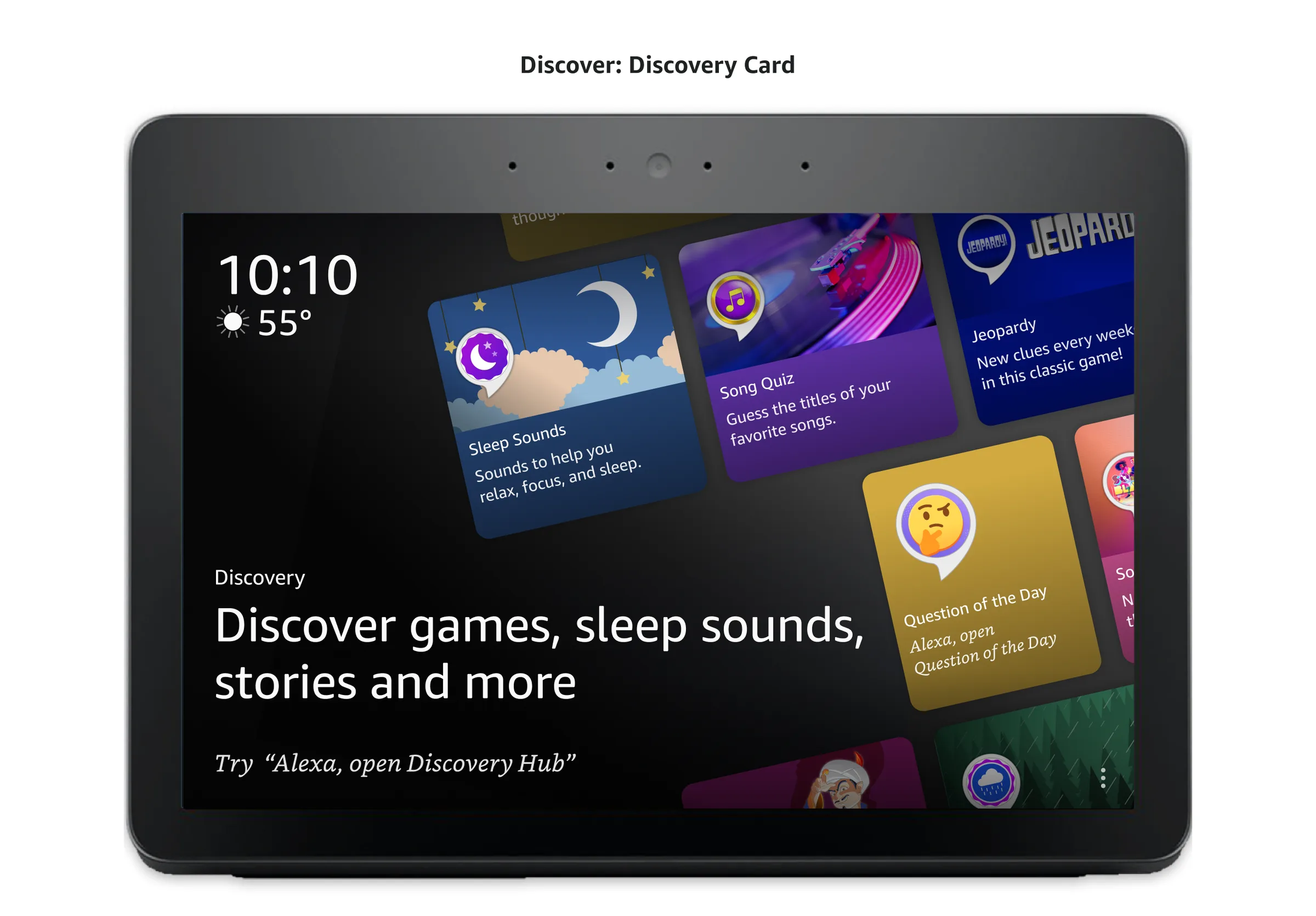
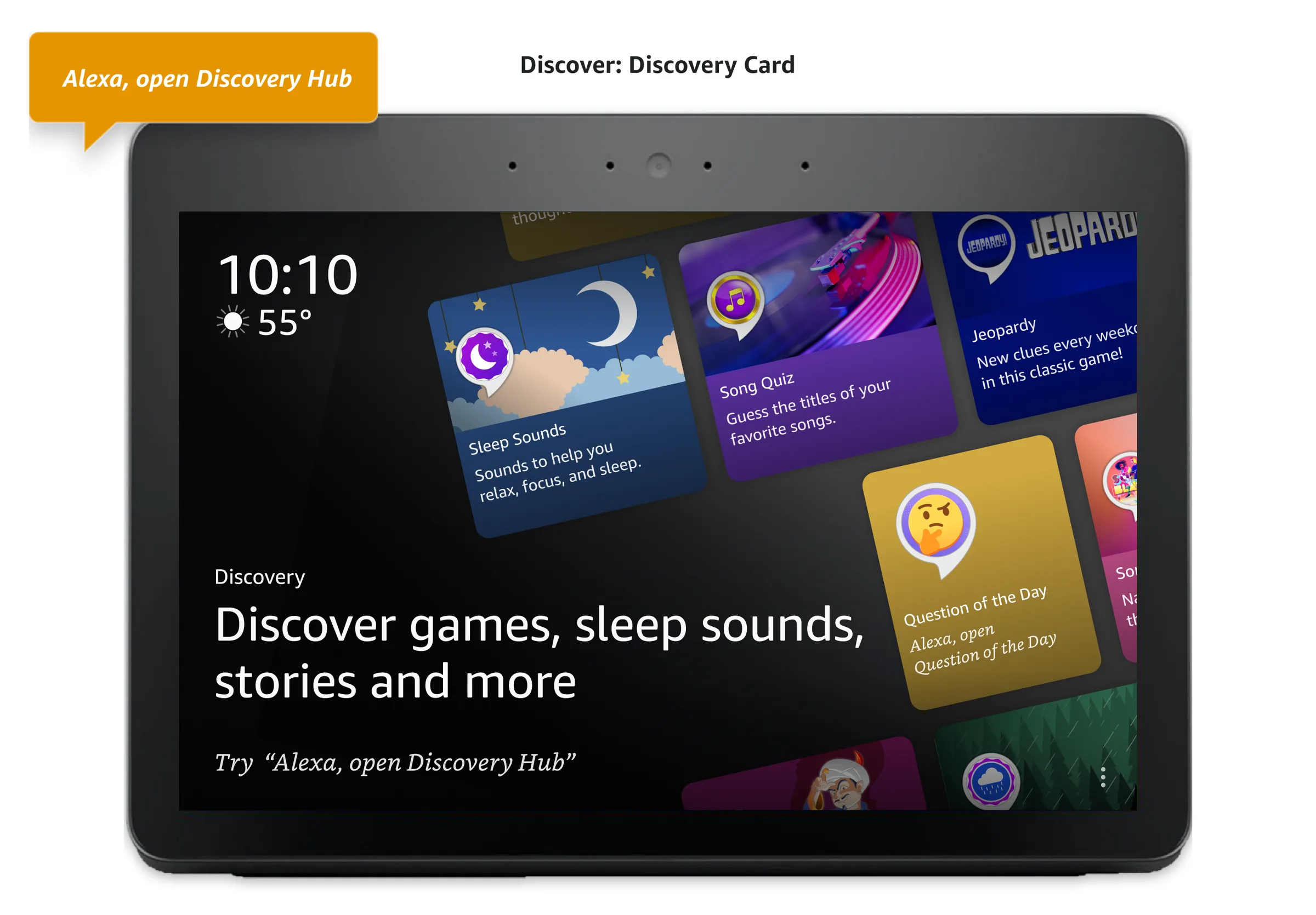
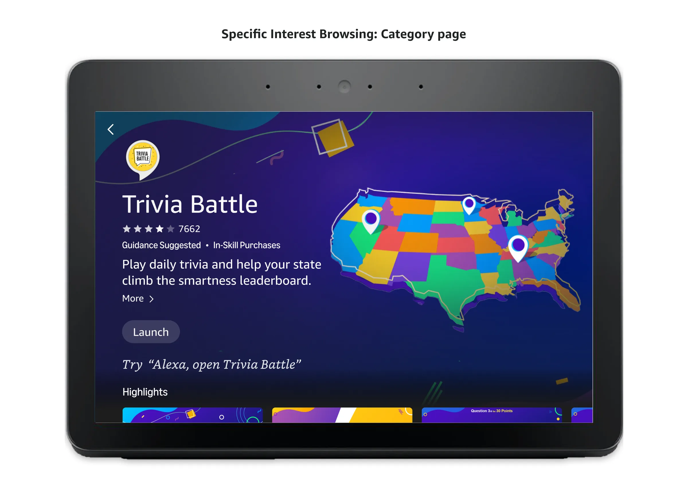
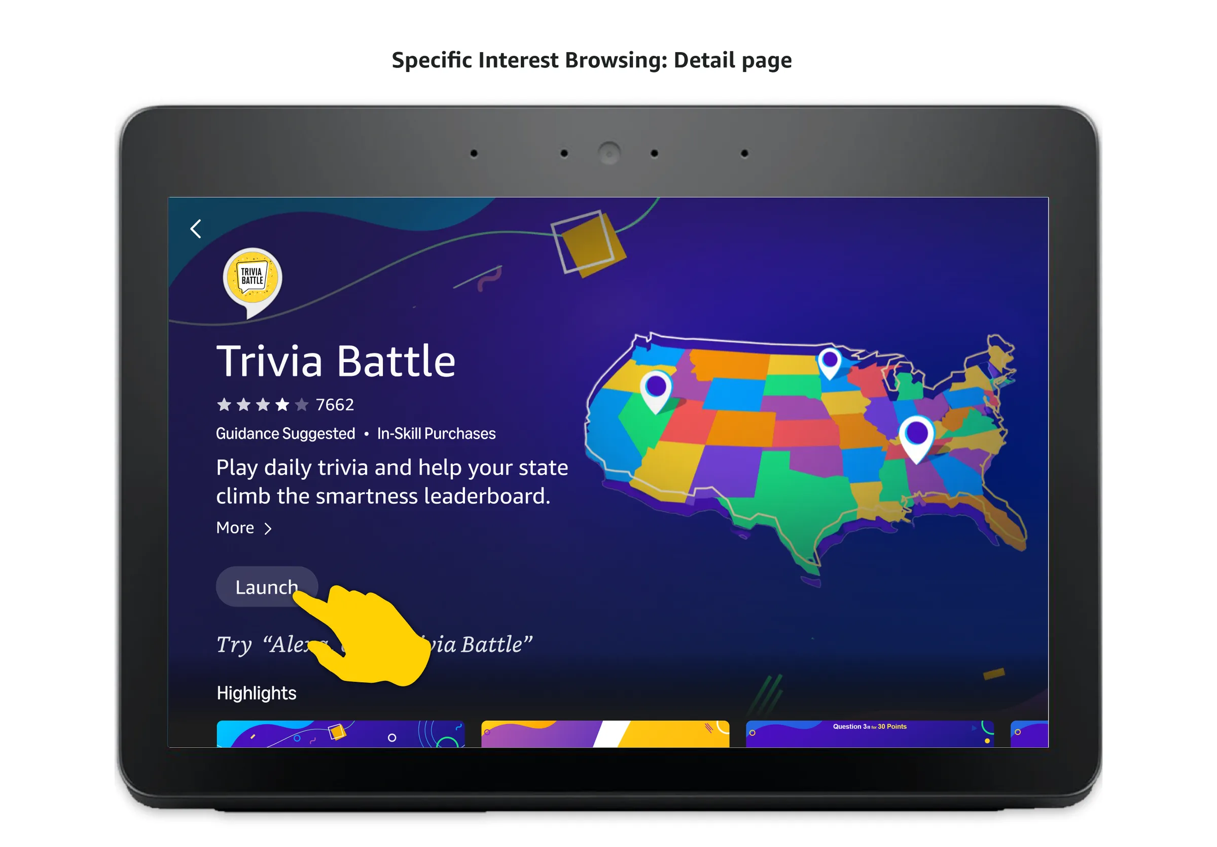
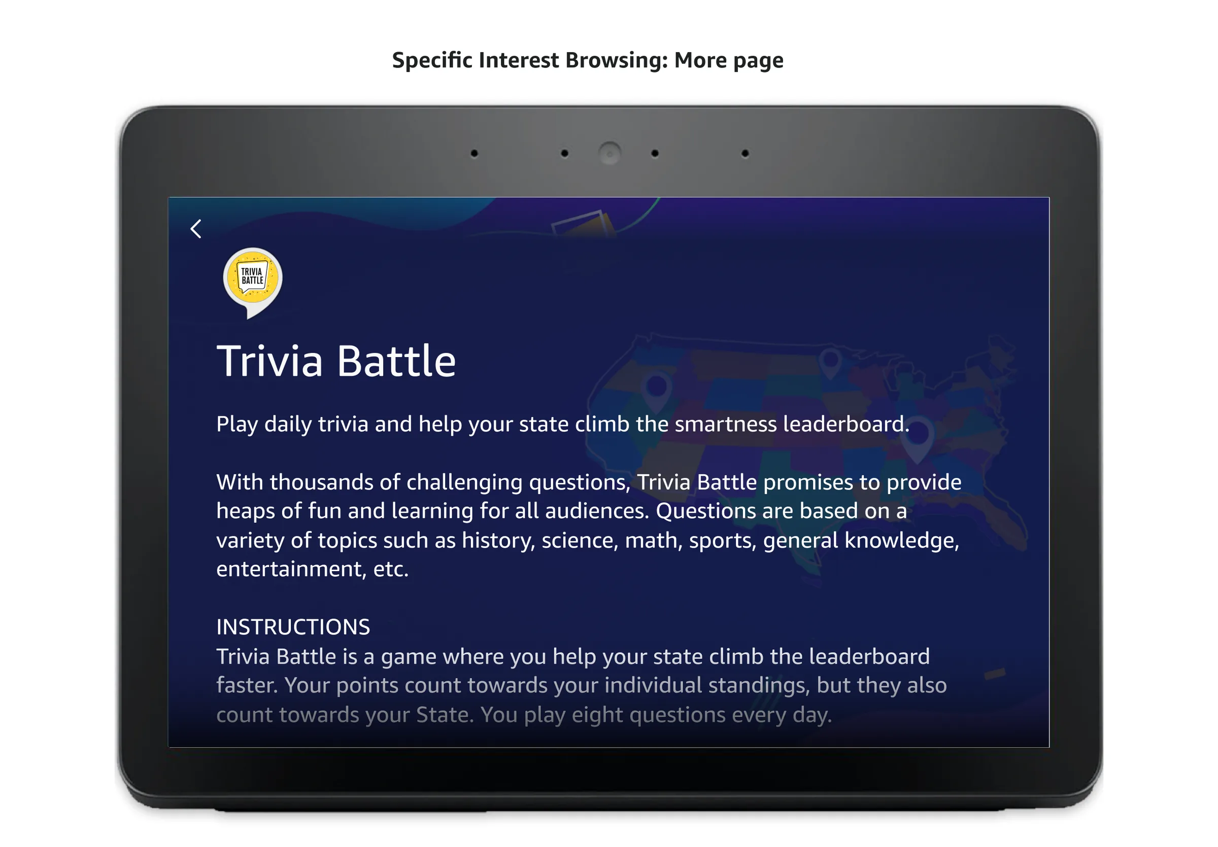
This flow shows how someone finds and opens a new skill for the first time, from noticing the Discovery Hub card on the home screen, to browsing categories and popular skills, to reviewing a skill's detail page and launching it.
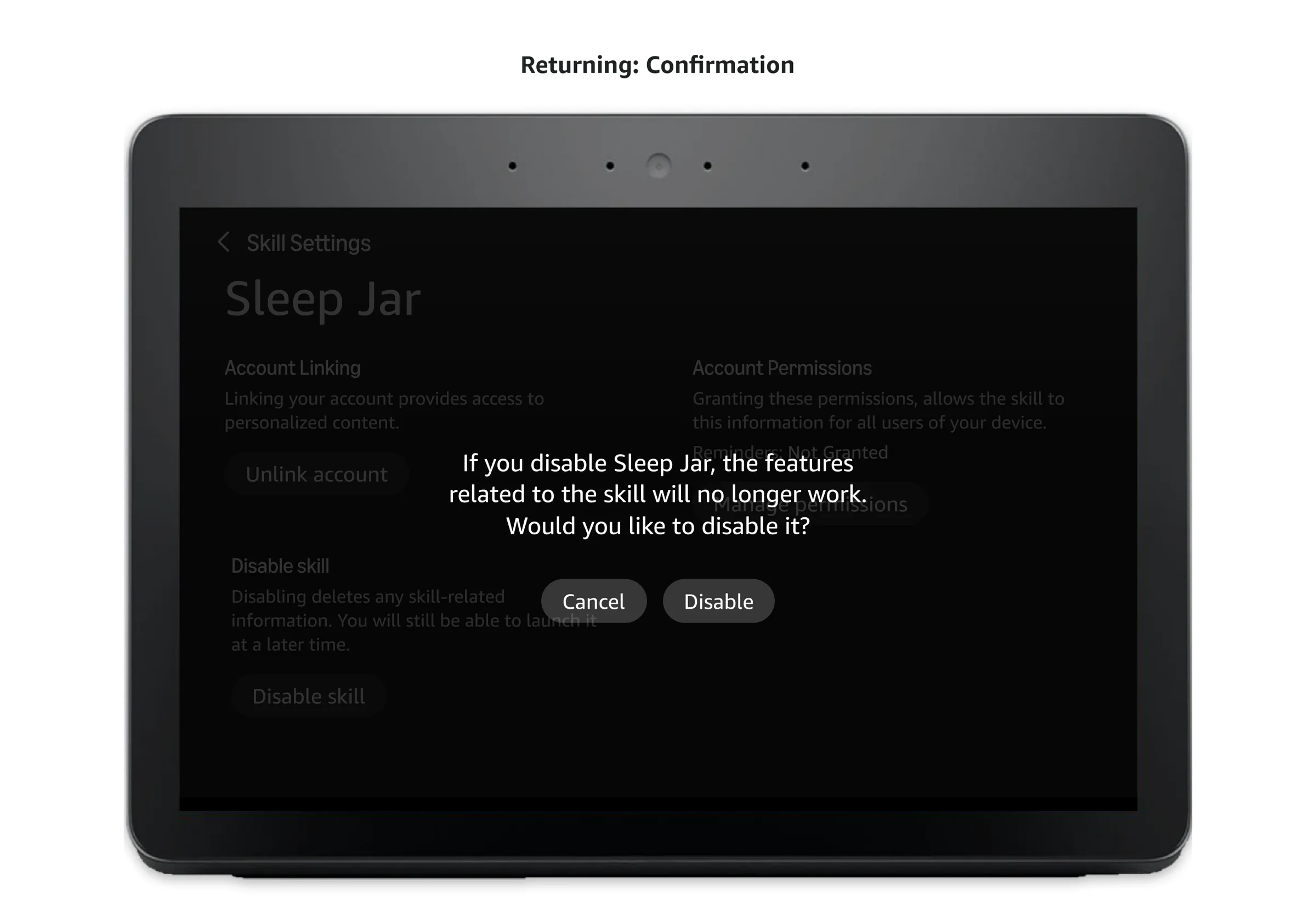
This flow shows how someone returning to a skill they already use manages it directly from Discovery Hub, adjusting its settings, reviewing terms of service, or disabling it when they no longer want it.
As ownership moved to the next phase of the roadmap, the top follow-ups were returning users to the hub after they exit a skill, favorites, personalized recommendations, and richer detail pages with pricing and multiplayer info.