This portfolio is password protected. Enter the password to continue.
Incorrect password. Please try again.
Amazon Alexa · 2026
Overview
Timeline
Design 2 weeks June 2026
My role
Lead designer User researcher
Scope
UX design UI design UX Researcher
Team
Alexa Experiences Devices and Design
Tools
Figma
Solution
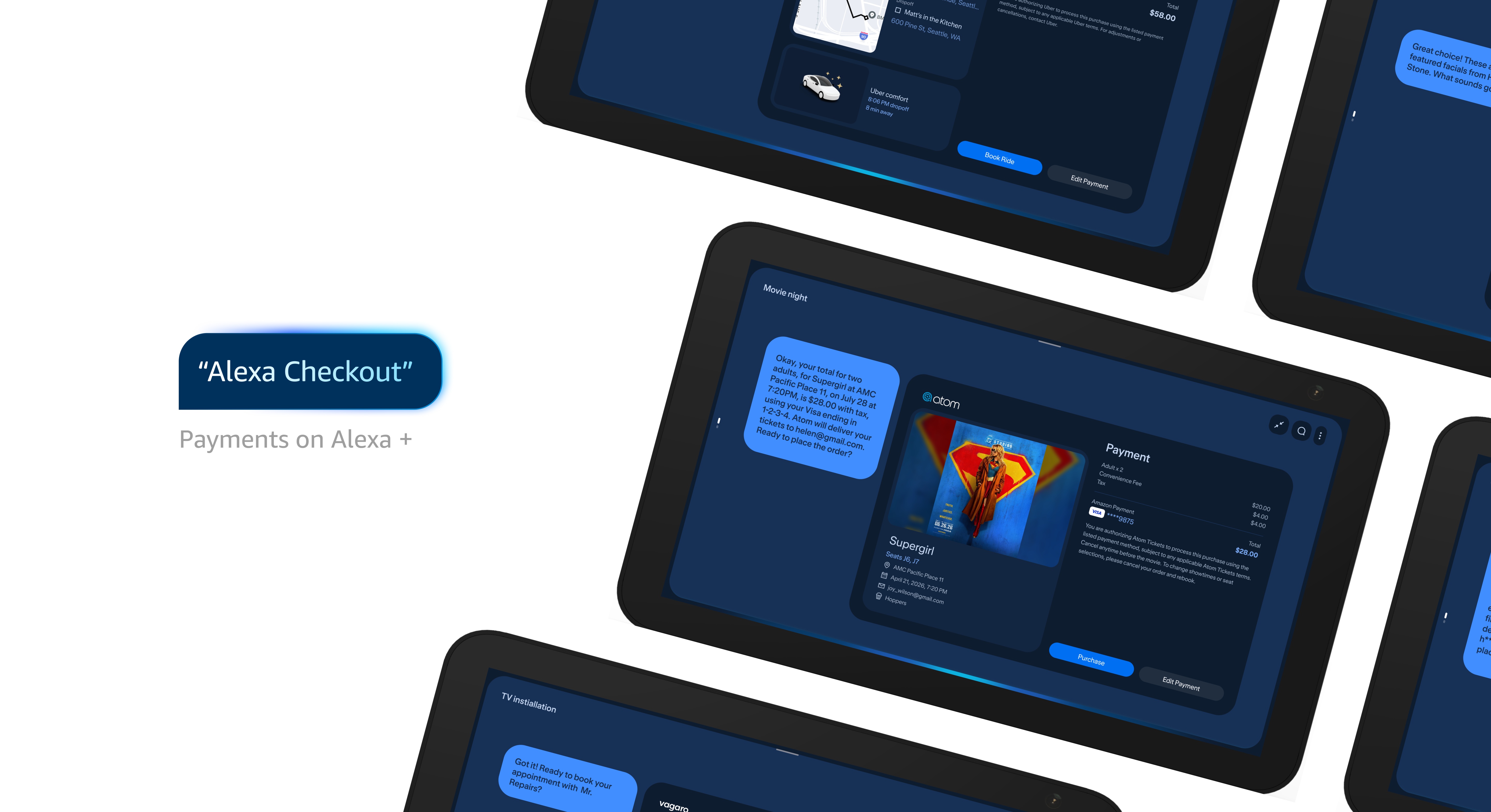
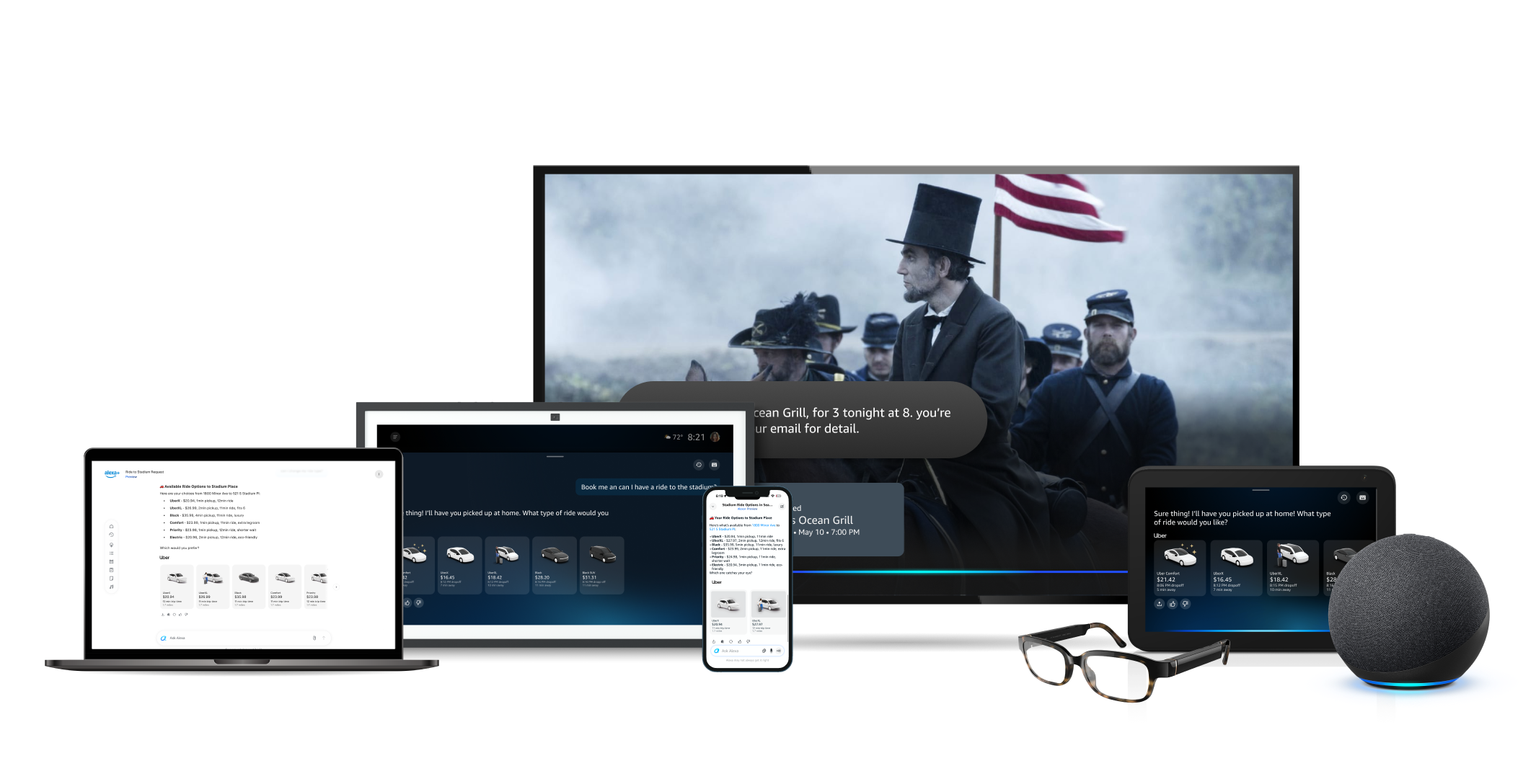
I designed one flexible payment template for Alexa+'s ambient displays. The layout automatically adapts to each partner's line items, legal disclosures, and hold timers, which means it can flex to any vertical's requirements without losing a consistent look and feel. Paired with clear voice confirmation and instant on-screen proof, it's built to hold up whether someone's standing right at the display or calling out an order from across the kitchen.
Focus on flexibility
One scalable checkout pattern standardizing hands-free commerce across ticketing, food delivery, and more.
Anticipated Impact
The template is designed to be the one payment surface Alexa+ uses across every vertical. The full rollout is currently in progress.
Faster integration: replacing custom, per-partner payment flows with standard API mapping to the shared template, cutting a lot of the engineering time it used to take to bring a new partner online.
An adaptive, scrollable layout built to accommodate every vertical's payload without teams needing to fork or override it. The goal is for current partners to adopt it as-is, with no custom changes needed.
Voice makes purchasing faster, but every Alexa+ partner, from ticketing to food delivery, still required a secure checkout step. The challenge was creating a unified payment template that could accommodate the distinct legal and product requirements of completely different verticals. The existing payment visual hadn't kept pace with those expanding legal requirements, leaving partners to bolt on one-off fixes that fragmented the experience. I designed a flexible checkout surface adaptable to any partner framework, paired with an intuitive confirmation step that gives people the clear visual proof they need to feel confident completing a hands-free purchase.
Current
The Problem
While voice interaction is fast, high-stakes financial transactions require visual confirmation. Users experience high anxiety when completing purchases without seeing itemized price breakdowns, hold timers, or exact order specifics. Every commercial partner operates on different backend constraints:
Vertical Disparity
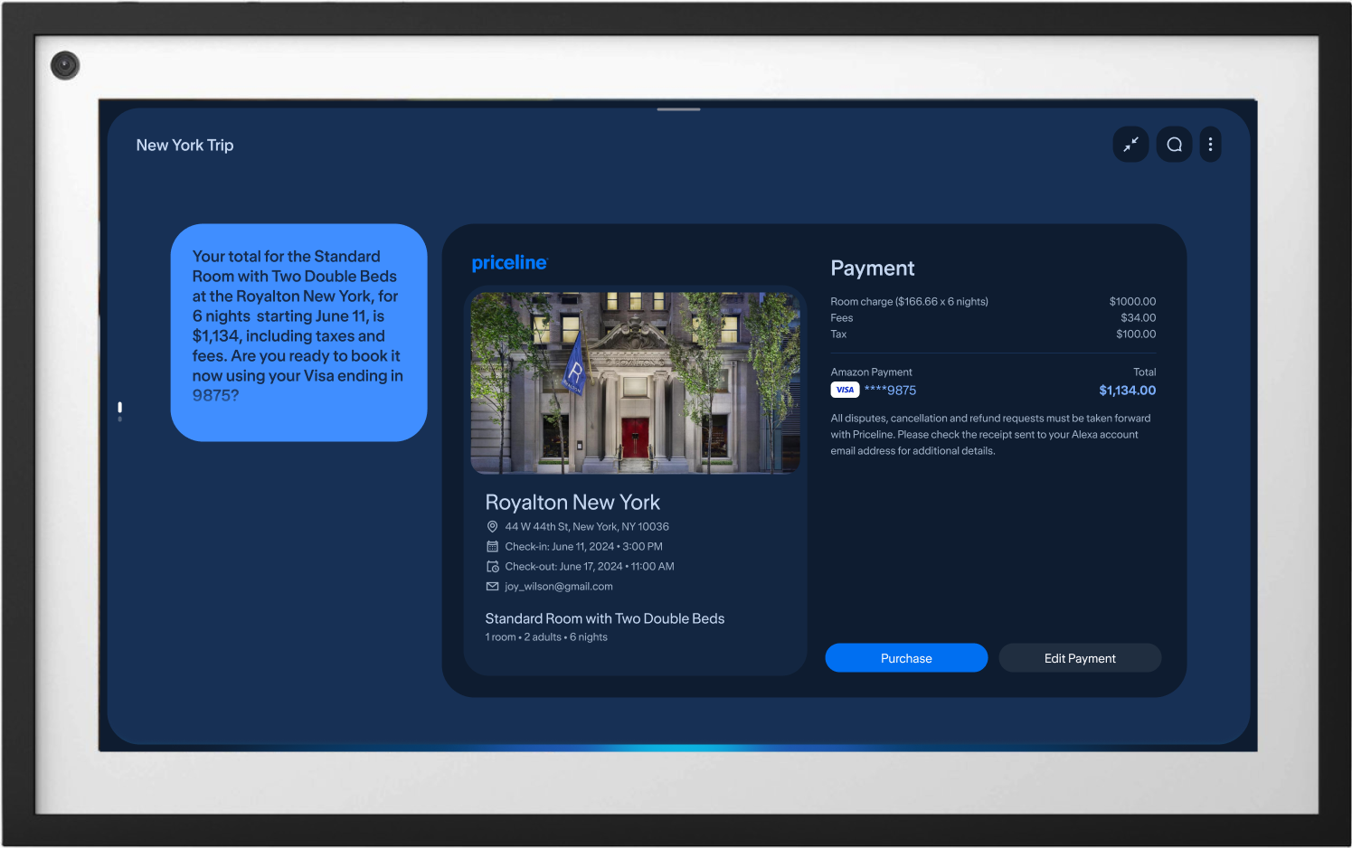
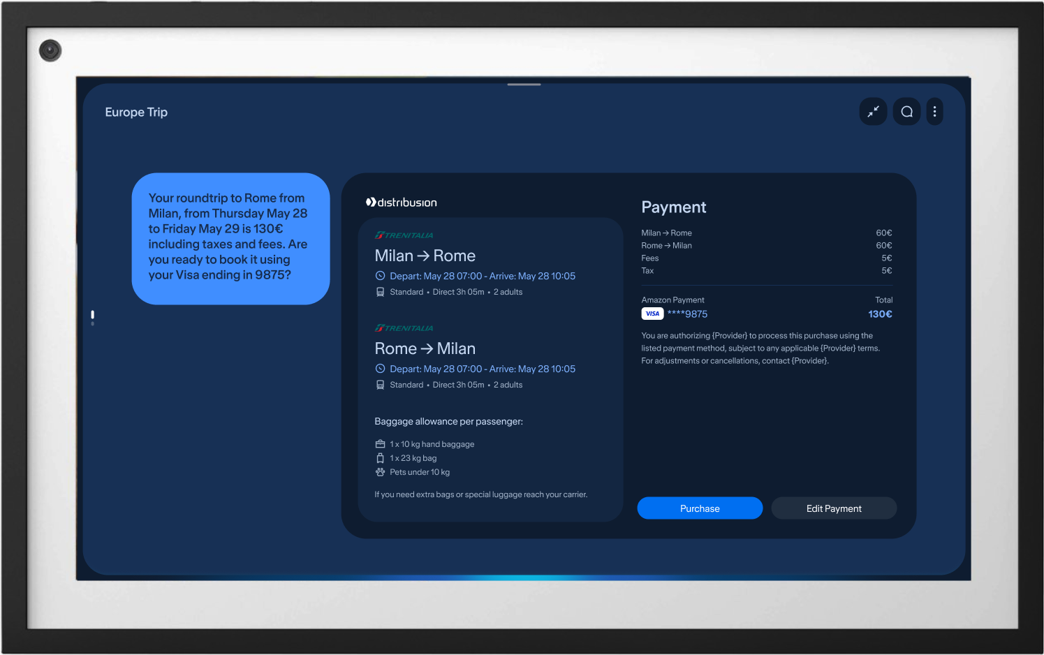
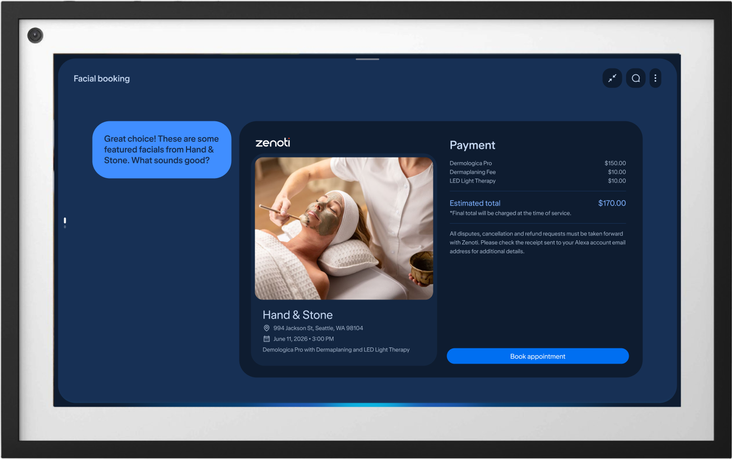
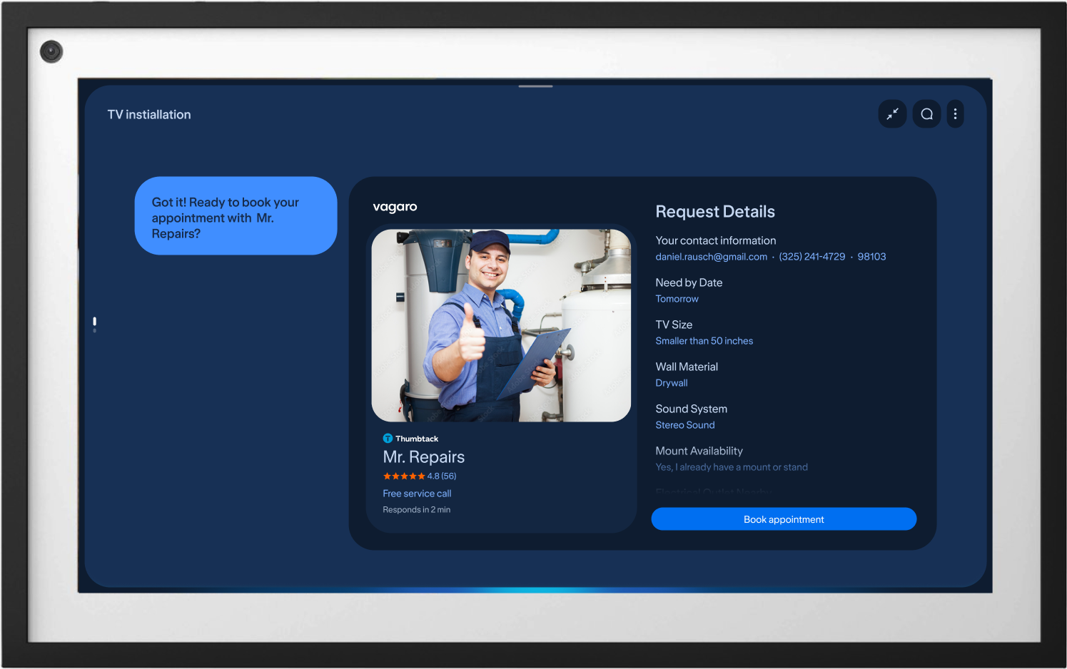
Every vertical has its own requirements for checkout: event ticketing needs real-time inventory holds and seat coordinates; food delivery needs tipping and driver ETA tracking; rideshare needs route previews and surge pricing disclaimers; travel and lodging need check-in dates and cancellation terms; and local services need time slot selection and service area verification.
Legal & Compliance Rules
Every partner brings its own legal requirements that have to be resolved before checkout, from mandatory disclosures and non-refundable deposit terms to itemized service and processing fees, age verification for restricted purchases, location-based tax rules, and clear auto-renewal disclosures on subscriptions.
Distance & Ambient Constraints
On-screen text and key financial figures need to stay legible from 8 to 10 feet away in bright, ambient lighting, all while staying responsive to voice commands, direct touch, and a range of screen sizes, without asking people to lean in or reach for a second device.
Multi-Vertical Flexibility
The template was architected as a universal component system, supporting dynamic data models across 8 core commercial verticals:
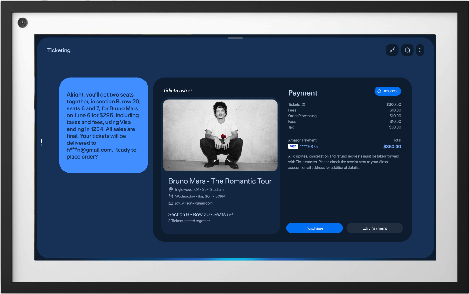
Event Ticketing
Real-time inventory hold timers
Itemized service and delivery fees
Seat-tier price breakdowns
Refund and exchange policies
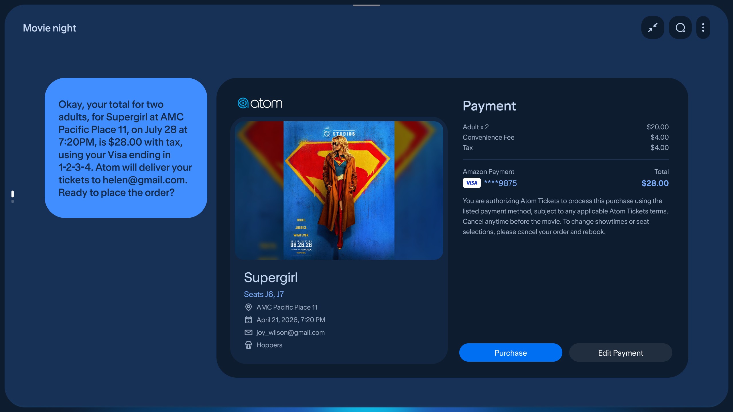
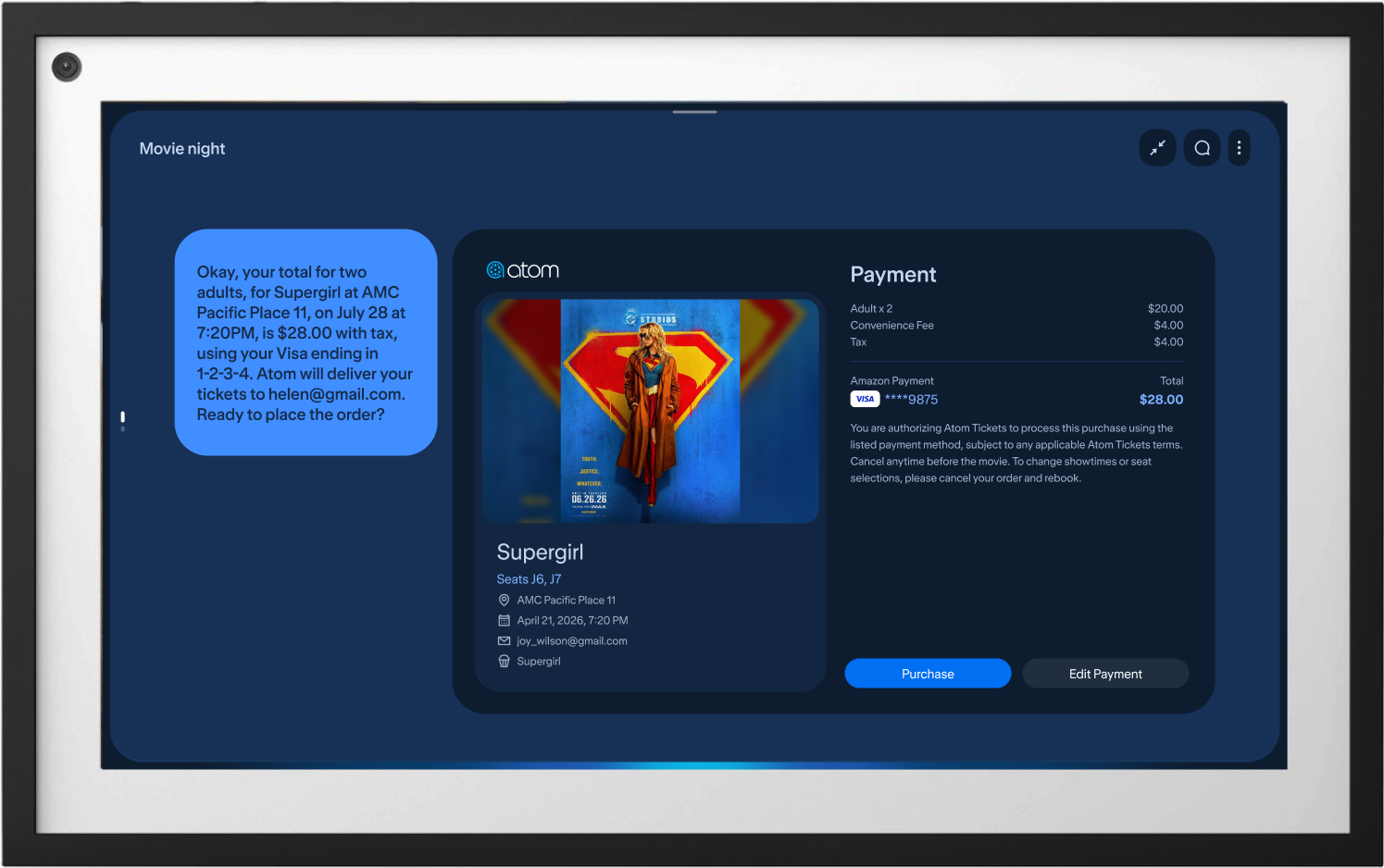
Movie Ticketing
Reserved-seat hold timers
Concession add-on pricing
Ticket types
Age-rating purchase disclaimers
Food Ordering
Tipping calculation and quick-select amounts
Delivery and service fee breakdowns
Order total confirmation before checkout
Special instruction surcharges
Local Booking
Time slot hold timers
Deposit and cancellation windows
Capacity-based pricing
Instructor or provider fee disclosures
Home Services
Estimated cost by service duration
Deposit terms
Arrival window confirmation
Cancellation and rescheduling fees
Travel & Lodging
Nightly rate and occupancy pricing
Resort and service fee breakdowns
Cancellation and refund window disclosures
Check-in and check-out date confirmation
Transit & Commute
Fare class pricing
Recurring pass billing
Route-based fare disclosures
Departure schedule confirmation
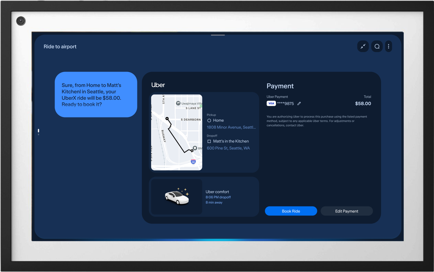
Ride Share
Dynamic surge pricing disclosures
Vehicle-class fare breakdowns
Route preview cost estimate
Pickup and cancellation fees
Consolidated Feature Requirements
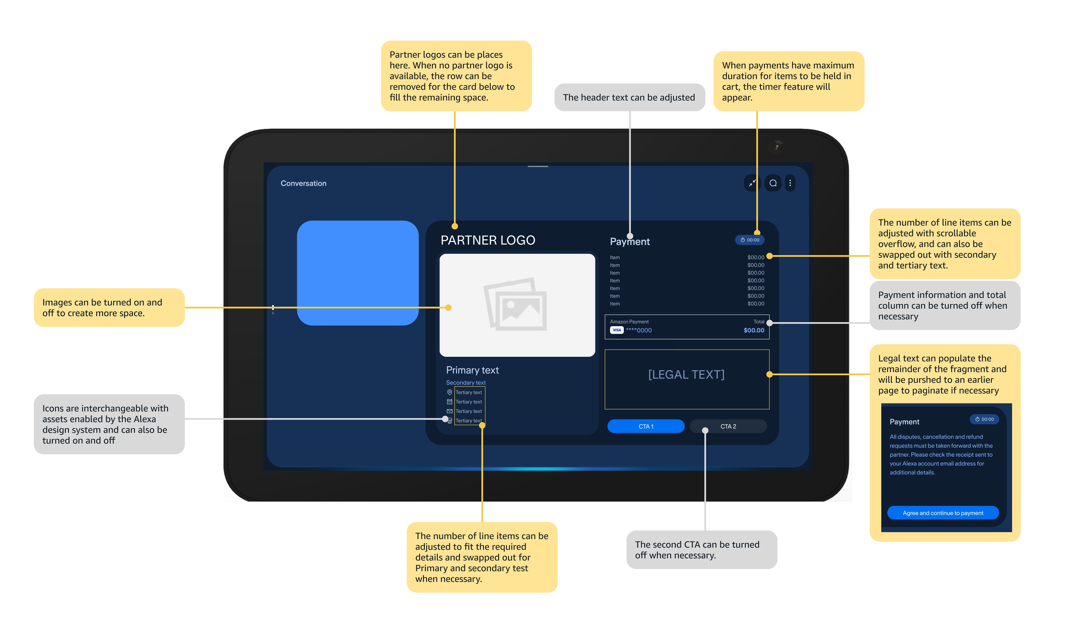
I put together a consolidated list of requirements, grouped by partner, legal, and CX needs. It became the reference point for aligning the cross-functional teams and for mapping out a single modular component system that could flex to every vertical's constraints.
Feature
Requirement Type
Description
Notes
Attribution
Partner requirement
Partner logo and branding shown at the top of the checkout surface.
Kept in a fixed position and size across every partner integration.
Line items
Universal requirement
Itemized breakdown of every item or service in the order.
Universal requirement across every vertical.
Payment information
Legal requirement
Displays the card or account being charged.
Card details must be visible before purchase confirmation.
Payment source
Legal requirement
Shows which stored payment method is linked to the account.
Pulled directly from the customer's saved Amazon payment methods.
Fee breakdown
Legal requirement
Expandable tooltip listing delivery, service, and tax fees.
Required disclosure for food ordering partners.
Alcohol disclaimer
Legal requirement
Confirmation prompt before completing an alcohol purchase.
Required for age-restricted purchases.
Tip CTA
CX requirement
Quick-select tipping options shown before order confirmation.
Not strictly required, but a familiar pattern that saves a voice turn.
Legal text
Legal requirement
Authorization language confirming the charge and cancellation terms.
Authorization language, adjustable per partner.
Edit CTAs
CX requirement
Inline controls to adjust quantities or remove items from the cart.
Lets customers adjust items without extra discovery, even by voice.
Change payment method
CX requirement
Lets customers swap the card or account charged mid-checkout.
Reuses the same payment source list surfaced during account setup.
Other fees breakdown
Universal requirement
Extends the fee disclosure pattern to non-food verticals.
Uses the same expandable tooltip pattern as the delivery and service fee breakdown.
Cross-Functional Collaboration
Designing a scalable template across 8 distinct commercial verticals required continuous alignment across five primary stakeholder groups. The team prioritized the 8 verticals with the clearest near-term partner demand: Event Ticketing, Movie Ticketing, Food Ordering, Local Booking, Home Services, Travel & Lodging, Transit & Commute, and Ride Share, with event and movie ticketing treated as distinct verticals given how differently they handle seat inventory and hold timers.
Internal Design Org: Partnered with design system leads to establish unified spatial tokens, so our far-field layouts, typography scaling, and high-contrast color standards held up against the broader Alexa+ visual design system instead of drifting from it.
Vertical UX Designers: Collaborated directly with domain designers across all 8 verticals to audit domain-specific user flows, map edge-case payload requirements, and validate layout flexibility.
Vertical Product Managers: Worked alongside domain PMs to evaluate partner SLAs, negotiate legal and compliance requirements, and establish clear content prioritization rules for mandatory disclosures versus optional line items.
Implementation Developers: Partnered closely with engineering teams throughout the build to define modular component props, establish data payload limits, and optimize dynamic state changes (such as scrollable itemized lists and live countdown timers) for smooth performance on ambient hardware.
Legal Team: Reviewed disclosure language, refund and cancellation terms, and age-restricted purchase flows for each vertical, and signed off on where that language could safely live earlier in the flow versus staying on the final payment screen.
Research
To validate the payment template, I partnered with our UX researcher on a round of qualitative usability testing across complex commerce scenarios, focused on visual trust, far-field scannability, and how people move between voice and touch when handling a financial transaction on an ambient display.
Objectives
Minimum Visual Proof for Purchase Authorization
Determine the minimum visual proof people need to see, and feel reassured by, before they're willing to authorize a payment.
Variable Line-Item Layout Performance
Evaluate how the layout performs when handling a variable number of line items across different verticals.
Multimodal Confidence
Determine whether people trust voice alone to complete a purchase, or whether they need touch available as a fallback.
Methodology and Approach
Testing took place across 14 participants in simulated home environments (kitchen and living room setups) using Echo Show displays, mirroring how people actually encounter these screens day to day.
Test Scenarios
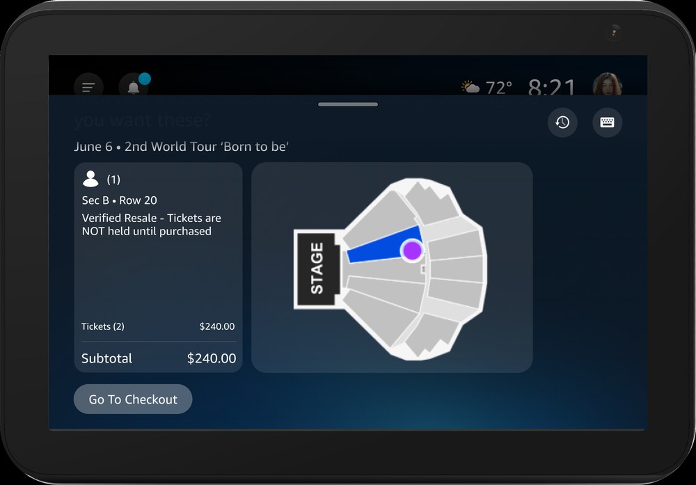
High-urgency purchases: live event tickets with an active inventory hold timer.
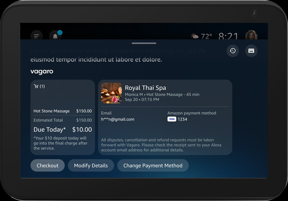
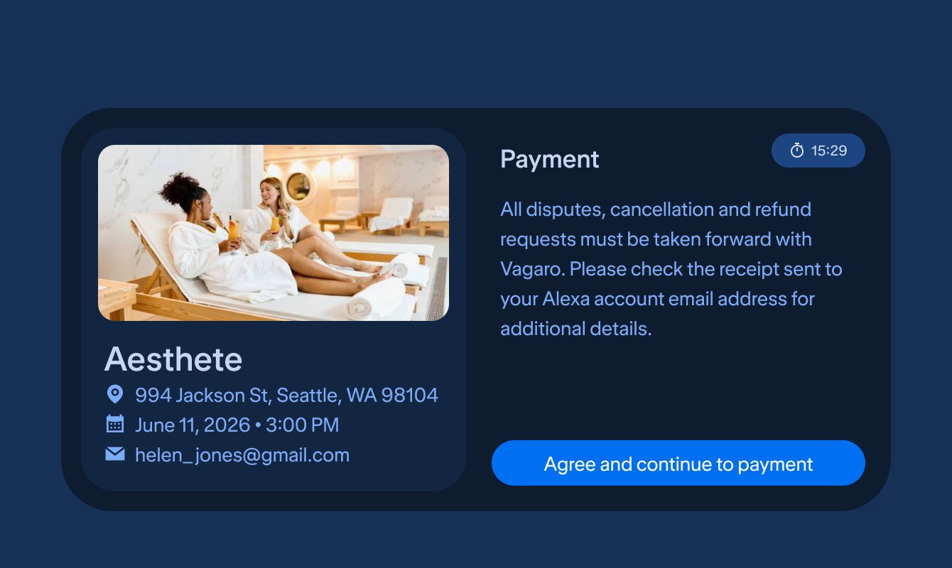
Deposit-based bookings: spa and salon appointments with cancellation terms and legal disclosures.
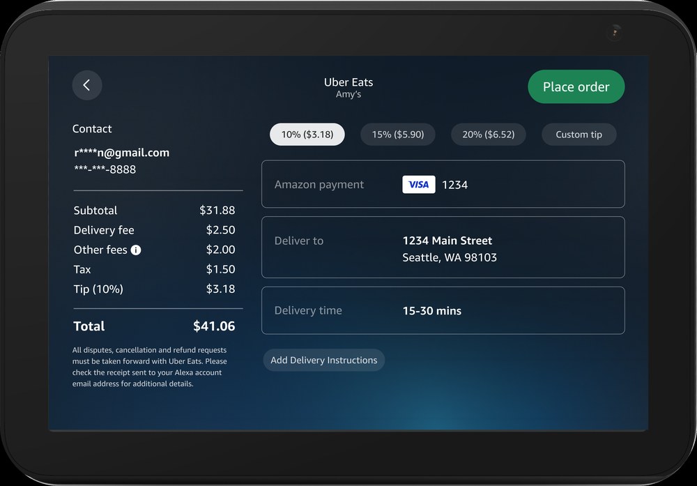
Itemized orders: food delivery with tipping and multiple line-item fees.
Key Findings and Decisions
Each finding below is paired with the design decision it drove, since the two were worked out together rather than in separate research and design passes, and each maps back to one of the three objectives above.
01
Legal Disclosures Belong Earlier in the Flow
Finding
Dense legal disclaimers on the payment card cluttered the screen and pulled attention away from the totals people actually needed to check, an effect that got worse on smaller Echo Show endpoints where screen space is already tight. Participants said they'd rather review terms earlier, during item or seat selection.
Iteration
Moved legal copy to the preceding selection steps, freeing up the limited space on smaller endpoints and leaving the final payment screen for cost review and purchase authorization only, closer to the minimum visual proof people said they actually needed.
02
Itemized Costs Work Better as a Scrollable List
Finding
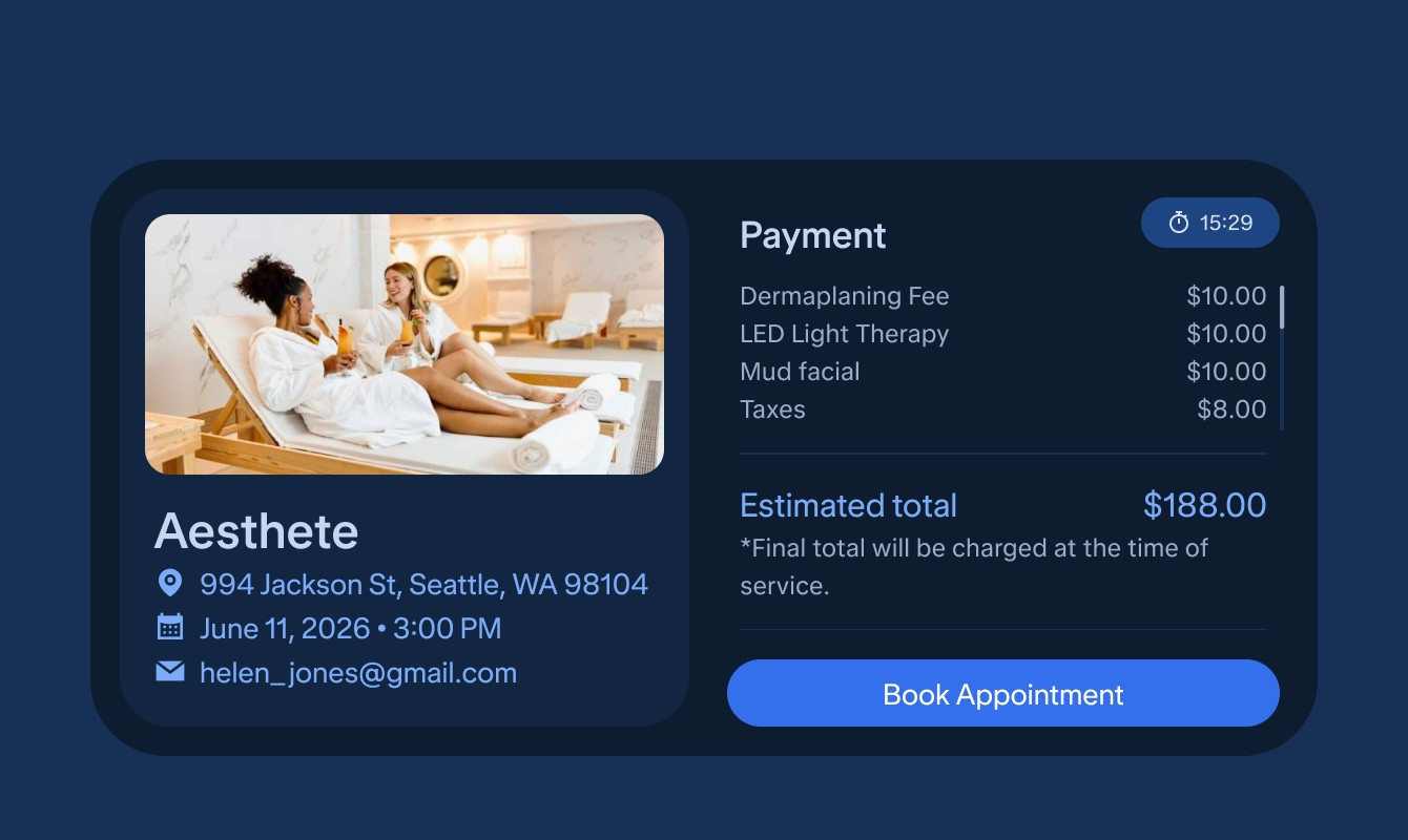
Participants hesitated to authorize purchases over $30 when shown a single collapsed total. They were far more comfortable reviewing a compact, scrollable list that broke out item costs, service fees, and local tax, especially on smaller Echo Show endpoints where there wasn't room to show every line item at once.
Iteration
Replaced the collapsed total with an adaptive, scrollable itemization view that can handle any number of line items across verticals without overflowing the screen, built specifically to hold up on smaller endpoints with limited vertical space.
03
A Visible Timer Eases Inventory Anxiety
Finding
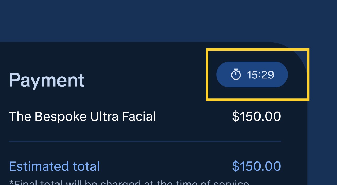
In time-sensitive scenarios like live event ticketing, participants worried about losing their seats while they reviewed the order, the same kind of reassurance gap the visual proof objective was meant to catch.
Iteration
Surfaced the partner's inventory hold timer as a persistent badge in the header, giving people visual reassurance that their spot was still locked in while they checked the details.
04
Touch Remains an Essential Backup to Voice
Finding
Most participants defaulted to voice to confirm and pay (11 of 14 used a phrase like "Alexa, confirm and pay"), but anyone standing near the display still reached for touch to make quick adjustments or when the room needed to stay quiet, confirming that voice alone wasn't enough for everyone.
Iteration
Built touch controls with full feature parity to voice — both paths now work equally well without crowding the screen.
Defining Success
Success, to me, wasn't just about visual polish. It came down to whether people actually completed their purchase, whether teams kept building with the shared template instead of quietly forking their own version, and whether the whole experience felt trustworthy enough that people didn't hesitate to pay.
Time to authorize:bring the typical 45–90 second checkout down to something closer to 15–20 seconds with express voice and one-click payment.
Template adoption: teams actually building on the shared component instead of maintaining their own fork.
Fee transparency: Hidden costs are a common reason people abandon a cart before finishing.
Touch optional: Ultimately, people needed enough confidence in the voice flow that reaching for touch felt optional, not necessary.
Final Design
Visual Breakdown
Endpoints
Final Variations
Next Steps
Full-system rollout (September 2026): starting in September, the template launches across all 8 commercial verticals: Event Ticketing, Movie Ticketing, Food Ordering, Local Booking, Home Services, Travel & Lodging, Transit & Commute, and Ride Share.
Current Status
The template is built and validated, with partner integration underway ahead of the September 2026 rollout.