This portfolio is password protected.
Enter the password to continue.

Incorrect password. Please try again.

Amazon Alexa · 2023
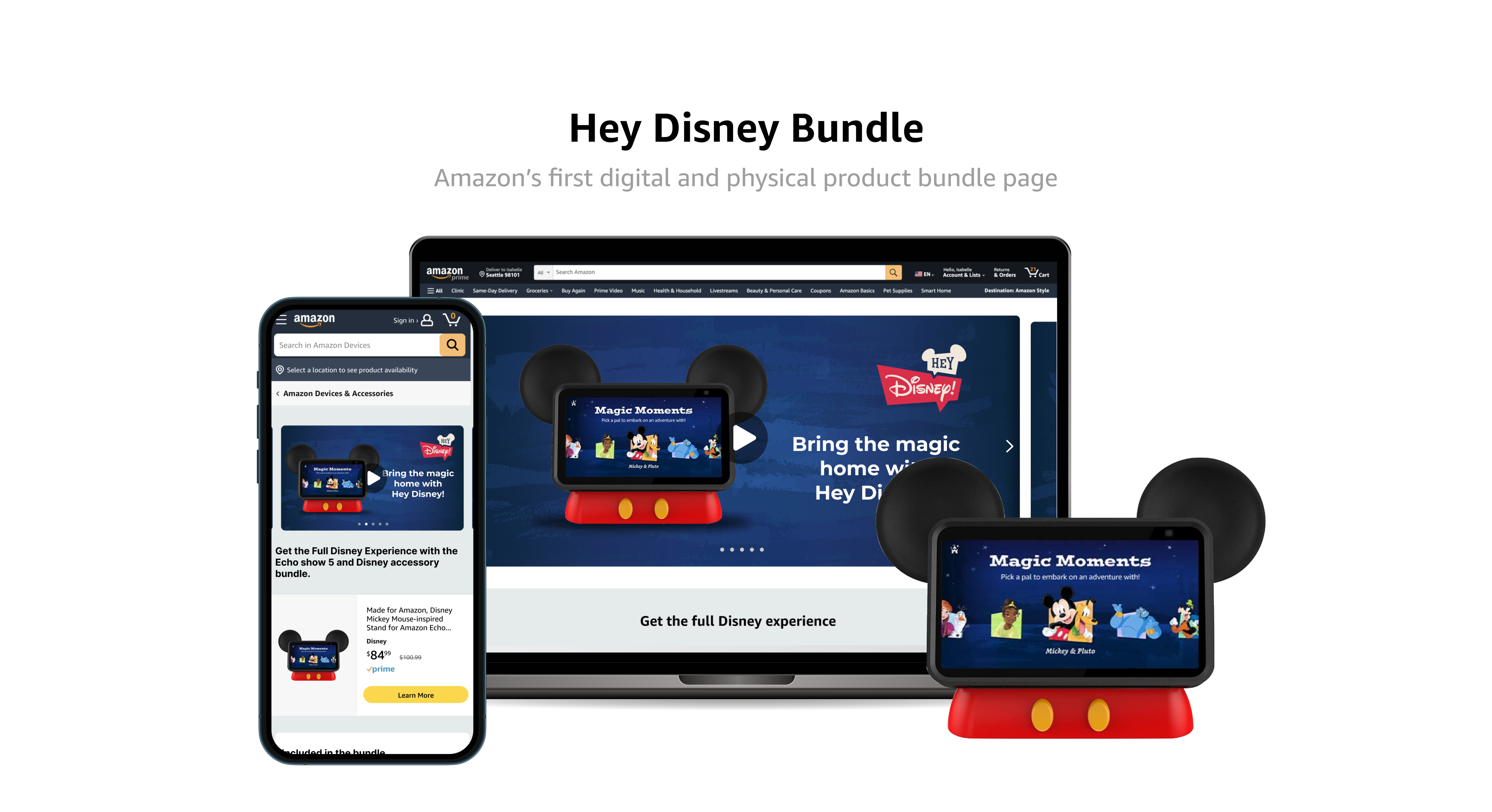
Amazon.com Product Bundle overview

Overview

Timeline
Design 1 week
April 2023
My role
Junior designer
Scope
UI design
UX design
Team
Alexa Experiences
Alexa Marketing
Tools
Figma
Figjam

Solution

My solution puts the subscription first. The page leads with Hey Disney as a digital purchase, then uses that as the on-ramp into selling the physical bundle, with the buy box placed just below the hero storytelling so the purchase decision follows right after the brand moment. From there, the page reshapes itself around entitlement: why-buy messaging for someone new, onboarding for someone who just bought in, and deeper use cases for someone who already owns it.

Purchase and Learn, All in One Page

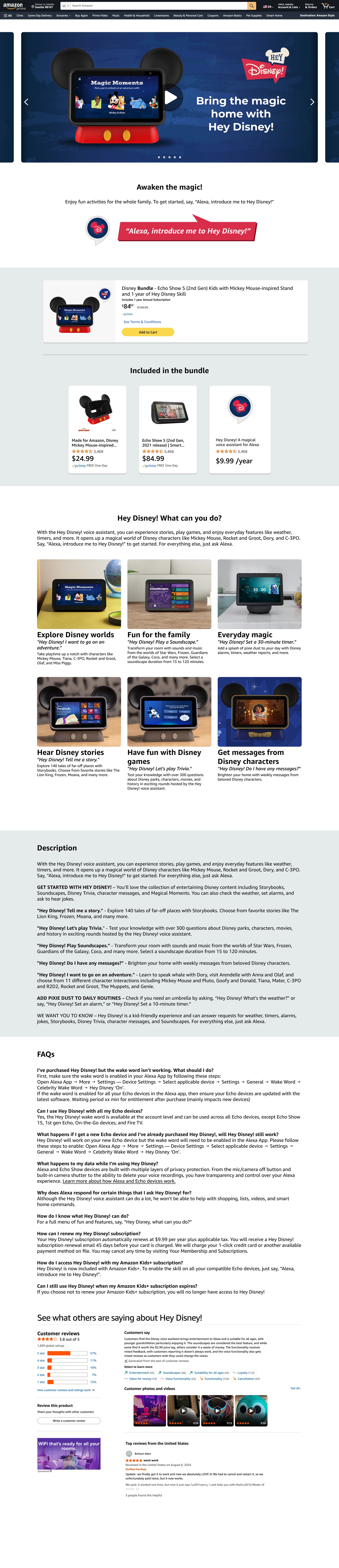
A page where the customer can both learn and act. They can quickly understand the value of a Hey Disney subscription, purchase related products, and then learn how to use it, all without leaving the page.

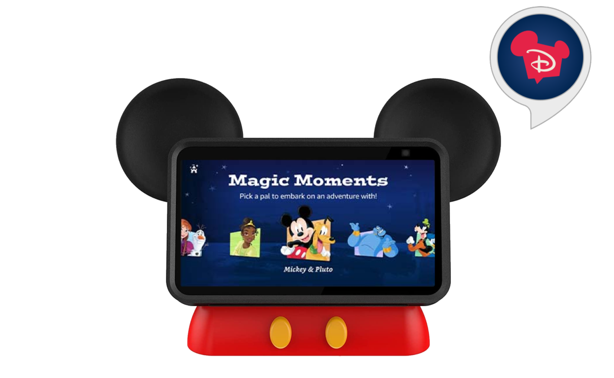
Hey Disney Magic Moments screen on an Echo Show device shaped like Mickey Mouse ears

Impact

The page launched toward the end of 2023. Hey Disney brought in 7,000 subscriptions in 2023 and 16,000 in 2024. Along with the Alexa Bundle Subscription, it helped the team hit its goal of 123,000 combined device and subscription sales by the end of 2024, a more than 50% increase over 2023.

Design Process

Background

Because of the Disney partnership, this couldn't just work like a normal Amazon product page. It had to sell, with campaign-quality storytelling and imagery that held up to Disney's standards, but it also had to work: everything a customer needed to make a purchase decision, and enough of a how-to layer to double as the program's main information hub. It also had to change depending on who was looking at it. Someone who already had Kids+, someone who'd already bought Hey Disney, and someone starting from zero all needed to see something different.

Constraints

  1. An existing design system, but no matching pattern

    • The page had to be built from Amazon's design system and follow existing product page patterns, but no pattern existed yet for bundling a digital subscription with physical products, so I had to invent that part within the system's constraints.
  2. Entitlement had to drive the layout

    • The skill's entitlement logic meant the page couldn't show the same thing to everyone: someone with Kids+, someone who already bought Hey Disney, and someone who owned nothing all needed a different version of the page.
  3. Legal and child-directed requirements

    • Hey Disney is a kid-friendly, child-directed experience, so legal review of the skill's terms of use shaped what could appear on the page and how it was worded.
  4. A partner requirement to lead with video

    • As part of the Disney partnership, the page was required to open with Disney's promotional video, which meant the hero had to be designed to support video alongside static product imagery.

Design Principles

Even though buy options are often placed above the fold, I put the Disney brand storytelling in the hero first and let the buy box follow right below it, since this page needed to sell the partnership as much as the product. I used a vertical, single-column layout so the page would scale cleanly between mobile and web without a separate redesign, and treated the Hey Disney subscription as the anchor product that the rest of the page upsells from, into the physical device and accessories.

Key Decisions

01
Page order changed based on entitlement

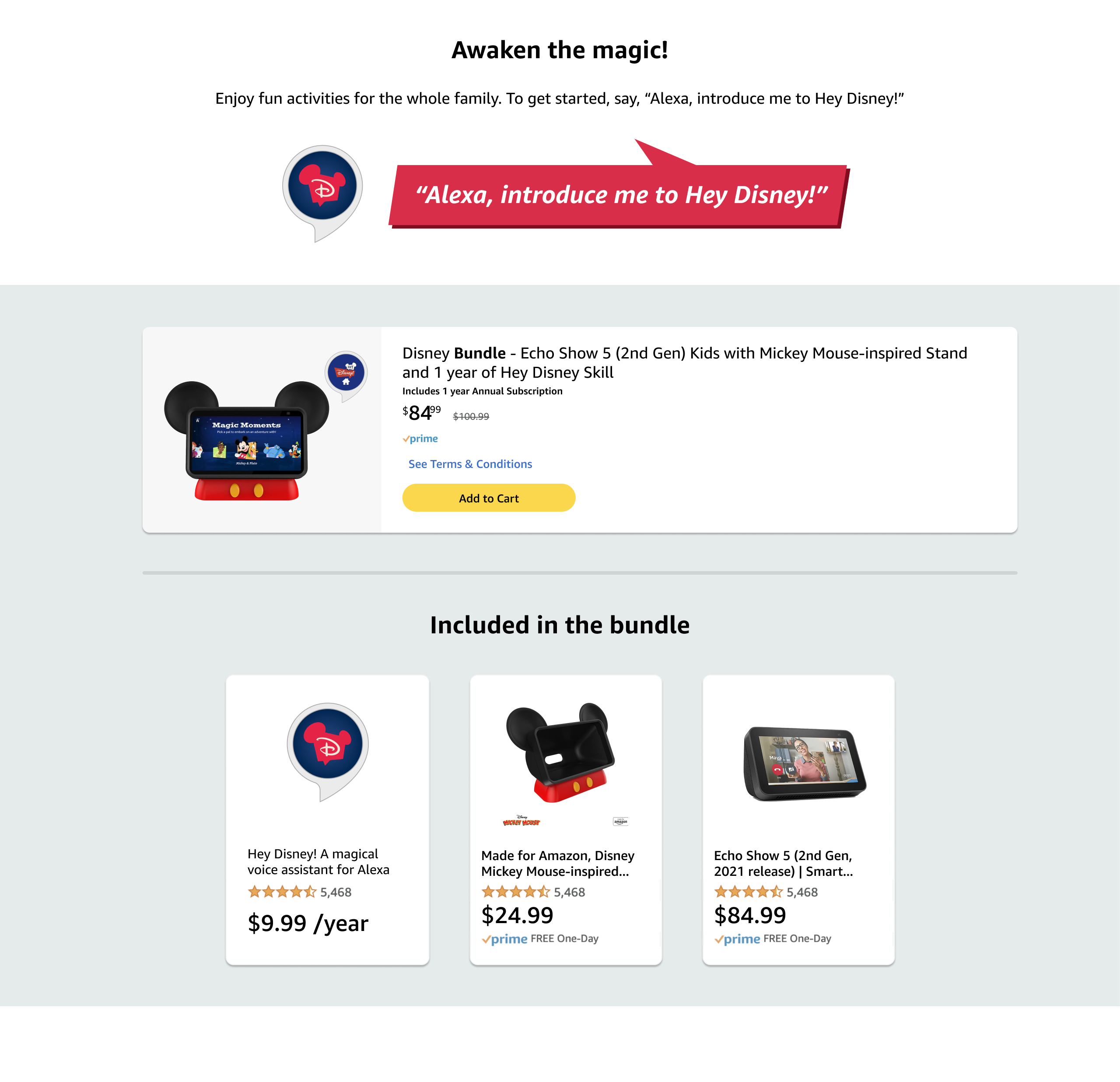
I reordered the page depending on whether the customer had already been exposed to the Hey Disney skill. Someone encountering Hey Disney for the first time saw an introduction on how to get into it, followed by the subscription promotion. Someone who'd already unlocked the skill, and so wasn't eligible for that promotion, skipped straight to the physical product bundle purchase instead.
Pros
  • Relevance: Customers only saw the parts of the page that applied to them, so someone who already owned Hey Disney wasn't stuck scrolling past a subscription pitch.
  • Faster path for entitled customers: Skipping straight to the physical bundle removed a step for customers who were already sold on the digital product.
Cons
  • More states to design and test: Reordering by entitlement meant designing and QAing multiple page layouts instead of one.
Page flow for a not-yet-entitled customer

Not entitled

Page flow for an already-entitled customer

Entitled

02
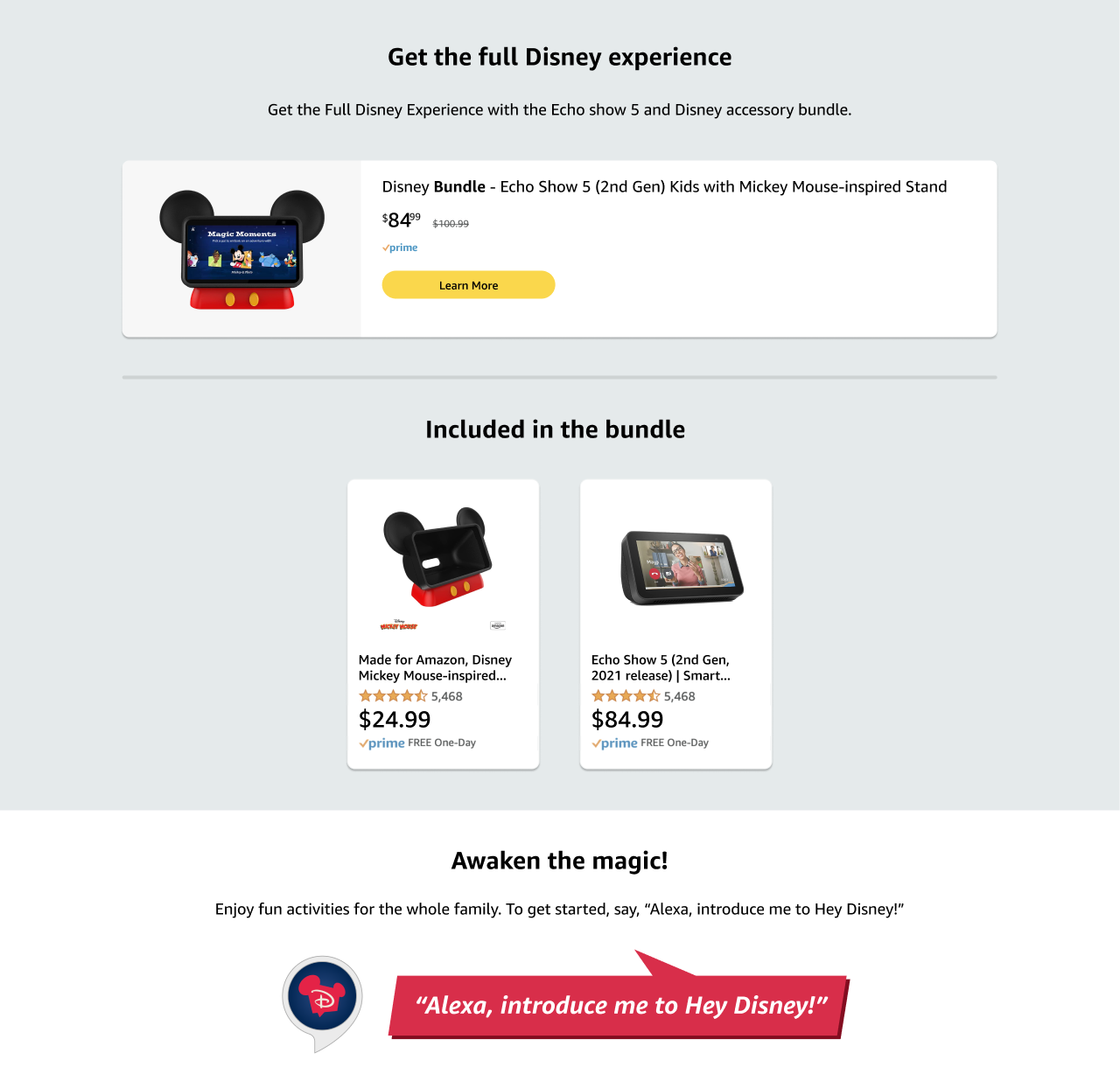
Called out each product in the bundle

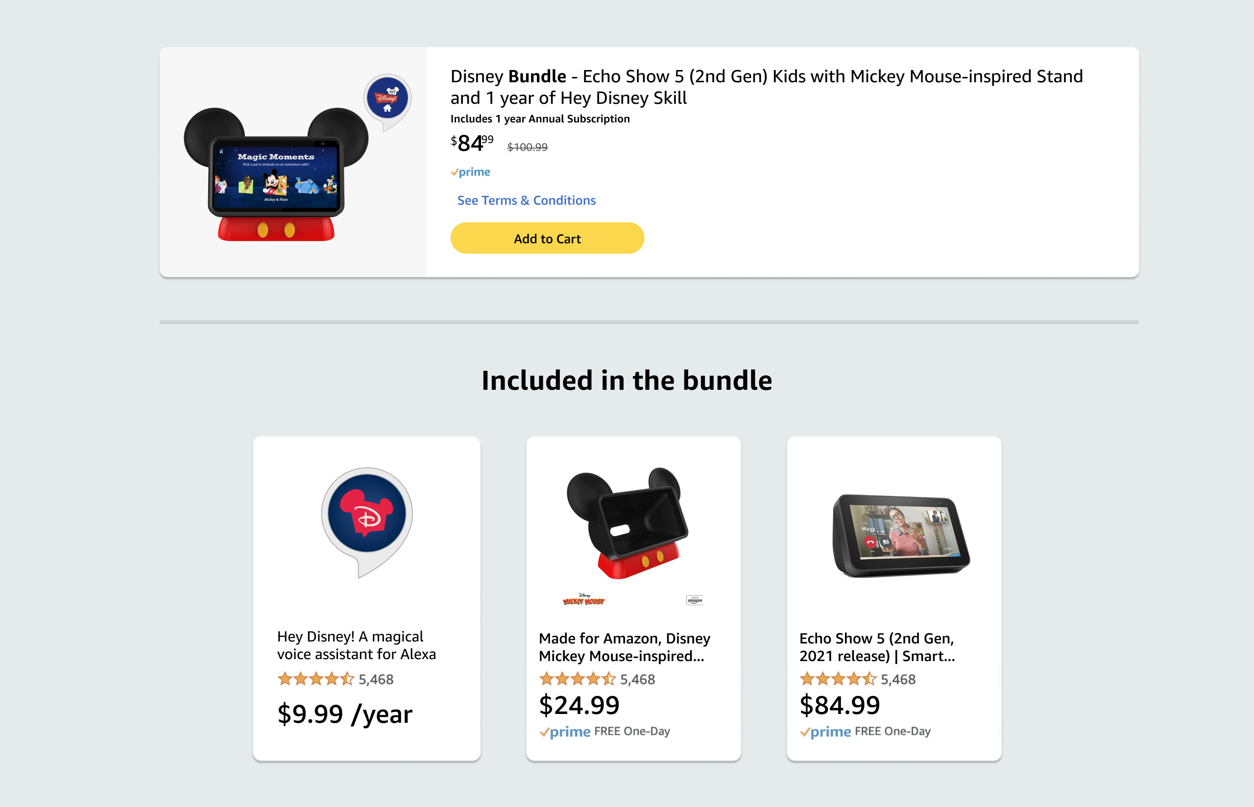
Instead of showing the bundle as a single line item, I broke it out so customers could see each individual product included, whether that was the Mickey Mouse-inspired stand, the Echo Show 5, or the Hey Disney skill itself, along with its own rating and price. That way customers knew exactly what they were getting and what it was worth before adding it to their cart.
Pros
  • Builds trust: Showing the price and rating of each individual item let customers verify the bundle's value themselves instead of taking the discount on faith.
  • Reusable pattern: Breaking the bundle into components meant pricing or included items could be updated independently without redesigning the whole listing.
Cons
  • Adds visual weight: Breaking the bundle into individual product cards took up more vertical space than a single bundle listing would have.
Included in the bundle showing each product broken out individually
03
One layout, not a separate mobile design

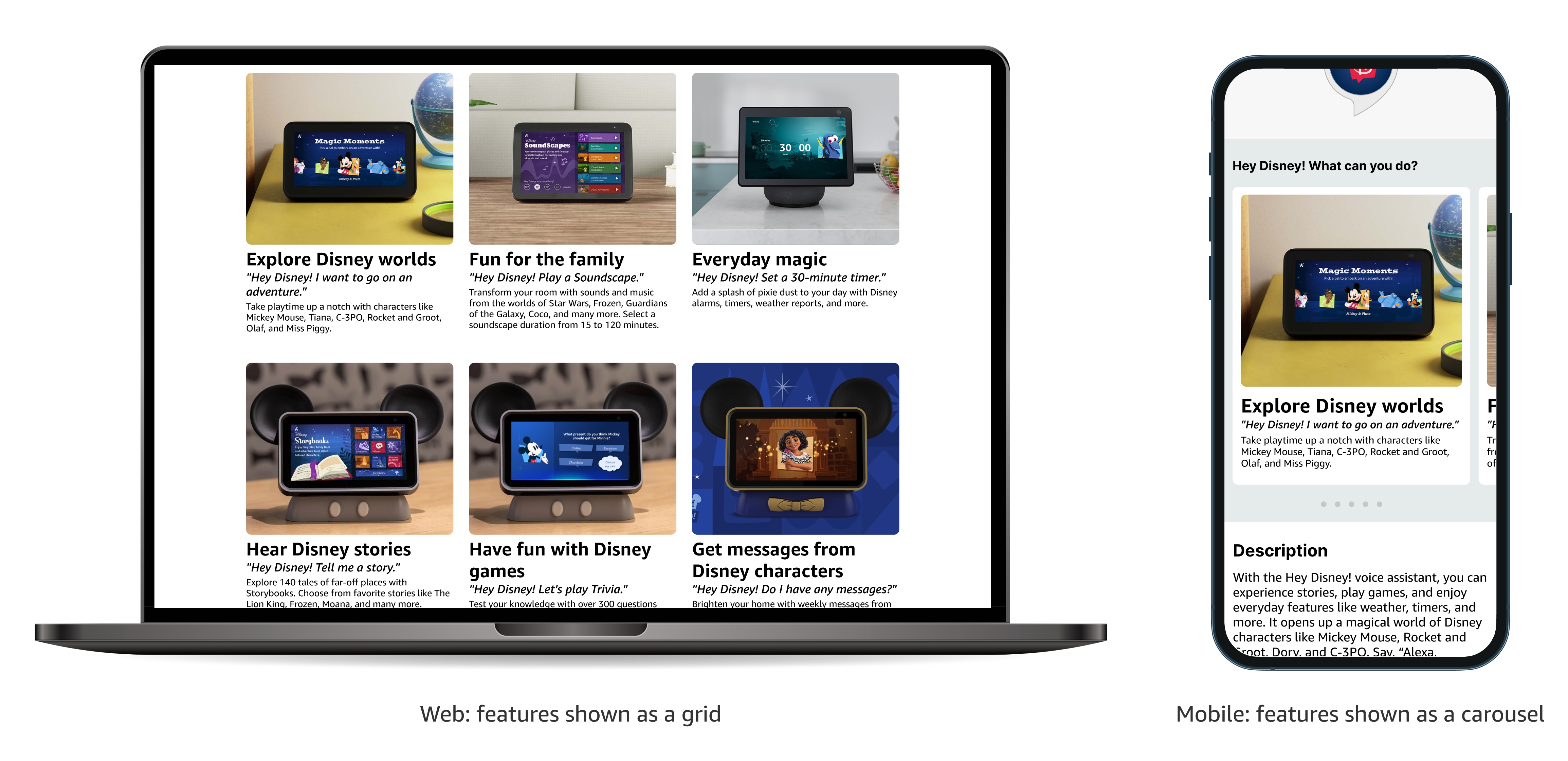
I chose a vertical layout over a multi-column one so the same page could work at both the 1280x1000 web viewport and the 390x844 mobile viewport, since most traffic was expected to come through mobile. The one exception was the feature showcase: on web it's laid out as a grid, while on mobile it collapses into a swipeable carousel, so mobile users could see all six capabilities without an excessively long scroll.
Pros
  • One layout to maintain: A single vertical structure meant no separate mobile redesign, so future updates only had to happen once.
  • Consistent experience: Customers switching between devices, like browsing on mobile and finishing checkout on desktop, saw the same page structure both times.
Cons
  • Carousel content is easy to miss: Only one feature card is visible at a time on mobile, so customers may not realize there are six to swipe through.
Web and mobile layouts of Hey Disney feature cards

Defining Success

  1. Purchase and conversion

    • Conversion rate: How many visitors who landed on the page went on to complete a Hey Disney subscription or product bundle purchase.
  2. Entitlement and usage

    • Entitlement mix: How the page performed across each of the three customer states it was designed for, since someone new, someone with Kids+, and someone who already owned Hey Disney each saw a different version.
    • How-to engagement: Whether existing owners were actually using the onboarding and how-to content, since the page was also meant to double as the program's information hub.

Final Design

Core User Experience

Scrollable core user experience page
Laptop browser frame

See more of my work

Uber Rides for Alexa+ thumbnail

Uber Rides for Alexa+

Bringing hands-free ride booking to Alexa+

Movie and Event Ticketing for Alexa+ thumbnail

Movie and Event Ticketing for Alexa+

UX/UI Design, Product Strategy

Horizontal payments on Alexa thumbnail

Horizontal payments on Alexa

UX/UI Design, Product Strategy