This portfolio is password protected.
Enter the password to continue.
Incorrect password. Please try again.
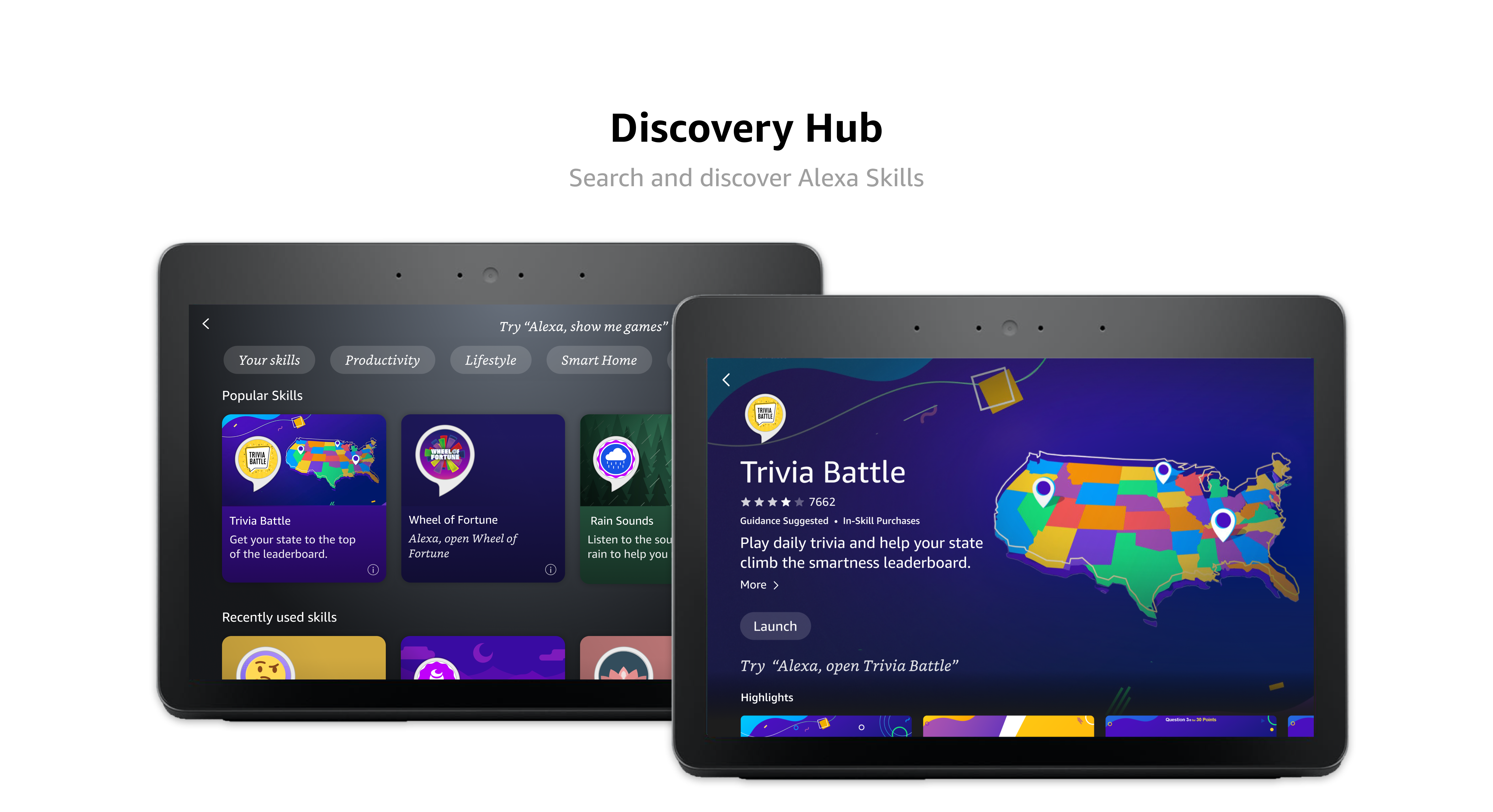
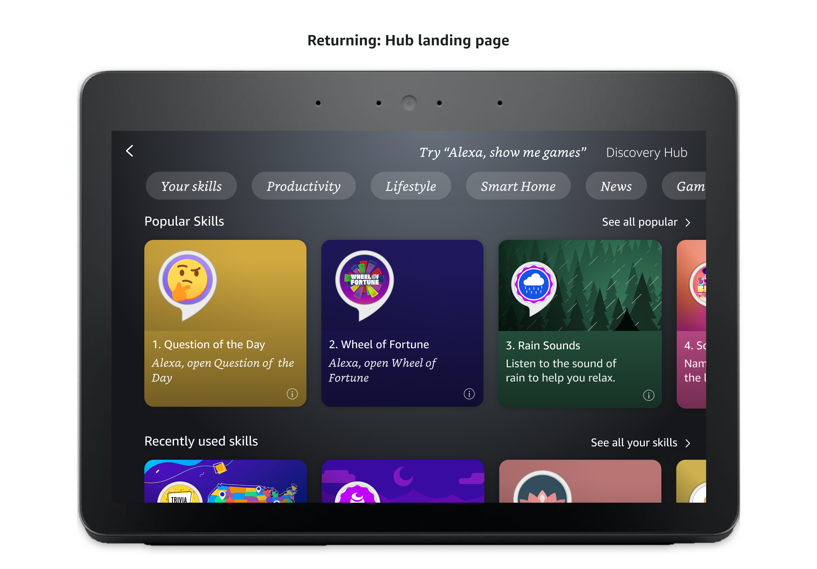
To close that gap, we built Discovery Hub, a multi-modal experience that makes it easier for users to find new skills and get back to the ones they already like, driving more overall engagement with the catalog. Discovery Hub gives users a dedicated place to browse, search, and enable skills, with sorting and filtering options that let them casually explore what is available or hunt for something specific. Results surface on a single screen that users can scan and click through to each skill's detail page to learn more.
Discover new skills and find your favorites on Discovery Hub
In the span of 3 months, Discovery Hub generated over 23,000 skill launches, with a conversion rate of 60% compared to the previous 23% for skills, more than doubling the launch rate.
Card comprehension
Navigation and search
Skill tile clarity
Detail page usefulness
We ran 30-minute moderated usability sessions on a Figma prototype of the multimodal experience, recruiting participants through the User Testing platform. This study ran in parallel with a separate voice-only (VUI) test of Discovery Hub; where the two studies surfaced the same issue, that overlap is called out in the findings below.
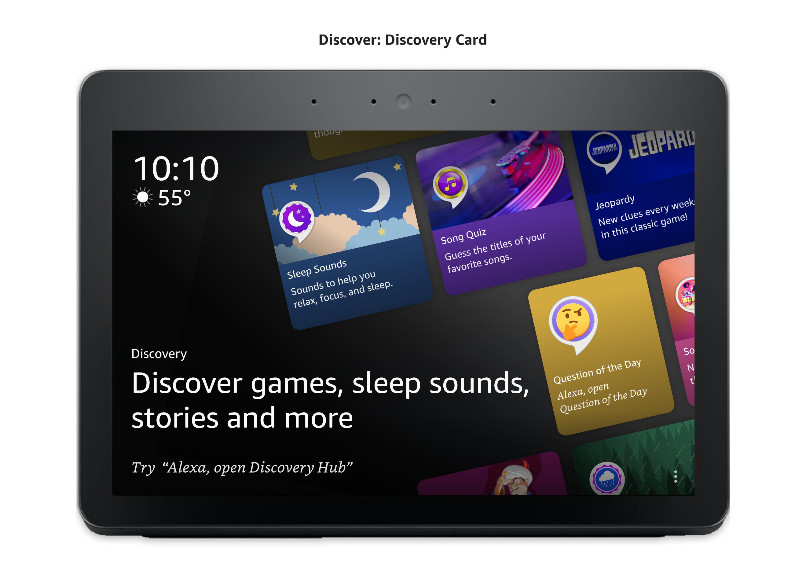
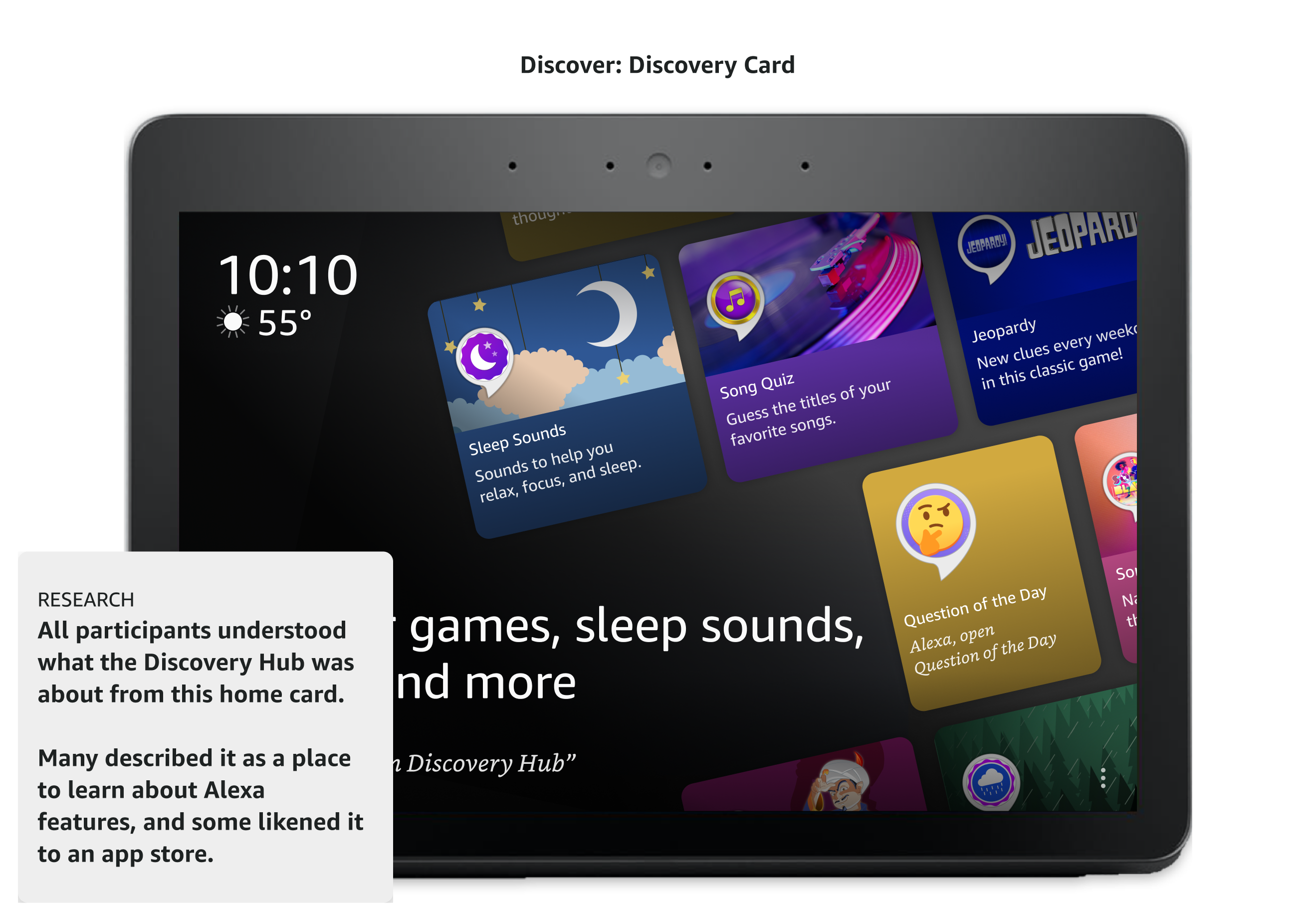
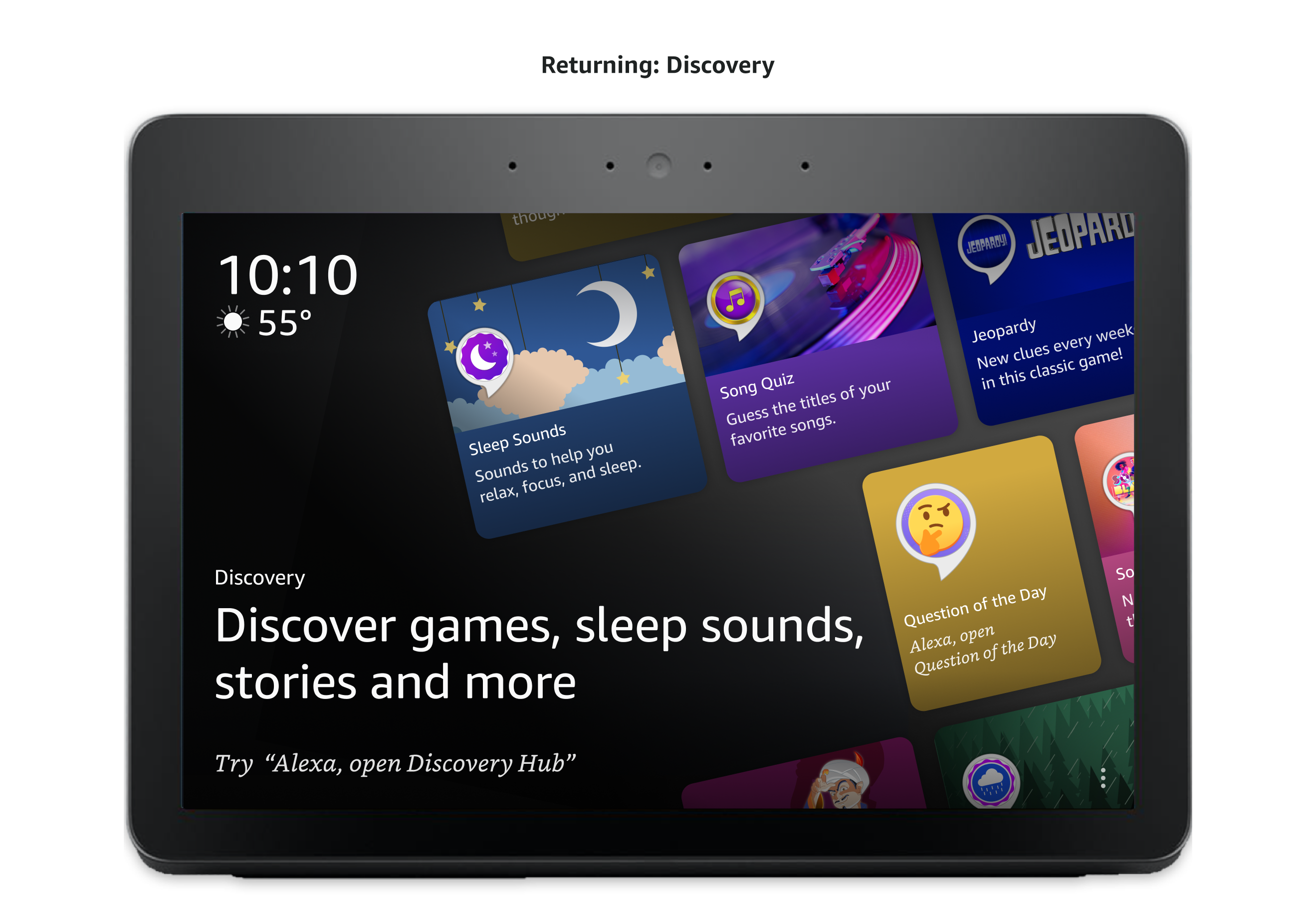
All participants immediately understood what Discovery Hub was from its card on the home screen, several likening it to an app store for Alexa.
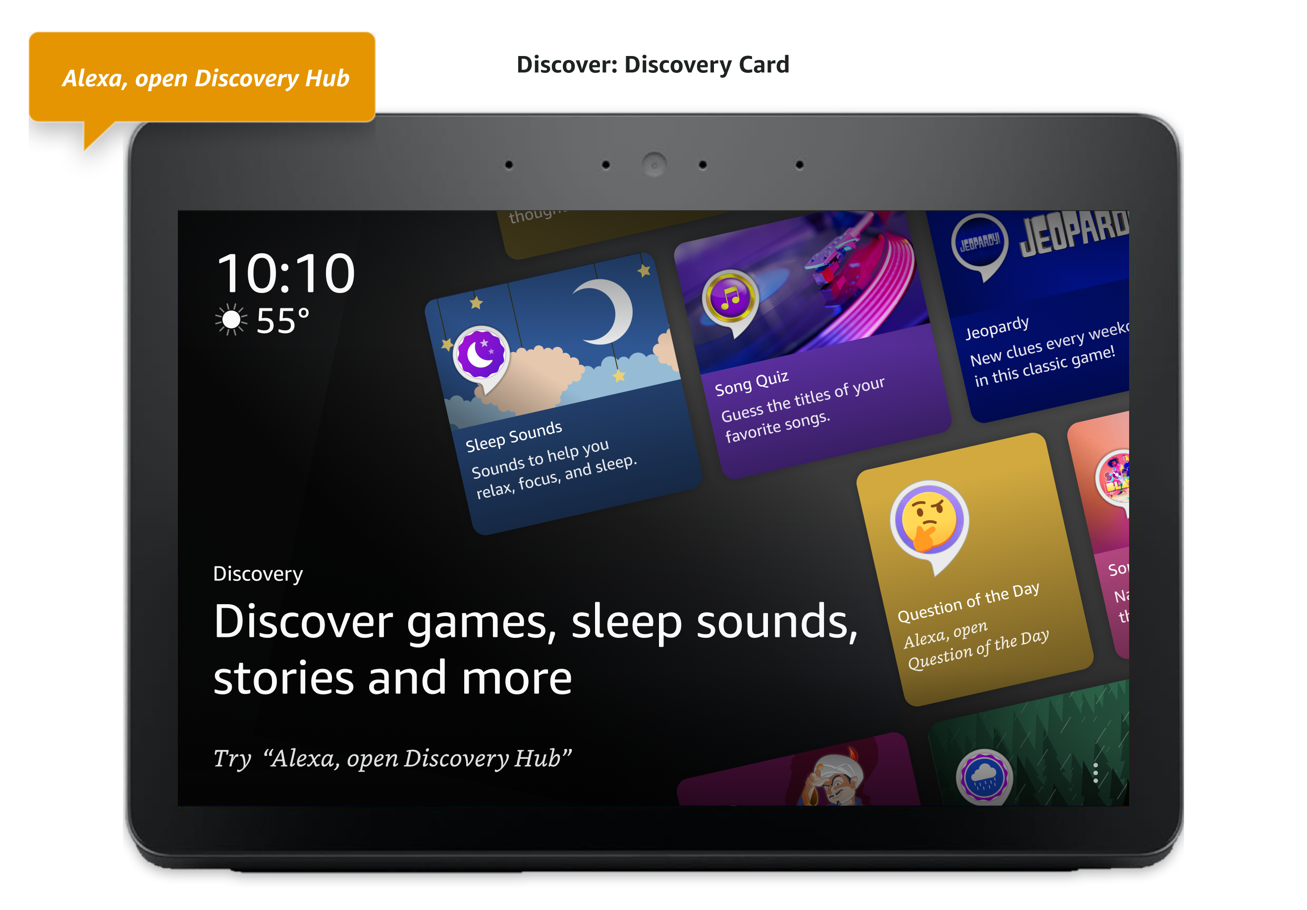
Participants were evenly split on how they chose to open Discovery Hub: half asked Alexa directly, and half tapped the screen. The deciding factor was proximity, not a preference for one modality over the other; participants near the screen tapped, while those farther away or occupied with something else asked Alexa instead.
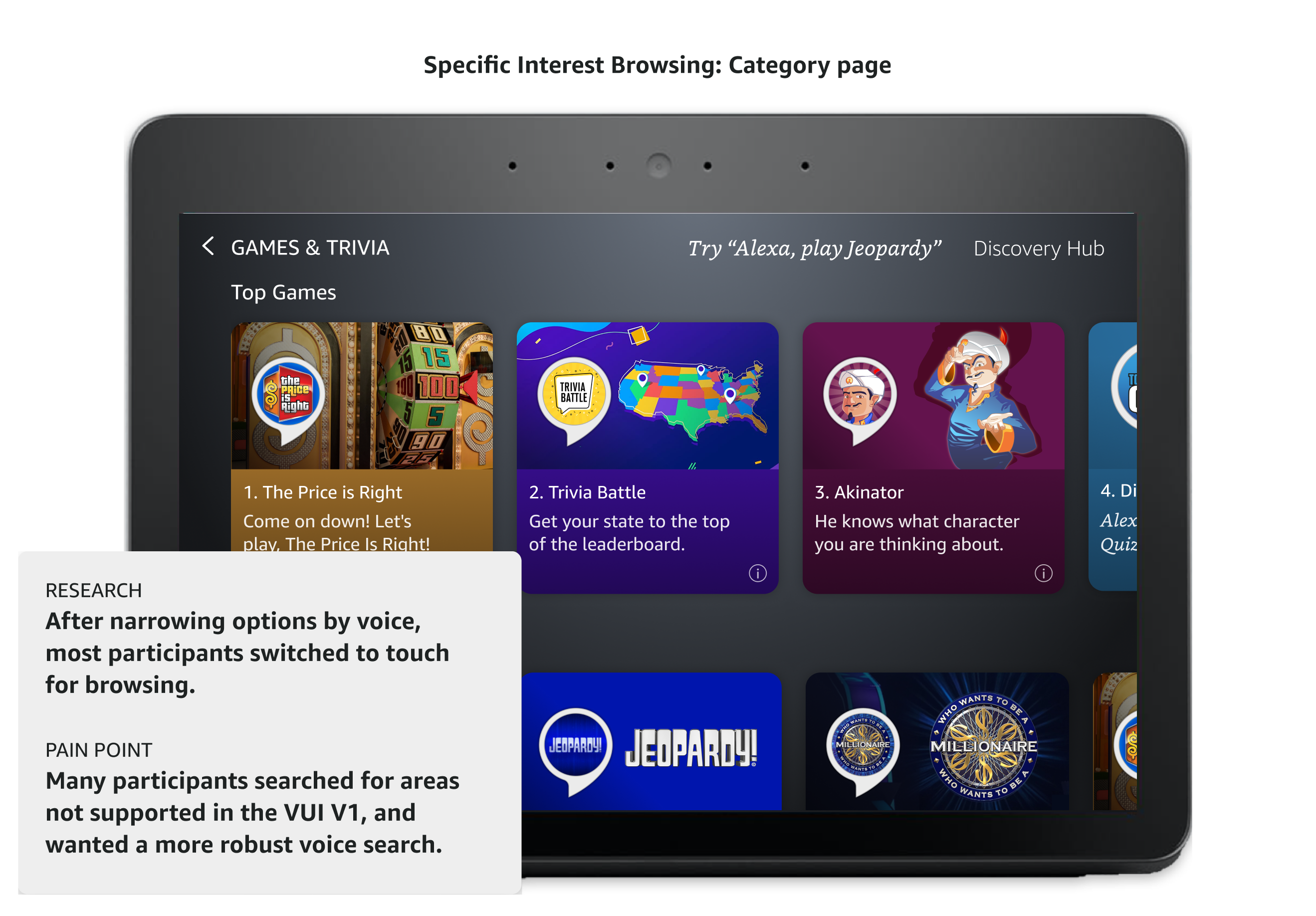
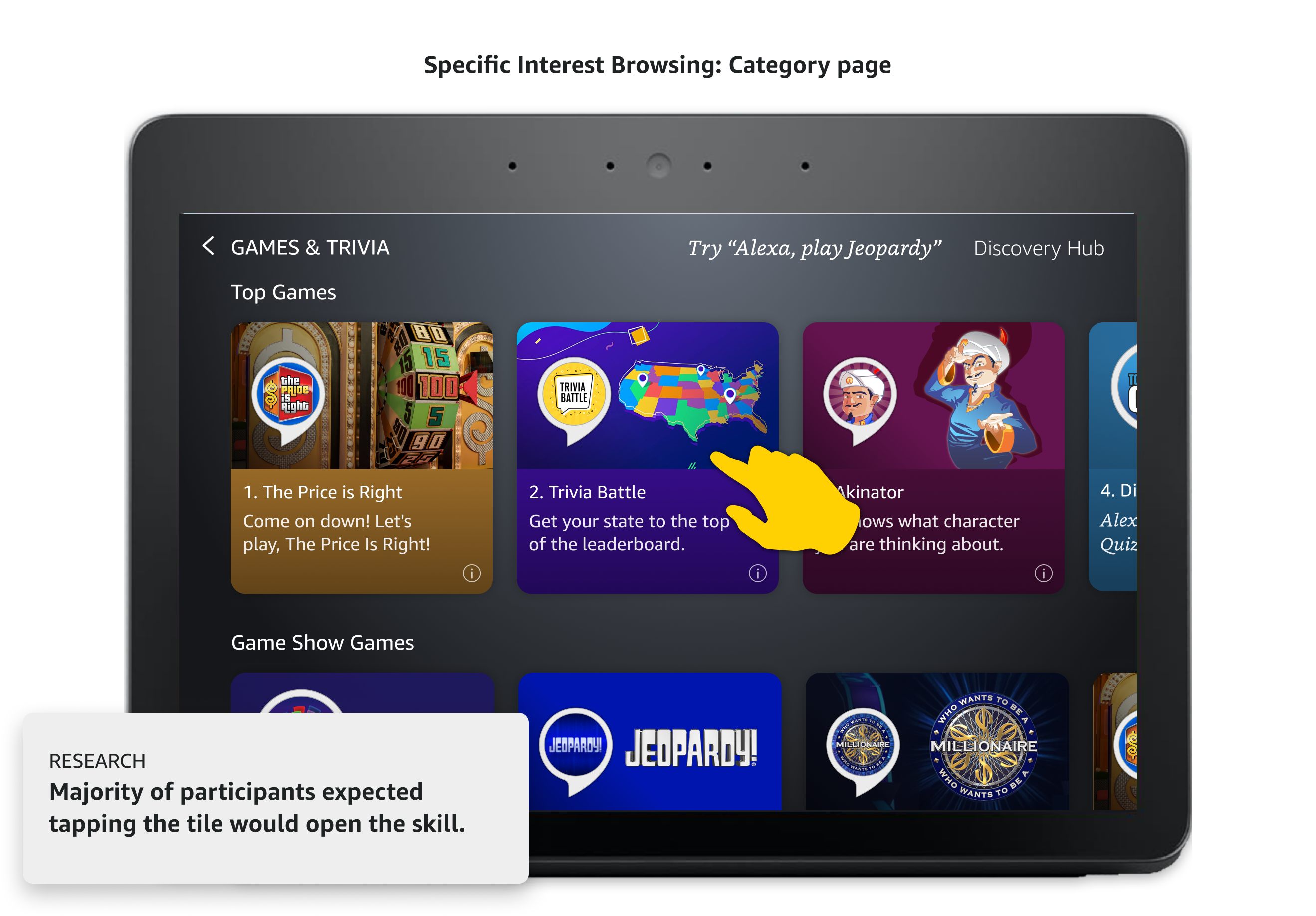
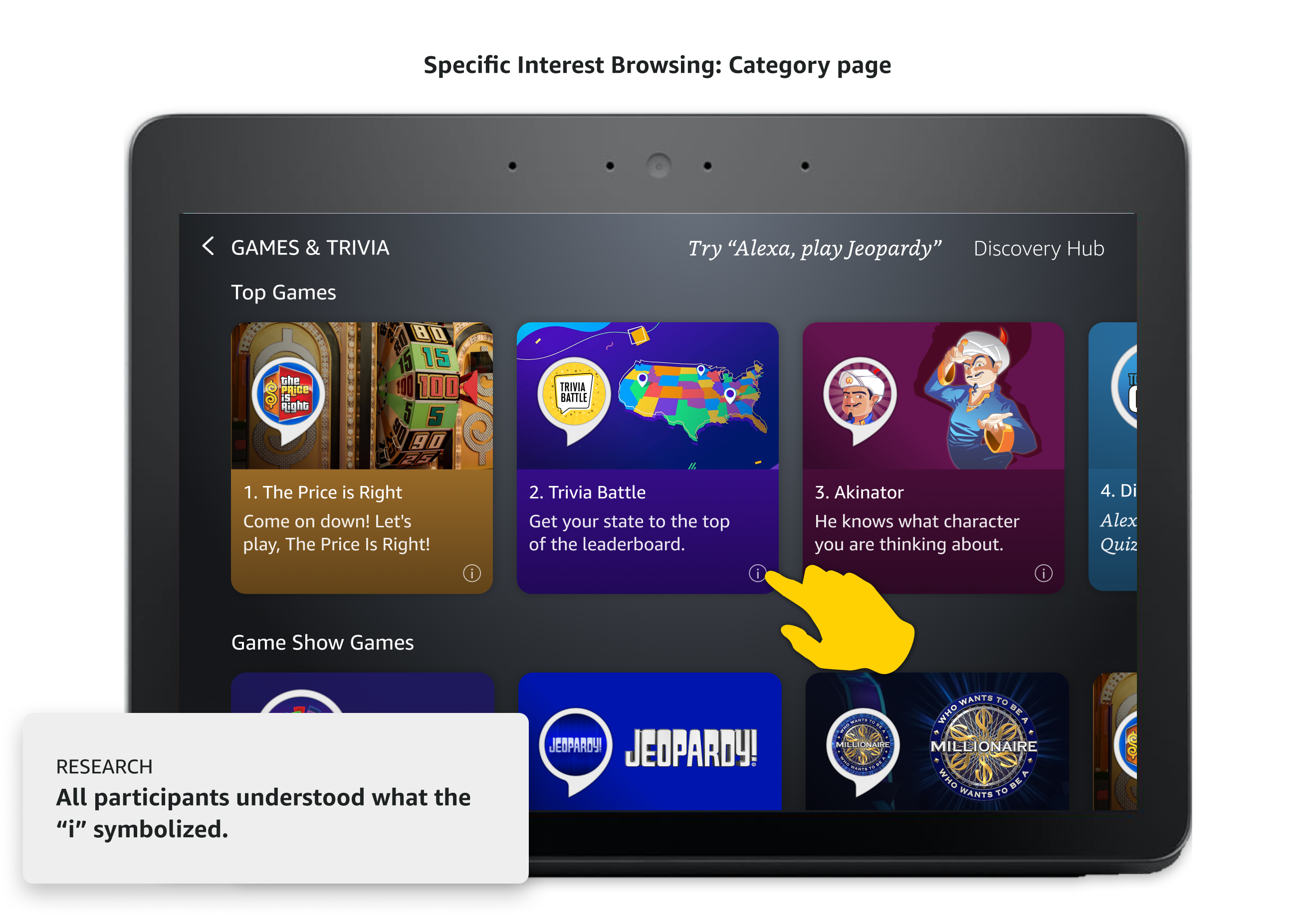
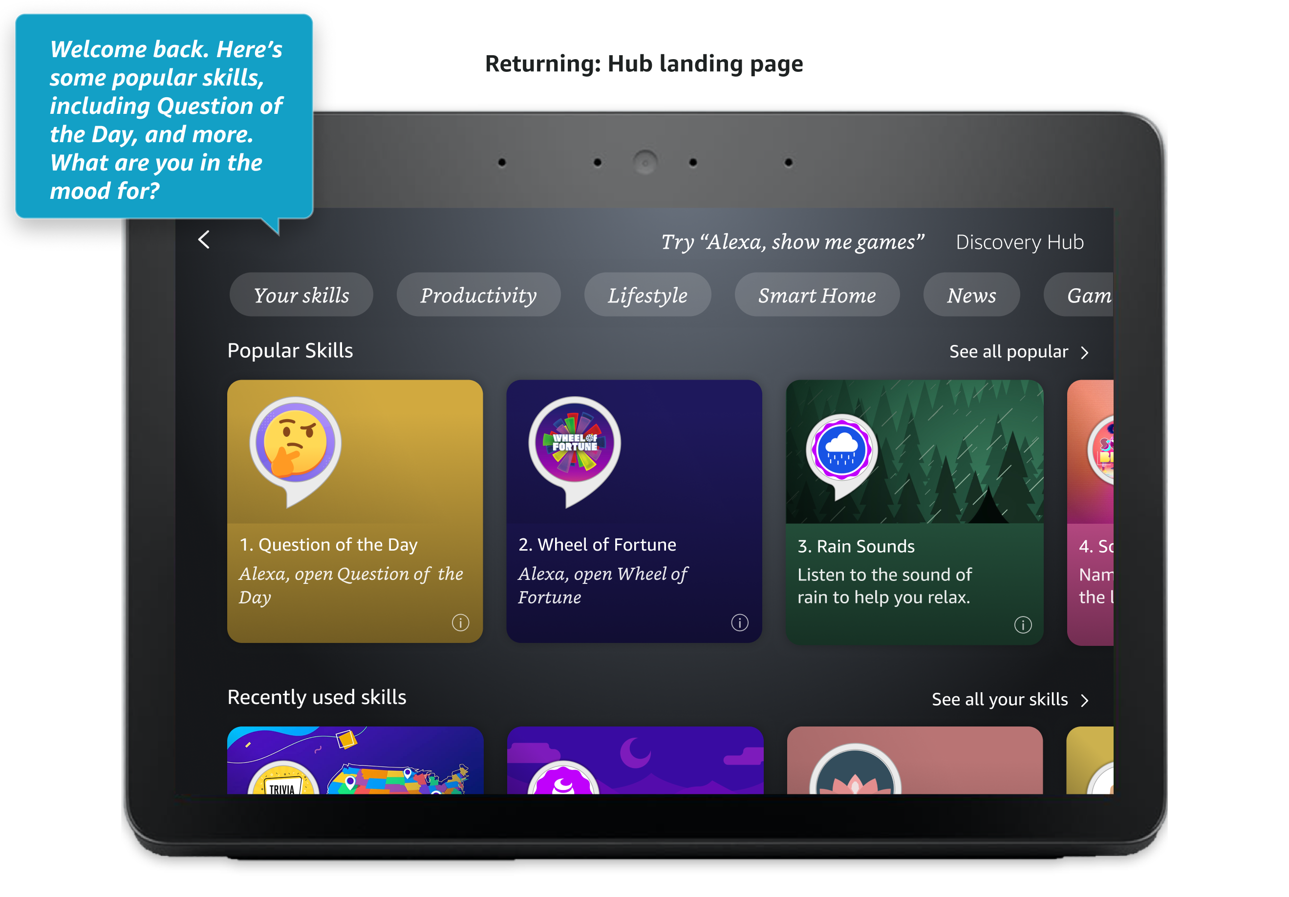
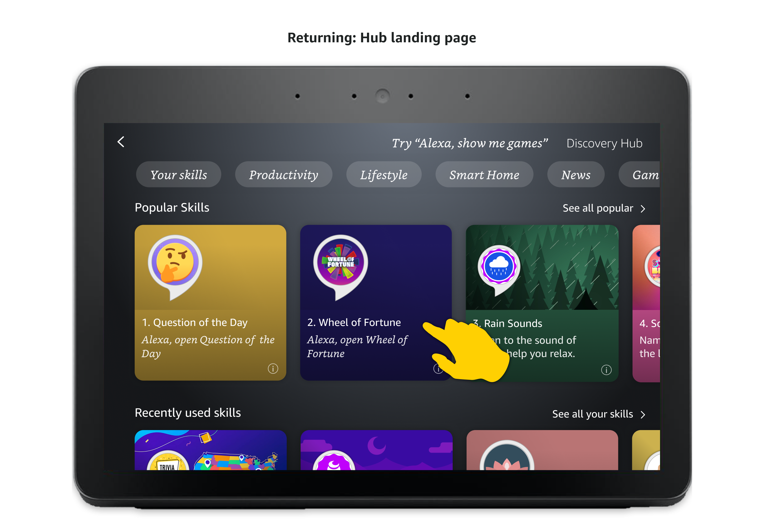
Participants explored categories by tapping the pills at the top of the screen or scrolling down the page, then scrolled each row horizontally to see more skills. Everyone recognized the "i" icon on a tile, and most tapped it to learn more before deciding whether to open a skill, though most participants still expected tapping a tile to launch the skill directly.
Regardless of how they asked to leave a game, participants expected to land back on Discovery Hub, not the device's main home screen. Being dropped at the home screen instead felt like a dead end, echoing the same issue found in the parallel VUI test.
With 130,000+ skills, Alexa's version of apps, most users only ever came back to the handful they already knew about. Discovery was left almost entirely to word of mouth or whatever someone happened to stumble into, with few real ways to learn what else was available. Users had to go to Amazon's website or the Alexa mobile app to search for a skill, and on an Echo Show, asking Alexa about skills meant listening to a long list of names and descriptions narrated one by one, with no way to browse them visually. Third-party partners, in turn, had no reliable path for new users to find them. I led the concept design for Discovery Hub, working closely with product, and partnered with a principal designer on implementation.
Bringing Discovery Hub to life meant working closely across design, research, engineering, and product.
To get buy-in from VP-level stakeholders, I worked closely with our PM to formulate clear requirements for Discovery Hub, then built a conceptual prototype that brought the idea to life. Having something tangible to walk through made it easier for leadership to see the value of the concept and align on moving forward. The pitch was a success: leadership was thrilled about the concept, and we got the green light to move forward.
Initial concept prototype
The multimodal catalog experience can be broken out into 4 use cases.
Browse & Discover
Browse the catalog, and search via voice to narrow down results and discover skills.
Evaluate & Engage
Quickly open skills from tiles or review details.
Return & Re-engage
Be reminded of skills I've used and ingress into the hub to see all recent skills.
Manage & Resolve
Manage core functionality for my skills in detail page settings.
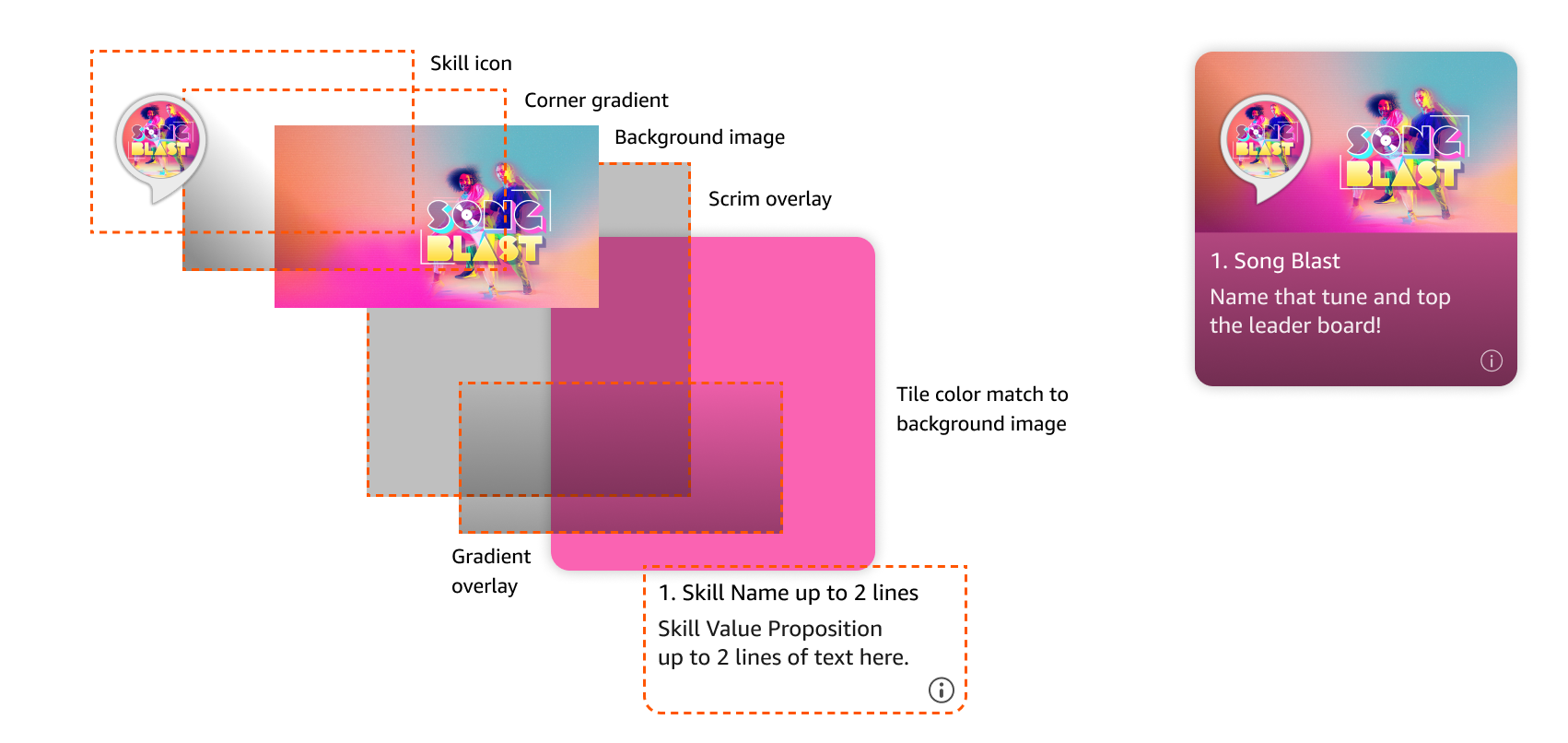
Featured skills are ones the Alexa team hand-picked as high quality and wanted to highlight to users. Each featured tile is built from layered components: a skill icon, a background image with a corner gradient and scrim overlay for legibility, and a gradient overlay that matches the tile's color to its background image so the card reads as one cohesive piece. That color isn't picked manually; it's dynamically sampled from the image itself, then toned down with a series of scrims and transparent gradients so contrast and visual balance stay consistent across tiles. The skill name and value proposition sit on top, each capped at two lines.
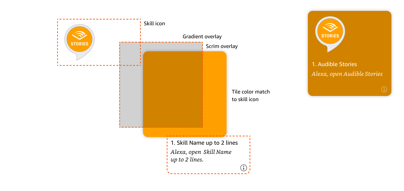
Default tiles cover the less popular, lower quality skills that don't have as much developer investment or maintenance. Rather than a custom background image, the tile color matches the skill's icon, keeping the same layered scrim and gradient treatment as featured tiles so the whole grid still feels visually consistent.
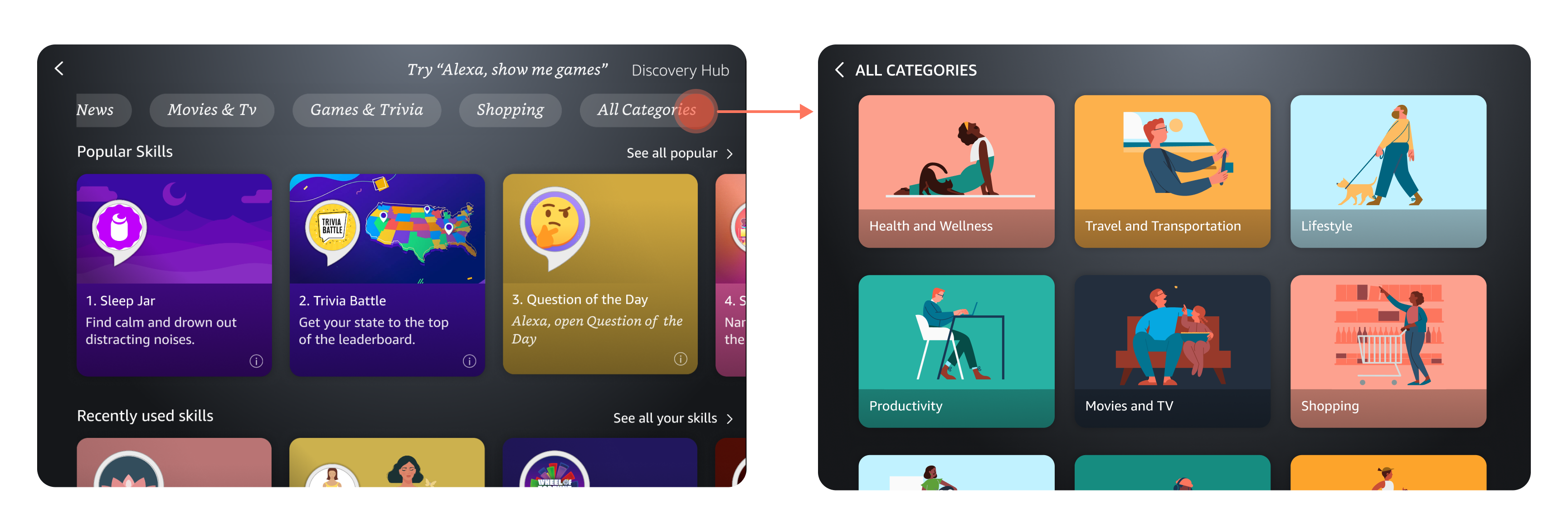
In order to display dozens of categories, I decided to place the most popular ones in front and add a pill that would ingress into a page with more. Only a handful of pills fit in the row before running out of space, and showing every category at once would overwhelm users, so I used usage data to surface the categories users engage with most and tucked the rest behind an "All Categories" pill. That page uses a custom illustration for each category, giving users a visual anchor to scan by instead of just reading a list of labels.
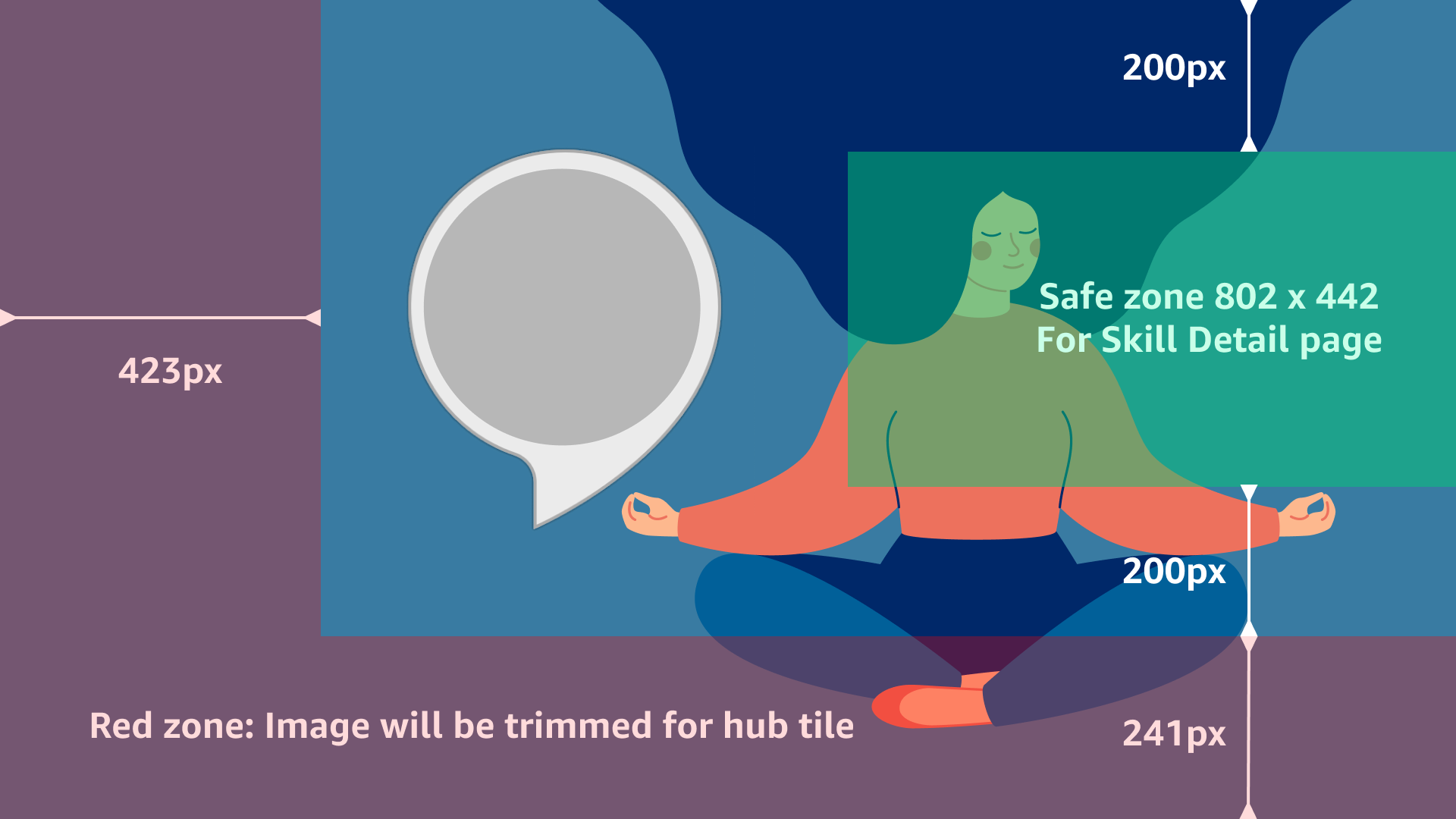
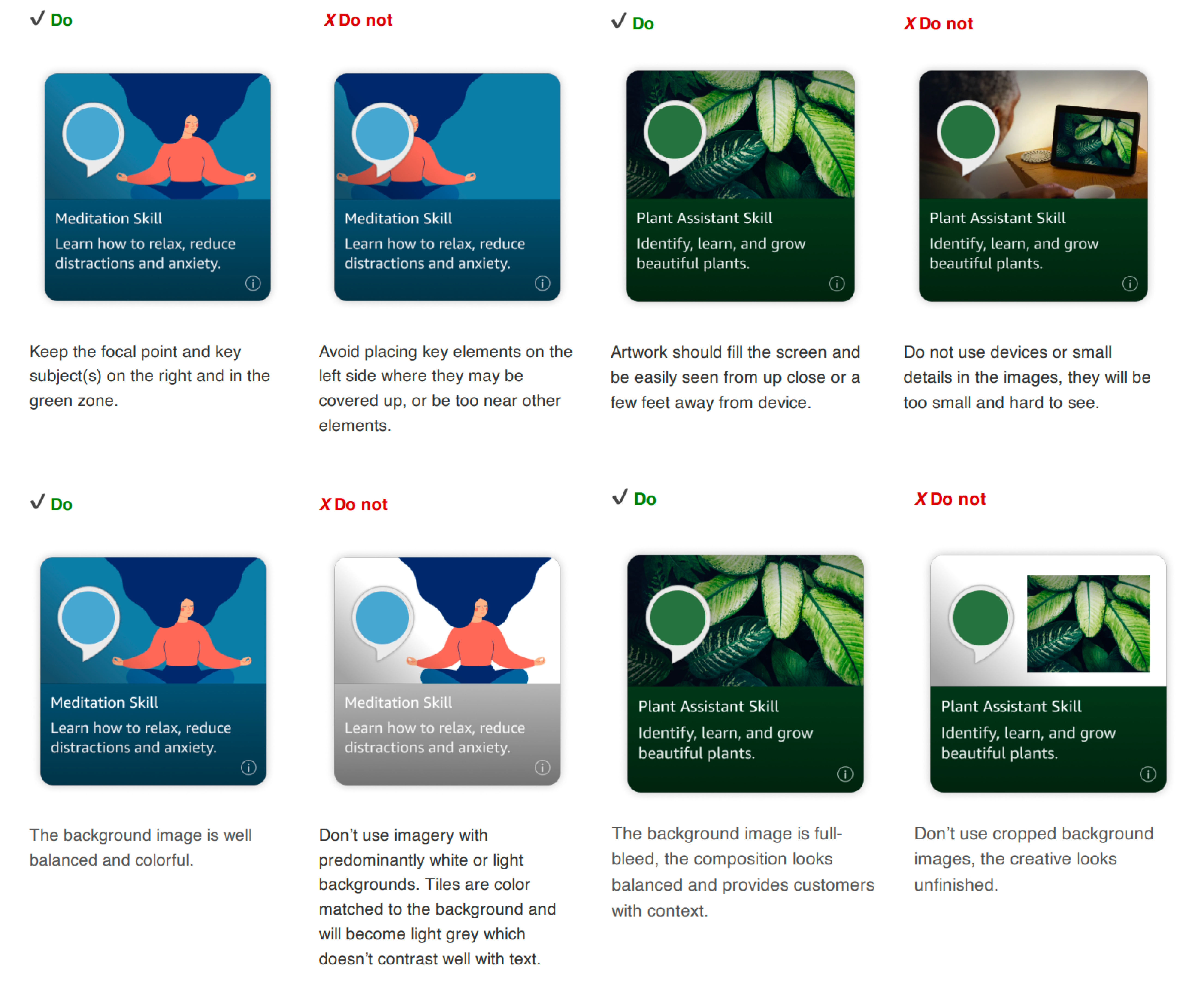
To keep the catalog visually consistent, I put together imagery guidelines for partners submitting skill artwork. Each image needs an 802x442 safe zone that holds the important visual content for the skill's detail page; anything outside that zone falls into a red zone that gets trimmed when the same image is cropped down for its hub tile. I also spelled out exact asset requirements: background images at 1920x1080px, submitted as high-quality layered PSDs and delivered as a JPG under 450KB, plus a skill name capped at 23 characters and a one-sentence description capped at 46 characters, both including spaces.
To measure success, we tracked three questions across engagement, discoverability, and experience quality, all prioritized as P1.
Skill MAUs (Monthly active users). First, were users actually using the skills they found? We tracked the net increase in skill invocations and clicks before and after launch, alongside device MAUs and the ratio of skill MAUs to device MAUs, which stood at 20% at the time, along with what share of skill invocations flowed through Discovery Hub versus other paths.
Findability and re-engagement. Second, was Discovery Hub easy to find and return to? We tracked monthly visitors and their month-over-month change, along with unique users and devices, broken down by how users first entered the hub and how they discovered it in the first place. Retention rate, repeat visits per user, and the share of system tray clicks that led into Discovery Hub rounded out this picture.
Experience quality. Third, how good was the experience once someone was there? Session-level metrics covered how many new and already-enabled skills users invoked, how many skills and detail pages they viewed, the touch-versus-voice mix for accessing and using the hub, and CSAT.
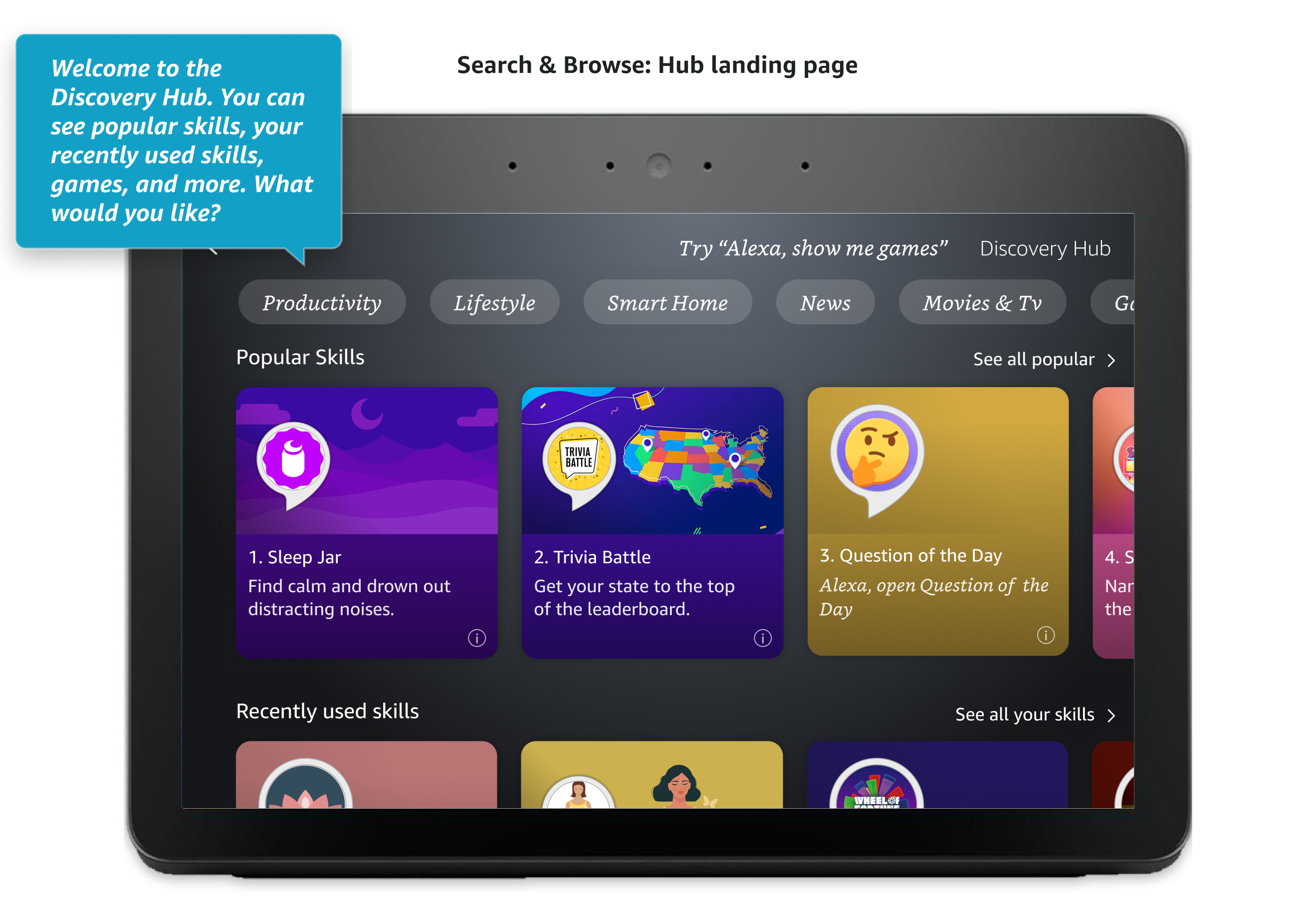
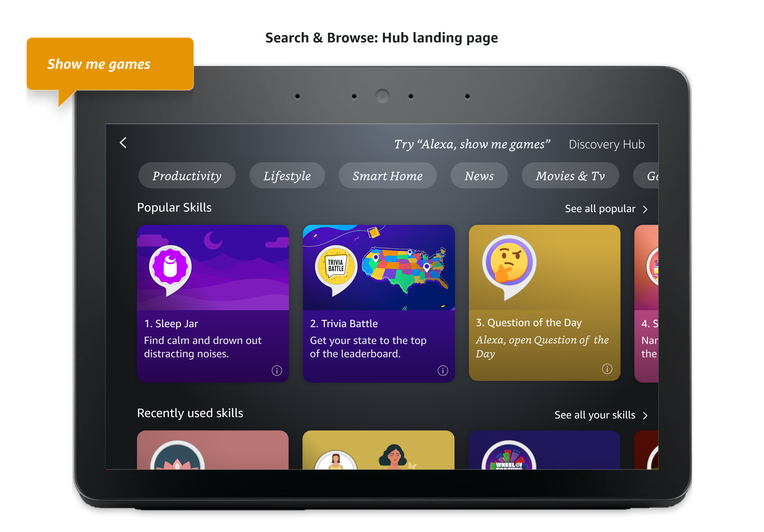
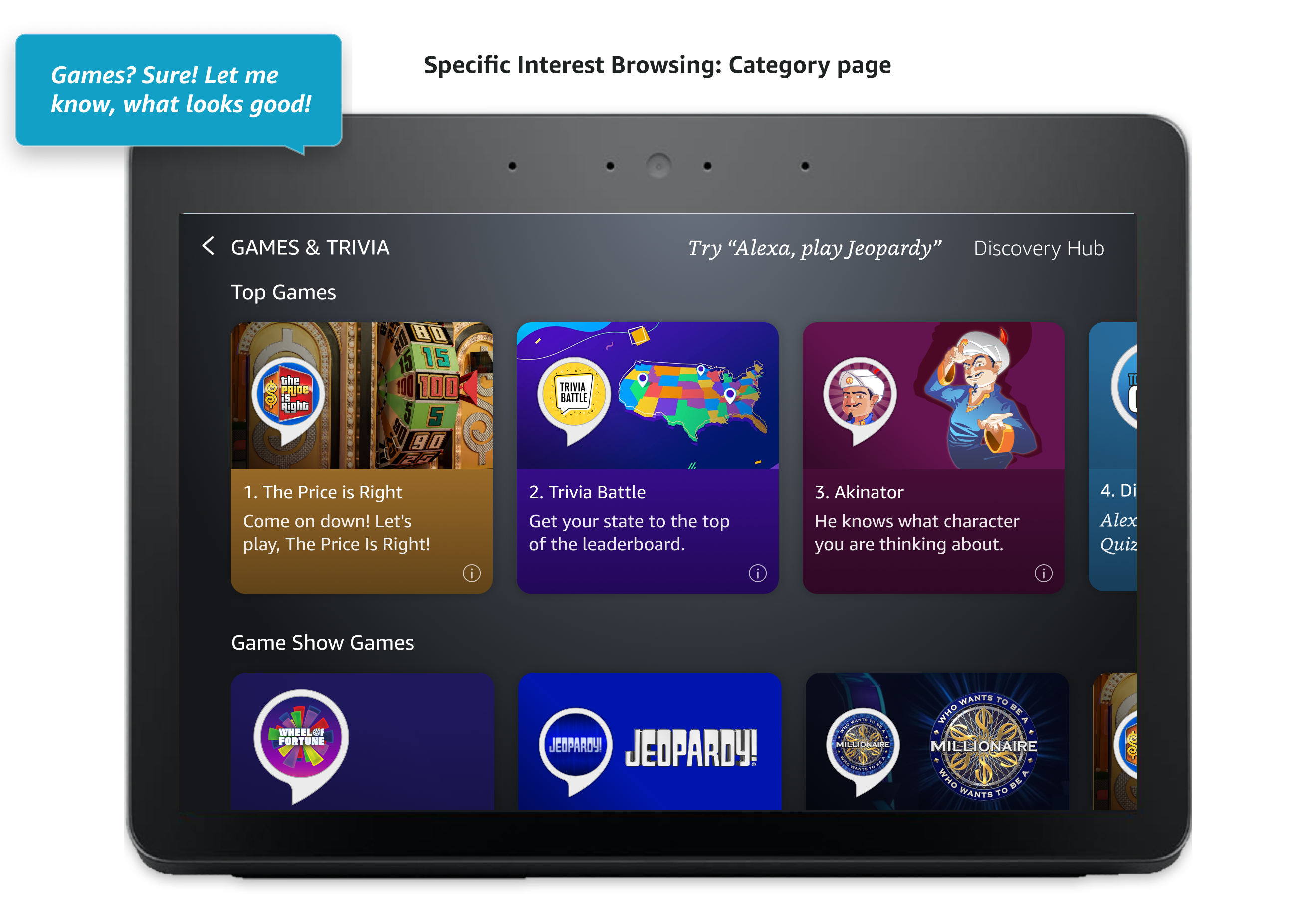
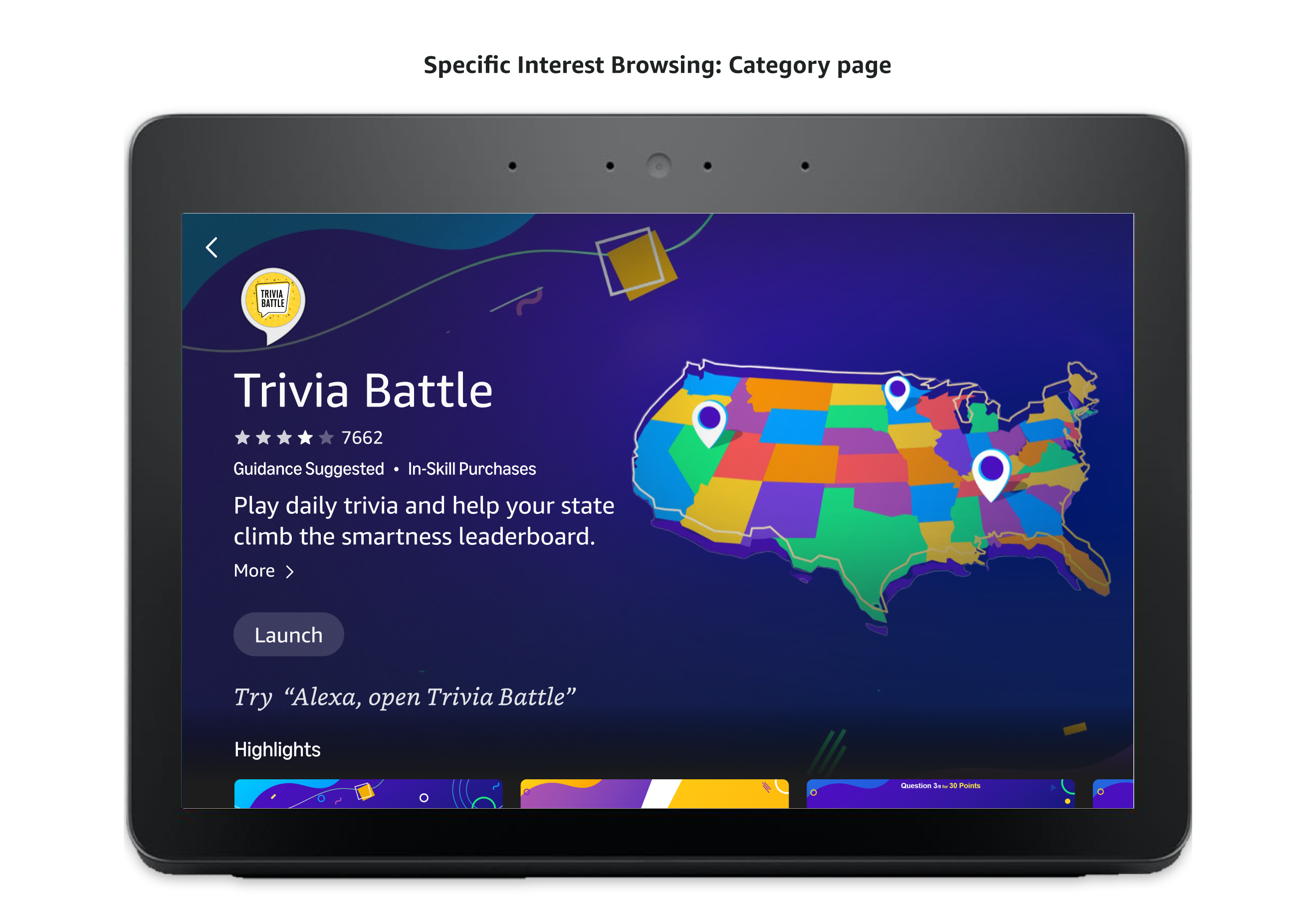
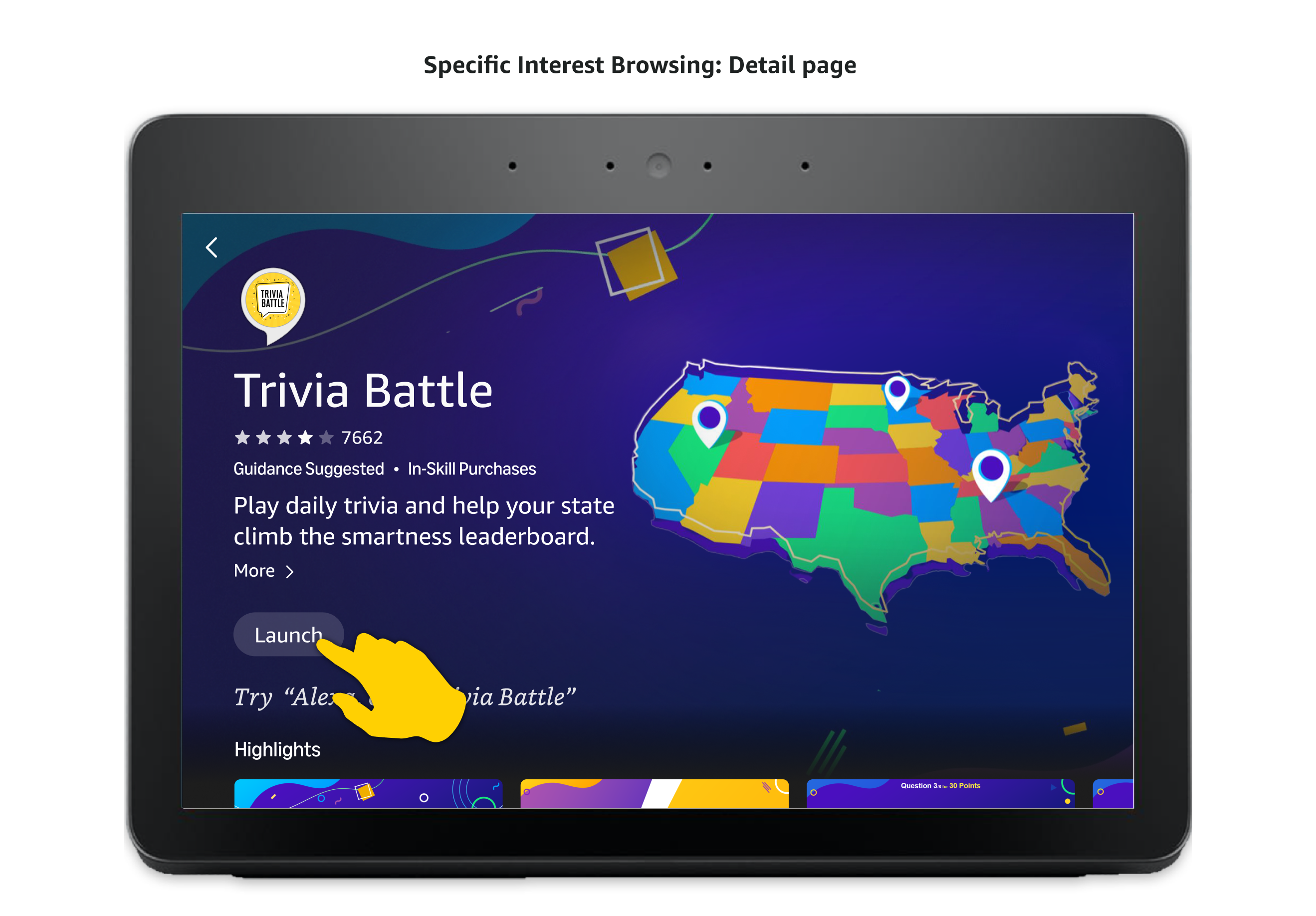
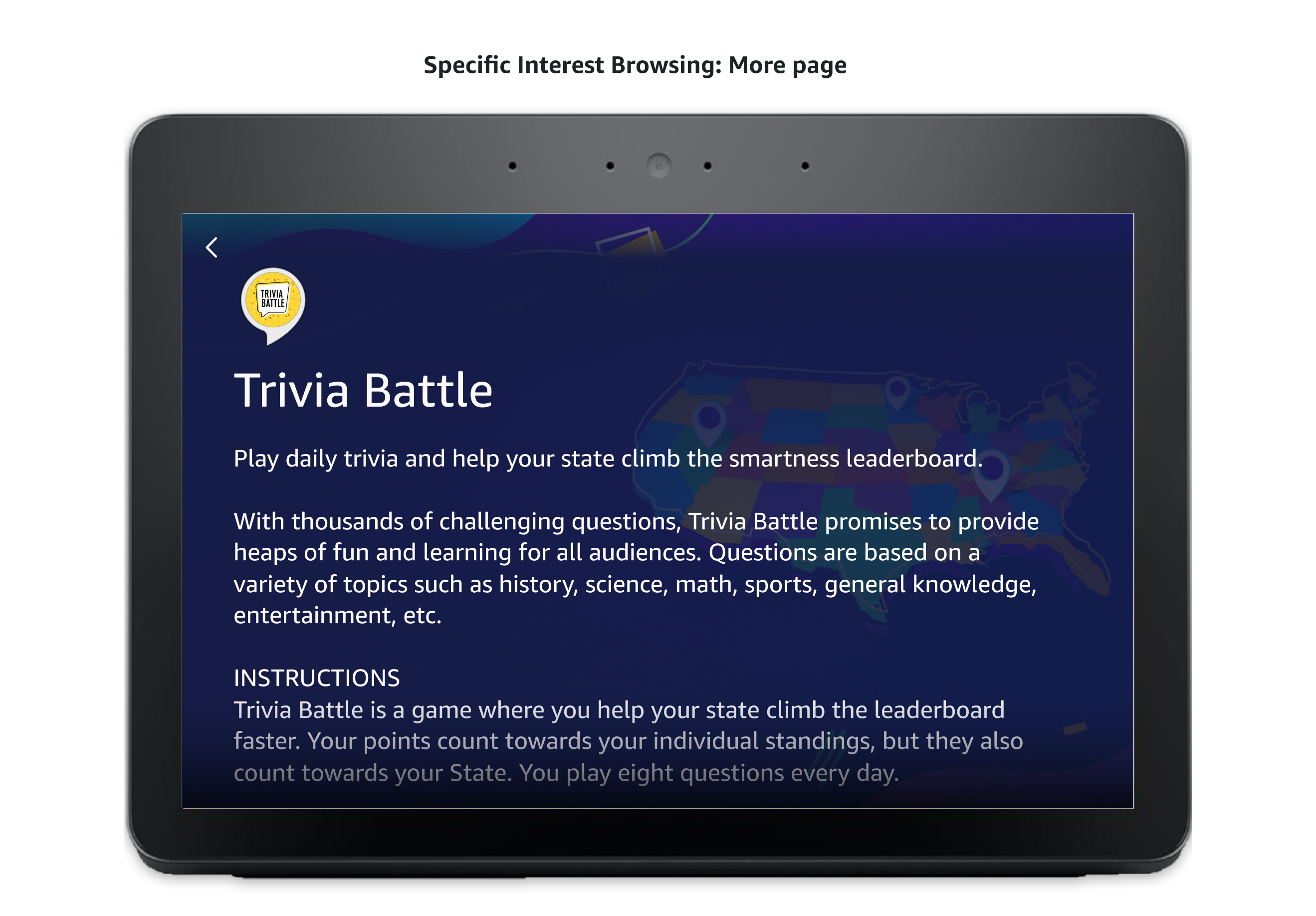
This flow shows how someone finds and opens a new skill for the first time, from noticing the Discovery Hub card on the home screen, to browsing categories and popular skills, to reviewing a skill's detail page and launching it.
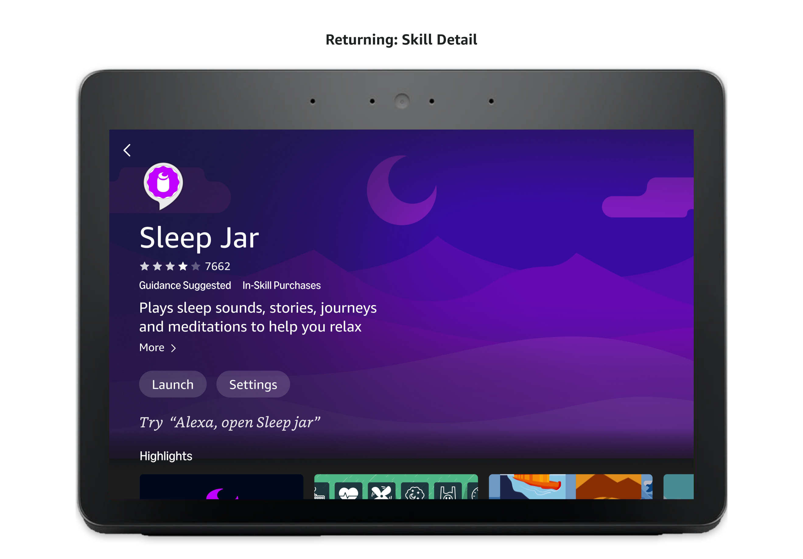
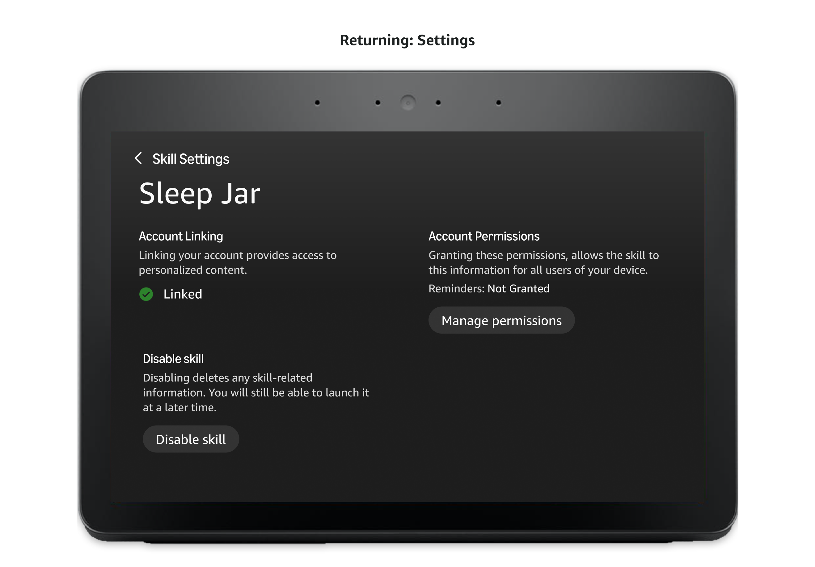
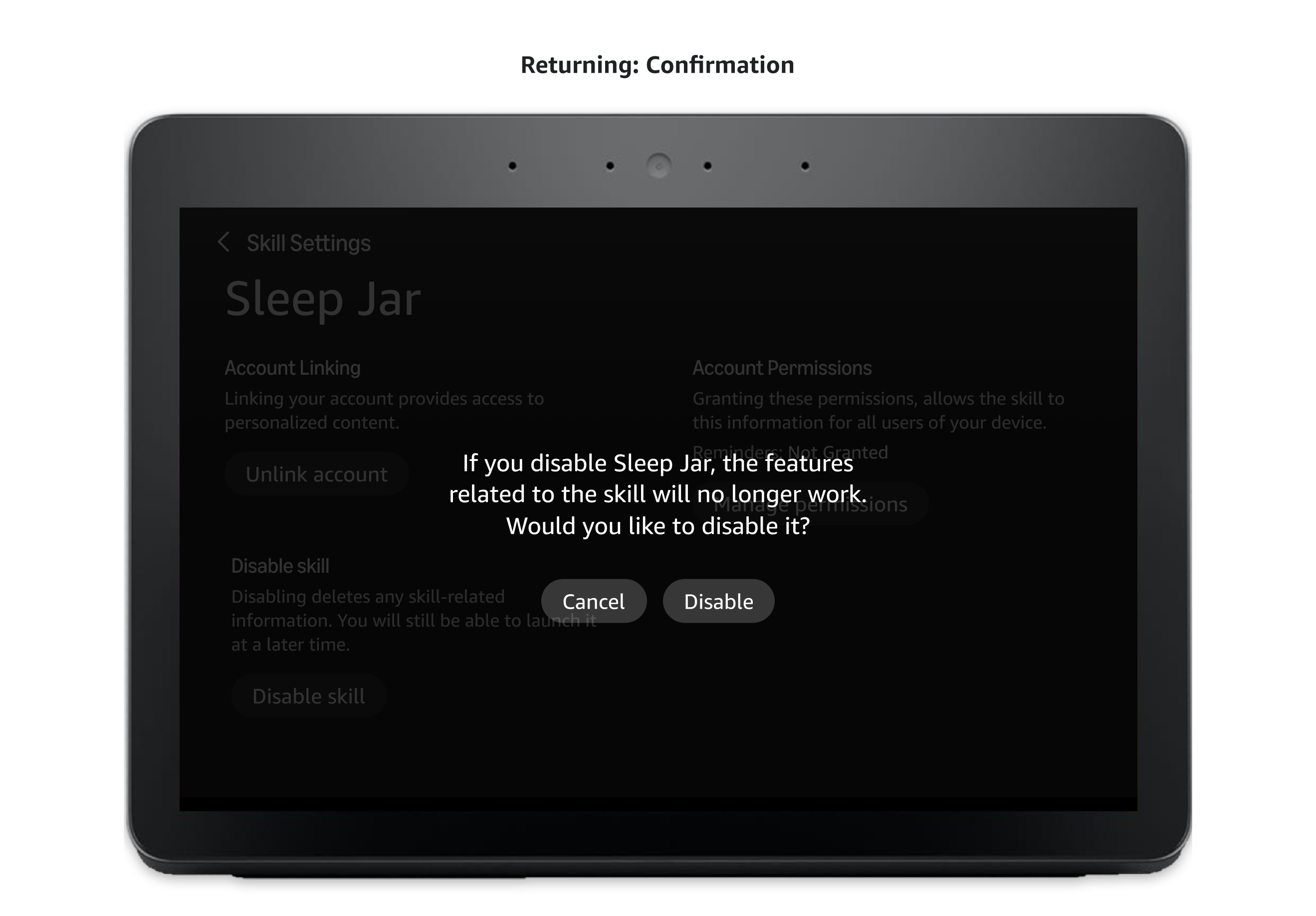
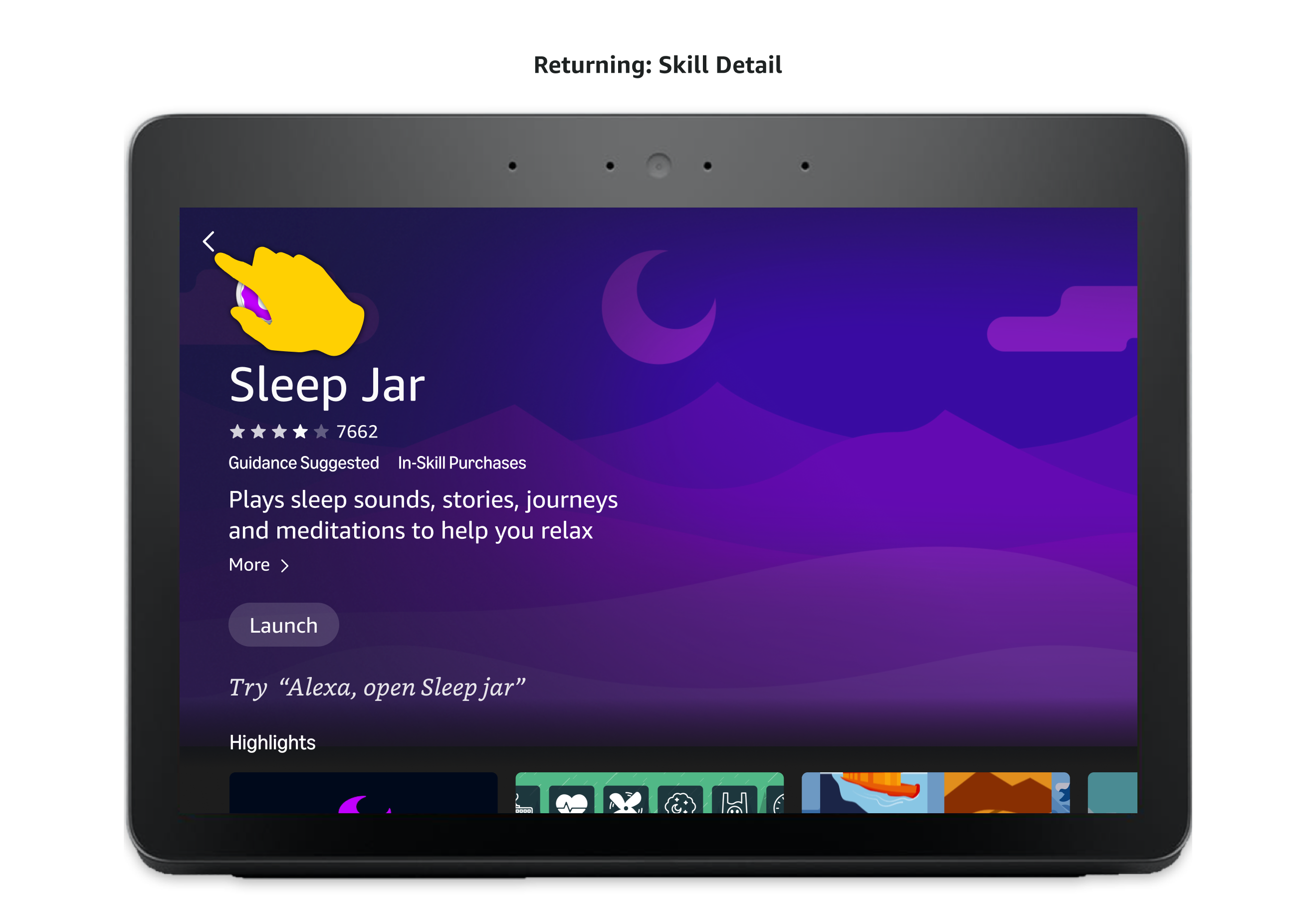
This flow shows how someone returning to a skill they already use manages it directly from Discovery Hub, adjusting its settings, reviewing terms of service, or disabling it when they no longer want it.
As ownership shifted to the next phase of the team's roadmap, a few directions stood out for where Discovery Hub could go next.